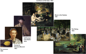
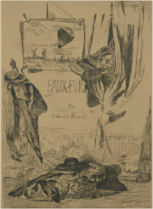
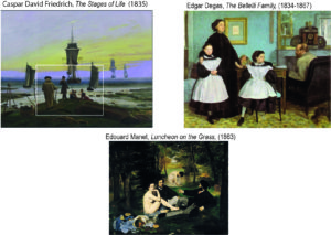
Explorations of Edouard Manet's paintings with diagrams

Category: Edouard Manet

Manet’s Scheme: Composition in Social Space (P9)

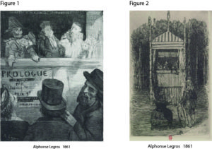
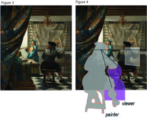
Two essential features of composition in Manet’s scheme – in MyManet – are the figures’ gazes and the setting of the puppet theatre, or:
the relation between the social space of gazes and gestures and the material space of the setting on stage.
Manet made deliberate choices on both features when he created Luncheon on the Grass.
This we understand better looking at two studies for the Luncheon
and the X-ray visualizing Manet’s first draft underlying the final version.

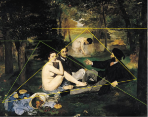
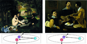
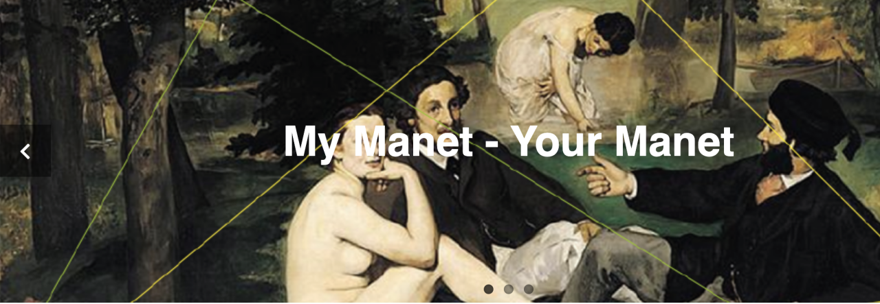
In Figure 1, the four versions are compared, scaled to the same size, and supported by diagrams indicating perspectives:

Figure 1:   Comparison of four versions of the Luncheon on the Grass

A – the final version of Luncheon on the Grass 1863
B –  a later copy made by Manet himself dated between 1864-68
C –  a study in watercolour with pen and ink dated between 1863-65
D –  a print from an X-ray of the final version revealing a first draft

All four versions are presented and discussed by Juliet Wilson-Bareau (1986, p. 37ff)
– including a comparison with the painting Pastoral Concert by Titian and the etching by Raimondi after Raphael’s Judgment of Paris (see previous Post 8). Her X-ray analysis is a much acclaimed and quoted source in the discussion.

Wilson-Bareau proposes that the study (C) was made from the final version, and that the copy (B) was probably made even later. She concedes, however, that the sequence is only hypothetical since the exact dating is unresolved.

Her analysis demonstrates convincingly how Manet was experimenting with elements and their composition directly on the canvas and even at a late stage (like inserting and deleting a little dog to the left of the nude).
She concludes:
“One of Manet’s major problems with the Luncheon was evidently his difficulty in integrating the very solid, sculptural group into the original open and airy setting” (p. 39; title adapted as Luncheon).

In view of MyManet, I suggest a slightly different sequence and interpretation of his “problems”.

Two major changes are occurring between the draft in the X-ray (D) and the final version (A):

–  On the left side,
in the X-ray an open view reaches from the foreground to the open landscape beyond the river,
with grass and bushes in the foreground instead of the clothing of the nude in the final version.

–  In the group,
the gaze and position of the head of the man next to the nude is changed;
in the final version, he looks slightly upward into some undefined distance
rather than connecting with the other man as in the X-ray,
while his head – in relation to the nude’s face – is a little moved upward and forward in (A)
placing the three faces almost onto the same plane in the picture space.

Looking at the final version, the X-ray, and the study C, it is remarkable that all three versions show the same “solid, sculptural group”. This is indicated by the identical white triangles connecting the faces and by the position of the background female in the diagram of perspectives.
“Sculptural” may not be the appropriate term, since the triad is rather “flat” with the second woman set backward and too large in perspective. But I agree that the impression is rather “solid”; the formation of the four figures appears to be the same and clearly predetermined in all three versions, and rather independent from the landscape in the X-ray.

Taking up the first change:
Manet may have seen a “problem” with the integration into the landscape, but he resolves this “problem” in a rather unusual way by enhancing the difference between the landscape on left side and the solid group!

He introduces the “split horizon” from Pastoral Concert (the two perspectives in the diagram) and accentuates the vertical divide (left red line) by dark bushes and trees above the nude’s head.
Then, he keeps the “too large” woman pushing the background forward and the horizon upward and promotes the artificiality on the centre and right side – the “stage”.
He paints the background rather indistinct as “coulisse” and fits the triad into a middle ground with reduced depth. To maintain the balance under these conditions, he introduces in the foreground the elaborate “still life” to the left and a dominant dark tree to the right.
All this makes sense, when he is determined to preserve the formation of the group though violating a “natural” perspective. He is not caring about integrating the group “into the original open and airy setting” (see Wilson-Bareau above).
Manet invents a programmatic scheme.

Taking up the second change, the gaze of the man next to the nude:
This change raises the question of the role and dating of the study (C).
Wilson-Bareau suggests that the study is made after the fact, after completion of the final version. Her argument appears to be that the study reflects too closely the original to precede it.
Placed before the X-ray, the differences of the study with the X-ray become incomprehensible.
Placed between X-ray and final version, Wilson-Bareau apparently would expect more resemblance with the X-ray.
But why would Manet do that kind of study after the fact?
Certainly not to prepare the later version (B) which is in many ways different again, as I will show below.

An alternative interpretation is suggested in MyManet.

First, it is telling that the left side of the painting is not explicated in the study. This side includes in the final version the attractive “still life”. Why would this be neglected in the – admittedly, unfinished – study?
Second, it seems that Manet wanted to clarify the formation of the group before changing the left side:

The crucial change from the X-ray appears to be the face and head of the man next to the nude!

For the direction of this gaze Manet has no example in either Pastoral Concert or Judgement of Paris. He has to decide where the man should look, and he is not satisfied with an internal communicating gaze to the other male or with an “absorbed” gaze within the triad – as in the X-ray.
If Judgement of Paris is to be the model, then the gaze has to be directed toward the “authority” or Big Other – the god Jupiter arriving from the sky.
Thus seeing the study as an experiment for the gaze of the Third – in terms of MyManet – also underlines the importance that Manet attaches to this gaze!
To my knowledge, only Gisela Hopp (1968, p.23) has declared the gaze of the Third, in connection with the gaze of the nude, a decisive centre of gravity in the design of the painting, although she tries to derive this crucial role only in terms of internal design of areas, colours and perspectives.
(In her words: “Sein Blick ist erst der endgültige Kernpunkt des Bildes, nicht zu lösen von dem der Frau, aber auch für diesen Ausgangs- und Anziehungspunkt.”)
MyManet could not agree more!

It is interesting or puzzling that the nude’s gaze in the study (C) seems to follow the gaze of the man next to her – not gazing to the viewer! This is difficult to understand, if the study is made after the final version, as Wilson-Bareau proposes.
Rather, experimenting with her gaze in conjunction with experimenting with his gaze demonstrates what Manet is attempting: designing the interactive effects of the gazes in constituting a certain social and pictorial space.
When the nude is not looking at the viewer, the interaction with the viewer is lost and the gaze of the man is not effective anymore either, because it loses its singular force.

Finally, we have to consider the later copy (B).

Wilson-Bareau offers a questionable interpretation – from the view of MyManet.
She perceives in the copy “a more coherent, close-knit relationship between the foreground figures, while … improving the perspective view of the bather in the background” (p.39).
In my view, Manet appears to be testing after the fact and after receiving all kinds of harsh criticisms about his “failures”, whether his programmatic scheme is successful in achieving what he wants to achieve.
He revises all the major changes which account for the originality and modernity of Luncheon on the Grass:

  • The perspective is “improved” by reducing the size of the background woman, setting her lower and lowering the horizon, and creating a more integrated background across the painting breaking the dark vertical above the nude.
  • The man to the right is moved closer to the other two figures creating more intimacy (see right red line and perspective). He is also positioned a little bit lower and to the front (white triangle), while the other man appears a little smaller following the perspective toward the woman in the back.
    Together, these changes produce a less “flat” middle ground extending into the depth of the painting.
  • The man next to the nude is now modestly looking toward the man to the right – sinking back into insignificance.

The result is a more “natural” setting which might have caused less of a scandal, because viewers could “read” those pastoral scenes – but we certainly would not be talking about this painting as a starting point for modern art!
The dynamics in the composition – the perceived lack of intelligibility, of inconsistencies and ambiguities – aroused the criticism of the art community, but caused also the later recognition of its ingenuity.

No wonder that Manet did not finish or exhibit this version!
Maybe he kept it ready at hand in his studio to show it to anybody worth to be engaged into a discussion about his innovative great scheme in the final version.

To be sure, this scheme is a hypothesis about the concepts guiding Manet. But I think it demonstrates two things:

  • It is necessary to consider not only the sources inspiring Manet to understand his compositions, especially, since he is substantially changing and adapting them to the needs of the emerging painting.
  • It is not enough to interpret Manet’s composition as “defined in terms of their rejection of academic conventions” (John House 1986, p. 12). The rejection is a critical attitude certainly shared by Manet, but it does not yet explain the programmatic choices and specific innovations introduced by Manet.

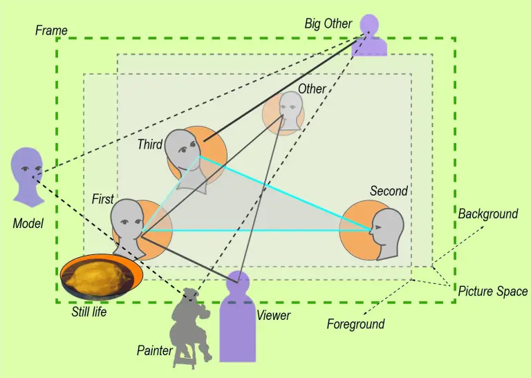
Time to summarize the elements of this scheme in form of a diagram integrating the results so far:

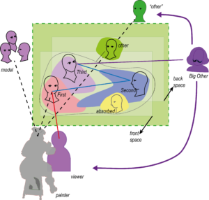
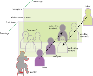
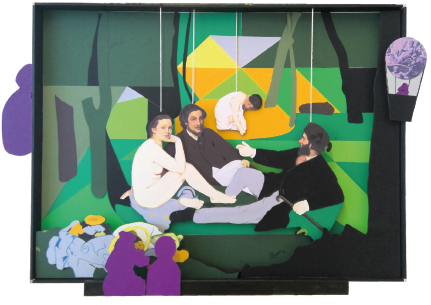
Figure 2:   Manet’s Scheme – Composition in Social Space

The diagram should not be understood as a “manual” which Manet is following in the composition of Luncheon on the Grass, or in the creation of any of the other paintings to which we will apply the scheme. The diagram is mediating between the painting itself as experienced by us today and the process of painting as an event happening about 160 years ago. It is a tool for understanding – as are all diagrams – not a “theory” of the painting.

The essential dynamic is the interaction of social and pictorial space, of the roles outside the painting with the roles inside the painting.
Obviously, such a dynamic is – in the strict sense – only meaningful in figurative painting. And not all figurative paintings, and not all of Manet’s figurative paintings, are exemplifying this scheme as developed in Luncheon.
To understand our experience of other types of painting, we will have to introduce new concepts and schemes which appeal to different ways of relating to “What do pictures want?”(Mitchell 2005).

Manet is inspired by the structure of the puppet theatre which provides a model or stage for the activity of painting.
As anybody who has witnessed a puppet performance knows, there is no clearly defined inside and outside in the relation between audience and performance. The relationship is negotiated as the “show goes on” in each performance.
In terms of painting, we should imagine a situated installation artwork with the painting presenting certain elements “performing” on the “stage” carried by the canvas. The essential medium for this “performance” is the way our eyes move through the painting following the network of gazes and gestures of figures in the painting while engaging us and other agents outside the painting. In a sense, the relations are the “spiderweb” that stretches the social and spatial relations “in mid-air” reaching beyond the frame.

As indicated in Figure 2, Manet does not see these relations as realized on the flat surface of the canvas, although he is certainly aware of the material vehicle. He creates his own version of a socio-spatial “reality” which does not follow the rules of perspectives but stages figures and objects in a layered way, similar to a collage.
The “stage” is structured into a picture space rather narrow in depth and delimited by a front plane and a back plane. The front plane defines the foreground and is often accentuated by a “still life”, symbolized in the diagram by the lemon.
The picture space holds the triad of social roles with the First relating to the viewer and the painter, the Second integrating the relations on stage, and the Third linking to the “world beyond”, to society and tradition, symbolized as the Big Other or – in Manet’s case – by his idol of painting Diego Velazquez.

An interesting role in Manet’s scheme is taken by the “Other”. The “Other” reflects Manet’s insight that placing the scene “on stage” – like a puppet theatre performance – implies that there is an alternative perspective “from the back”. This “Other” may be represented within the picture, “painted on the coulisse” as in Luncheon, but the role may be only implied by the way the scene is staged.
As we will see in some interpretations of Manet, this “Other” – besides the relation between Third and Big Other – provides a welcome entrance for psychological or psychoanalytical interpretations looking from an unconscious “deep back stage” (often symbolized by a dark background) or for sociological interpretations emphasizing societal influences.

Similarly, the other external agents may be presented or unrepresented and only invoked by elements in the painting. Manet strongly reminds us of the presence of the painter by the very style of his painting. The viewer is, obviously, engaged by the outward gaze of the First; only on rare occasions does Manet introduce a “represented” viewer. The Big Other is implied by the diversion of the gaze of the Third, which avoids the gaze of the viewer and makes the viewer aware that looking at the painting is not only an individual subjective affair by the viewer – there is a “world beyond”. Finally, we have seen that Manet produces an awareness for the model – in case of Luncheon, by the amused gaze of Victorine Meurent who contacts the painter Manet in the process of painting.

The diagram offers a tool especially for the structural features of Manet’s scheme.
In that sense, it can be understood as representing aspects of the aesthetic form of the painting. However, the scheme is not simply aesthetic, it is incorporating a social form. It reflects how Manet (and, consequently, how the viewer) experiences the social reality and transforms it aesthetically in the painting.
This interaction between social form and aesthetic form, between the social reality of the painter and the development of new ways of seeing and expressing the reality in painting, has been brilliantly described, in the case of impressionism, by Robert Herbert (1988).

Obviously, the diagram does not tell us everything about Manet’s approach to painting.
There is much more to be told about the form and content of Luncheon on the Grass.
The diagram must be placed in a broader context to be meaningful.

Two important themes, we have already identified and postponed:
One theme is about the question how the paradigm of a puppet theatre can be aligned with Manet’s avoidance of “telling stories”. His figures are typically not engaged in clearly identified activities.
Another theme is closely related; it is about Manet’s realism which seems in conflict with the idea of a puppet theatre as well as with the application of an abstract compositional scheme.
Enough stuff for another post!

Meet you next week!
The Composition of Luncheon on the Grass (P8)

The “story” of Luncheon on the Grass has been told many times, and the interpretation usually focuses on two themes:
The scandal provoked by the female nude, and the fact that
Manet borrowed the basic composition from two Old Masters, Titian and Raphael.

As far as the scandal is concerned, I tend to agree with Robert Herbert (1988), among others, that Manet himself did not intend to produce a scandal. The “story” of Manet, the rebel, causing a scandal, is based on the reception of the painting by the public and the rejection by contemporary criticism.
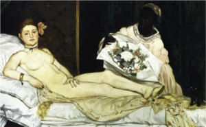
To some extent, we have to attribute the interpretation of the Luncheon to the reactions to the other painting causing an even greater scandal, the Olympia (1863). The latter painting does show a prostitute or, rather, a courtesan reclining on an impressive diwan who could afford a coloured woman as a maid presenting a quite expensive flower bouquet from a well-to-do customer.
There were literally hundreds of paintings with nude women in the Salon in 1863 when Luncheon was rejected, or in 1865 when Olympia was exhibited.
So what exactly caused the scandal?

Figure 1:  Two scandals starting Manet’s career – Luncheon on the Grass and Olympia 


The relationship between the two paintings is, indeed, very interesting. But in my view, the fascinating relations are not linked to the presumed allusion of both to the issue of modern life and prostitution in Paris of the time. I do not think that Luncheon on the Grass is about prostitution at all, although it is about modern urban life.
I will return to the theme of social scandal in a following post.

What I find interesting has more to do with the second theme, the question of composition of the Luncheon.
The two paintings are created at the same time, and yet they seem to be totally different in their approach to composition. This is easily explained, if we are content with pointing out that they cite very different Old Master paintings.
This causes a problem, however, if we propose – like in MyManet – that Manet developed in Luncheon a programmatic scheme for other paintings to follow.
How are the two paintings related on a structural level?
We have to return to this question when discussing Olympia, and after clarifying the scheme for Luncheon on the Grass.
So we ask:

Question 6: How can I paint a female nude following the formal scheme?

As Michael Fried – an expert on Manet – describes the painting:
It is “his sheerest, most intractable masterpiece” (1998, p. 57; emphasis added).
He notes that Manet’s “use of previous art was highly conscious, even programmatic, though it has not yet fully emerged what that program was” (p. 81). He goes on to argue that Manet aimed at a new synthesis of the French art tradition with Italian, Dutch and Spanish traditions. Manet’s way of achieving it, Fried sees in a certain kind of “theatricality” found in the realism of the French tradition, especially in the Le Nain brothers and Antoine Watteau.
Aspects he describes as “essentially theatrical – that the figures are grouped, that they either confront the beholder or in effect pose for him, that they participate only in the most formal or conventionalized of actions  – were experienced not just as compatible with realism but as intensely, even uniquely realistic in their own right. The crucial notion, here as elsewhere, was that of naiveté” (fn 111, p. 485; italics added). Thus, Manet found “a new paradigm of what a painting was” (fn 97, p. 482).
But what is the compositional aspect in that paradigm of grouped figures?

I learned immensely from Fried’s analysis about the sources and the meaning of elements in Manet’s painting. However, his way of composition is not explained by the selection of elements, especially, since it is generally agreed that Manet did not simply “borrow” entire compositions.

John Rewald (1961, p. 86; emphasis added) detects a “curious lack of imagination” leading Manet to “borrow” subjects from other artists. But Manet certainly demonstrates a lot of creativity in integrating these citations into an own composition.

This is not John Richardson’s view, he flatly states: “Manet’s sense of design was faulty”(1982, p. 9f; emphasis added). He initiates a discussion on “Manet’s compositional difficulties” referring to the Luncheon on the Grass as well as other paintings in the 1860ies.

Anne Coffin Hanson tries to defend Manet discussing critical reactions to Richardson’s evaluation. But in the end, we are left with few remarks on more formal principles of composition such as proportional systems, diagonals and triangles. “Of all the qualities of Manet’s art, his picture construction has been least understood”, is her resume (1977, p. 197ff; emphasis added).

For Sandblad (1954, p. 93f), Manet makes “efforts to transform the pastoral idyll which he had set up on the floor of his studio into a decorative and ordered picture on the surface of the canvas” … ” the three strictly contoured figures in the foreground appear like paper dolls pinned to the surface of the canvas”… “(Luncheon on the Grass) did not become the definitive work which Manet had presumably dreamt of” (emphasis added).
This – according to Sandblad – was achieved in Olympia.

Robert Herbert offers a brilliant description of the “social form” of picnics and the Parisians’ concept of leisure and landscape comparing it especially with Claude Monet’s version of the same theme two years later.
While pointing out Manet’s ironic way of “mocking history and its guardians, the academy”, Herbert also has his difficulties with the figures: “Not only do they appear as virtual cut-outs, arbitrarily transported from the studio, but their wooded clearing seems as artificial as a stage set. Among other things, our view back to the water on the left cannot be reconciled with our view through the center (the foliage over the nude’s head is too obvious a device to bridge the two perspectives successfully). … Manet’s painting, in fact, is built upon the juxtaposition, rather than the integration, of its separate parts.” It is not yet “a piece of contemporary leisure that embraces a more satisfactory narrative” (1988, p. 172f; emphasis added).

I find it amazing that one of the most famous paintings in European art history evokes such puzzled reactions from the art community!

The most convincing analysis I have found so far in the literature is the one by Michael Lüthy (2003).
His approach focuses directly on Manet’s use of gazes in the “internal” order of the painting and the “external” relationship to the viewer, and it places Luncheon on the Grass in the context of other paintings of Manet to discuss an emerging pattern.
MyManet is inspired by him, and I will return to his book for guidance in other cases, also discussing the differences of our approaches.

The emerging scheme is obviously only one perspective among many others, but it confronts the issue of Manet’s “compositional difficulties” directly. Interpretations of the composition are quick to demonstrate that Manet was inspired by at least two paintings. What is typically overlooked is the question:
Why these two – and not any of the countless other paintings in the Louvre museum?
Manet did not copy either one, he selected elements from both and combined them in a new way.
Why did he choose these elements and combined them the way he did?

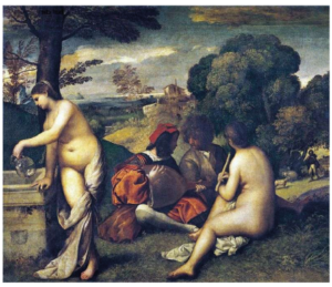
Let us take a look at the first painting Pastoral Concert (1508) by Titian, attributed to Giorgione at Manet’s time. The painting was (and still is) in the Louvre museum and Manet made a free copy of it earlier.

Figure 2: The Pastoral Concert by Titian (1508)

The painting delivered the basic idea of two nude women and two dressed men. They have interrupted their music, and the female to the right seems to wait patiently until the two men have settled some issue, while the second woman gets the drinks (sounds somewhat familiar?).
In the background, a shepherd is tending to some sheep, but no one is alarmed; there is no sexual activity interrupted here. In the good old days (over 3oo years ago) painting this scene was no scandal, and it hanging in the Louvre at Manet’s time was no scandal either.

So, Manet transposed the scene into modern urban life – only, now it was a scandal if people did that sort of leisure activity in the Bois de Boulogne, the park near Paris! And a metaphorical interpretation – like long ago – was not acceptable by the viewers (and not intended by Manet). After all, these people could quite readily be identified as contemporary, living individuals, at least by insiders of the art community.

Again, I am not worried about the scandal, but interested in two other aspects.
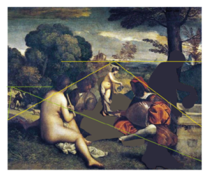
Therefore, I did a little transformation of the piece by mirroring it and moving the lady at the left edge into the background – see Figure 3.
First, this way it is obvious that Manet borrowed the theme and the basic composition from Titian. Mirroring images was something very common to him since he worked often with printing techniques.
Second, we see that Titian used a split horizon with a different perspective into the depth toward the shepherd, now on the left. We find the same split in Luncheon, and in both paintings the areas are separated by dark bushes and trees, as noted by Herbert (see above; although without mentioning the same element in Titian).
The relationship between the two paintings was generally recognized by contemporary critics.

Figure 3: Modifying Pastoral Concert to match Luncheon on the Grass


But there is an important difference which was not mentioned then, and not in later discussions.
In Pastoral Concert the three central figures are looking at each other – they are “absorbed” in their activity.
Why did Manet change that if the composition was so suitable?

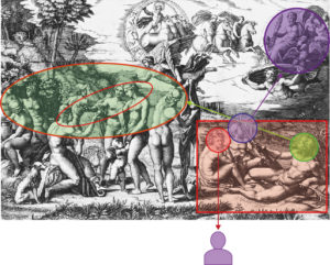
Noticed by the art critic Ernest Chesneau at the time, Manet had a second inspiration from where he took the arrangement of the central triad, an etching by Raimondi of Raphael’s Judgement of Paris (ca. 1475).
Here we see three river gods sitting in the right-hand corner in the same arrangement as the triad in Luncheon.
In Raphael’s composition, the triad and especially the outlooking woman has the function of introducing the viewer into the picture. This relation to the viewer is exactly what Manet is aiming at – only that he is not interested in leading the viewer into an allegory or “story” shown in the main part of the painting.
The viewer relation is the “story”!

Figure 4: Etching by Raimondi of Raphael’s Judgement of Paris – with markings of Manet’s scheme

The elimination of the rest of Raphael’s painting induces certain changes – marked in Figure 4 following our scheme.
The basic orientation of the figures with the female (First, red) turning toward the viewer and their gazes away from each other is maintained.
But the male to the right (Second) is leading into the whole painting or onlooking (green) toward the scene to the left – his right hand extended by a palm branch behind the group. In the  Luncheon, he is only looking at the other two (blue). His right hand is not needed to point to the scene beyond; in Luncheon, a somewhat indistinct pointing or arguing finger has to do. The oar in his left hand is substituted by a fashionable cane supporting a main diagonal in the painting.
The other male (Third, purple) is in the Luncheon not looking up and backward toward Jupiter arriving from heaven. In modern urban life in Paris, you might see the balloon of Manet’s friend Nadar drifting by in the sky, but this would occur more to the front where the light is coming through the foliage. (Remember, Manet was making lithographs of this balloon.)

For the interpretation of the Third in Manet’s triad we have previously identified the function of relating to some external “authority” or Big Other. This interpretation is readily supported in Raphael’s painting!
After all, Jupiter is the final authority arriving to confirm the judgement of Paris (the figure to the left in the inner circle) on the beauty of Venus (the female hugged by the little angel). I am sure, Manet appreciated the “theatricality” of the scene with a backfigure, the nude in the centre, wisping away the cloth hiding her beauty. But this kind of storytelling is exactly what he was trying to avoid.

Another intriguing element in Raphael’s painting is the figure of Hermes who is in the inner circle looking from the back onto the scene! So far, I found no reference to this element in the literature on Manet.
Quite clearly, Hermes is completing the inner scene to a group of four figures which again form a mirror image of Manet’s composition. Thus, Hermes is in the position of the “other”! Since Hermes is the messenger and mediator between humans and the divine, there hardly could be a better figure in Greek mythology to fill that position in Manet’s scheme.

Manet did not talk or write about the choices he made in the composition of Luncheon on the Grass.
We know that he made his decisions deliberately with knowledge about traditions in literature and art and with a witty irony directed both toward traditions and modern society. The choices for inclusion of elements and their arrangement in the Luncheon are no exception. What he deliberately modified into a composition of his own were the gazes of the figures establishing a relationship between an “internal” and an “external” order.

Manet was developing a programmatic scheme, a “new paradigm of what a painting was” characterized by a new realism and naiveté (Fried).

In the next post, I will pull all these elements together in a diagram of Manet’s scheme.

See you next week!

The Emergence of the Scheme (P7)

Manet’s scheme – the MyManet scheme – did not emerge in one creative step, but over several paintings experimenting with figures, their gazes, and their roles.
As we have seen, the scheme implies at least three figures and their gazes within the painting. Therefore, we look especially at his multi-figure paintings, and try to find elements of the emerging scheme:

Question 5:  How can Velazquez – figures within – and Courbet – figures outside – be combined in a social scheme?

According to Michael Fried, the years 1862-63 saw the breakthrough of Manet’s art (1996, p.1).
After copying The Little Cavaliers (1859) and before he created The Luncheon on the Grass (1863) and Olympia (1863), Manet painted four scenes with three or more figures (excluding graphical works and sketches):

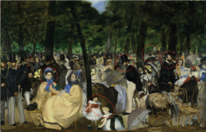
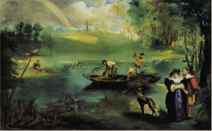
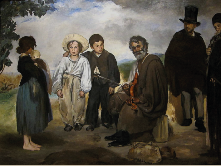
Music in the Tuileries (1862), Spanish Ballet (1862), The Old Musician (1862), and The Fishing (1863).
In Figure 1, the four paintings are shown together.

Figure 1: Four multi-figure paintings preceding the Luncheon on the Grass

Music in the Tuileries

Spanish Ballet

The Fishing

The Old Musician

What I find striking is that these painting are so different!
Would anybody (without some acquaintance with Manet) guess that they are even from the same artist?

As Fried demonstrates in detail, this is at least in part due to Manet’s attempt to integrate very different sources from past Old Masters.
In Spanish Ballet and The Old Musician, the reference to Valezquez and Spanish art is obvious.
In The Fishing, we find references to the French tradition (e.g. Watteau) but also to Rubens.
Music in the Tuileries seems to pick up The Little Cavaliers, and  – assuming (wrongly) that the original was from Velazquez and that the Master pictured himself at the far left  – Manet is putting himself in his place.
But citations go also across these lines e.g. with French masters also appearing in The Old Musician and Spanish influences in Music in the Tuileries.

Actually, Manet kept generations of art historians busy to find the references to past and present art and to identify persons in the painting.

While I find these discussions of sources and influences of different painting traditions very interesting in themselves, these interpretations emphasize the differences between the four paintings. Typically, Manet is described as experimenting with different styles and techniques, and often he is said to be still lacking certain skills.
What is somewhat missing – as far as I dived into the literature – are the common themes or issues guiding Manet’s exploration in these paintings. The theme of combining past and present in each painting is always acknowledged but the common themes cutting across these paintings are reduced to the development of different aspects of his painting style.
Music in the Tuileries receives in this perspective most recognition, since the painting appears to be most “modern” both in subject and in painting technique. The other three examples owe more to the past, it seems.

In Post 3, I pointed out one theme that unites Music in the Tuileries and The Fishing with Luncheon on the Grass, namely, the issue of scale. The paintings are different from Luncheon in their scale of the figures and the social and spatial relations between them, but they have in common an exploration of the effects of scale:
The Old Musician is, in this respect, comparable to the Luncheon: it shows the figures on the level of direct face-to-face interaction.
Music in the Tuileries and Spanish Ballet are like The Little Cavaliers in showing the figures lined up in a middle distance trying to keep contact with each other at least by proximity.
In The Fishing, this contact is broken or rather restricted to relations of body orientation and gestures. The grouping dissolves into a pattern of distributed small groups or individuals.

Manet does not like to paint large groups – like the traditional paintings of historical mass scenes of war or festivities. To connect larger groups in a composition, the painting needs a “story” uniting the figures – Manet avoids telling stories. The number of people produces problems, when you want each individual to play a specific role. It becomes even more of a problem when each person in the painting is assumed to have his or her own “story”. This is especially the case in a group portrait, where we expect that each individual has a distinct personality and a contact to the viewer – as in the typical portrait.

We can see the problem in the Spanish Ballet.
Manet invited the group into the studio to make a group portrait, and we can imagine how he found everybody looking at him. This was not the social situation, he wanted – we can feel the distance he created between the group and himself. As a result, he focused on two couples, dispersed the group, placed some dancers in a darker background, and tried to achieve unity in the composition by spatial rather than social relations – and he never tried to paint a situation like this again!
I do not think that Manet was incompetent to paint large groups or group portraits. He was familiar e.g. with the Dutch tradition of group portraits, and he found innovative solutions whenever he wanted them. But his interest in the direct relationship between the viewer and the action “on stage” is impossible or missing in those situations.
So, Spanish Ballet demonstrated for Manet that his concept of pictorial space – the puppet theatre – is not in alignment with a viewer facing a crowd or a larger group facing the viewer.
This, indirectly, supports the view of MyManet. (It also tends to contradict Fried’s concept of “facingness” of the whole picture as a central aspect of Manet’s art.)

At first glance, Music in the Tuileries is a counter example to the point just made – that Manet does not like crowds. But a closer look shows that Manet emphasizes a series of distinct figures, small groups, and even specific faces lined up from left to right. We see a series of individuals, and many of them have been identified as members of his social circle. The art historian Niels Sandblad (1954) is right, I think, when he draws a close connection with The Little Cavaliers. Most figures in the crowd are not more than an atmospheric background – except a few figures (highlighted by red circles in Figure 1) stand out.

Interestingly, the painting is structured by the trees into three sections.
Only in the left section, perhaps 4-5 figures look towards the viewer, most prominently one of the ladies (First).
She catches our attention and induces us to “read” the painting from left to right – just like in The Little Cavaliers.
The centre breaks this move – by a deceptive perspective deep into the park – but it is puzzling with its diffuseness of figures except for the strangely enhanced gentleman (Second) looking down at a sitting woman and for the “absorbed” children playing at the front edge of the painting (or “stage”).
To the right, again one gentleman (Third) stands out greeting somebody outside the painting lifting his top hat – taken directly from The Little Cavaliers.
Finally, a strangely enlarged gentleman (a reversed “other”) with a grey top hat is looking toward the back.

I have emphasized the references to the diagrams to highlight the “testing” of roles occurring in the painting.
As Sandblad sees it, Manet is distributing a series of “faces” that are “flat, unmodulated areas on the surface” replacing “reality with a kind of sign-language” (p. 63), an element showing an unusual “respect for the pictorial surface … most remarkable in the whole painting” (p.23). Sandblad detects here first traces of symbolism modifying Manet’s realism (distinct from current naturalism or emerging impressionism).
I would agree with him that Manet is presenting here a hidden constructed scheme arranging symbols of faces and gazes. And that this is not to deny that the painting is also the first “modern” painting of leisure activities of the urban bourgeoisie, as many art historians point out (like Herbert 1988).
But Music in the Tuileries can also be seen as testing elements of the scheme. However, the model built on The Little Cavaliers turns out to be an alternative second scheme for the middle range of the scale. We will encounter it again in other paintings (like Masked Ball at the Opera 1873).

Considering The Fishing in this perspective, it shows dispersed groups and individuals with a combination of social relations across spatial distances in a rather free composition. This arrangement should also be regarded as an alternative third scheme for the large distant range of the scale (like View of the World Fair 1867).
As I suggested in a previous post (P3), Manet has, obviously, not only one scheme for his compositions.
But MyManet tries to demonstrate the impact of a specific scheme – realized in Luncheon on the Grass – on other paintings beyond this special case. We will see this influence even in paintings following alternative compositional schemes.

So, let us take a closer look at the remaining fourth picture: The Old Musician.

As Fried tells us, this painting is a perfect starting point for analysing the way Manet is citing and borrowing from other paintings – an El Dorado for art historians. It is also a great example for the way Manet is combining freely – like in a collage – elements for his own purposes. He is not copying.

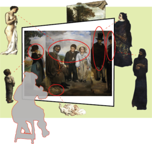
I have engaged in some own collage making. In Figure 2, I combined The Old Musician with the figures from Courbet’s painting representing the roles outside the painting. Although not exactly, since I mirrored the inner group of three figures, and added some red ellipses and a face diagram to enhance the critical elements.

Figure 2: Combining The Old Musician with Courbet’s roles outside the painting


The diagram fits to the emerging scheme almost perfectly. We see all five roles outside the painting and their corresponding “partners” within:

The triad – First, Second, and Third in the middle (with Second and Third switching positions).
The girl – inspired by the boy? – looking from the left like another “represented” viewer.
The “other” – looking from the back; quite tellingly, he is The Absynth Drinker from Manet’s own painting (1959), thus, Manet is citing himself as the “other”.
The “authority”– the philosopher or the representative of society and tradition is cut off by the right frame.
And we find a little still life marking the front stage.
The “absorbed” figure is eliminated in this case; we have kind of an “absorbed half-figure” represented by the cut-off philosopher.

The experts agree that
simplification”, “sincerity”, and a “new type of connection with the beholder”,
besides a “resistance to available modes of pictorial understanding” (Fried p.21-23), is characteristic for Manet.
So, Manet, looking at the painting as his own first viewer and critic, might have reached some conclusions:

For simplicity, the girl as a “represented” viewer is not really needed in a generic scheme realizing a new type of connection with the beholder. A painting surely should allow for additional figures, but they may vary with the subject.

In communicating the relationship with the “authority”, the Third has to be credible as connecting to an agent outside the picture space and not e.g. day dreaming. A boy, not even looking at the “philosopher”, may be not convincing and evoking other interpretations e.g. related to his youth or social class.

Placing the “authority” clearly outside the painting (like Velazquez) may be the better solution for the generic scheme. Although, depending on the subject, strong clues for the implication of “authority” may be required (like Velazquez representing the royal couple in the mirror of Las Meninas).

Citing the painter himself as the “other” is a nice ironic touch, but for a generic scheme it will not always work .
The “other” looking from the back should perhaps be less dominant.
Moreover, like in the lithograph with Polichinelle peeking out from the coulisse (Post 2), it might be better to imply the “other” rather than representing the figure in the painting e.g. by moving the background forward and making room for imagining a social space “behind the stage”.

So, in the perspective of a sincere, new scheme presenting the “painting of painting” – including roles inside and outside the painting – we should focus on the essential elements.

Now, Manet needs a subject that allows for the realization of the consolidated scheme, but also for his way of mediating between the past and the present while critically and ironically distancing himself from both.
The nude is clearly the “classical” subject which – transposed into the context of modern life – offers all the possibilities for confronting existing traditions in art and society.
The paradigm of the puppet theatre provides not only a vision for the composition, it clearly feeds into all ironic and critical intentions of the project.

So, the subject will be a Luncheon on the Grass with a female nude accompanied by the three additional figures required by the scheme!

See you next week!

Beyond the Viewer: Who is Looking? (P6)

In the previous post, we distinguished 5 positions inside the painting.
(see Figure 1 in Post 5)
Now, we consider the positions outside the painting:
Who is looking?

Or as the question in    Installation My Manet    has it:

Question 4: What kind of social roles are involved outside the painting?

For the answer, we turn to Gustave Courbet (1819 – 1877) :

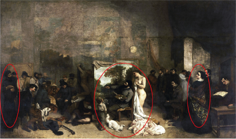
Figure 1:  Gustave Courbet  The Painter’s Studio – A Real Allegory (1855)
(with red ellipses added)

Unlike Vermeer, who depicted only himself and the model (see Post 1), Courbet shows himself in a crowded studio with all the members of society relevant for his realistic painting – with himself in the centre!

In the centre, the nude model looks over his shoulder – although he is painting not her, but a scene from his home province. Well, a nude is always helpful to get (male) attention, and the nude signals serious painting.
The little boy with the cat is allowed to take a closer look, and seems to admire the artist more than the painting.

To the left, we see members of society – both poor and rich (the sitting man with the dogs may be Napoleon III).

To the right, members of the art community are gathered: friends, writers, artists, art lovers, critics, and financiers (at the right edge, reading a book and not interested: Baudelaire, the realist writer and Manet’s friend).

Notably, only two people – besides the inner (red) circle around Courbet – are really interested in the painting (marked with red ellipses).
To the right, there is a woman looking over her shoulder from behind;
to the left, and at the very edge, we find an old Rabbi or philosopher observing the scene.
The others, presumably, play a role in the allegory of Courbet’s life, but they seem to be present just to support the Grand Ego of the painter.
Thus, if we count only the interested persons, we find 5 positions and social roles outside the painting:

The painter
The painter is clearly shown as independent, creative and skilled to transform ideas with paint into a visual object. There is a personal life depicted leading Courbet from his rural provincial region to the centre of French culture and society.
Painting is shown in a social context, but the context is not really involved in the process. The painter is the centre of the activity.
With Manet, the painter is present and active, but not represented.

The model
In Courbet’s painting, the model has a curiously passive role standing behind the painter, while he is painting his own provincial background.
As we will find, the model has a crucial and active role for Manet. In Luncheon on the Grass, the model has direct eye contact not only with the viewer, but also with Manet, the painter.
Manet preferred models interested in his art (family members, friends, supporters) and artists like his favourite model Victorine Meurent (who not only modelled but painted herself) or his friend and painter Berthe Morisot.
We will return to the relationship of Manet and his models.

The viewer
Courbet clearly takes pride in collecting a large group of viewers around him – he was a great painter, but also a great marketer of his art and engaged in public life. Paintings are created to be seen! And for Courbet, the painting can and should talk to the viewer, even presenting an allegory of a painter’s life.
For Manet, the communication of ideas through painting is a much more subtle thing. The viewer has a role in understanding and interpreting the ideas of a painting, but Manet is not telling the viewer a “story”.
In the reflection on the “painting of painting”, the painter is his own first viewer. Other viewers may be present on a visit to the studio or are an anticipated audience (if only in the museum), but they do not enter the painting.
Still, their viewpoint in front of the painting plays an important role in the composition, and their view, their anticipated reaction, and their role as customers influence the painting process.

The critic or the “other”
Members of the art community, critical evaluators including the artist’s friends, are vital because they provide the examples, role models, and feedback for the painter.
Courbet sought independence in his Realism from traditional Romantic schools early in his career – perhaps, this is why the group of artists and critics in the painting is somewhat distanced to the side. Still, he was well aware of the importance of the art community for his work.
Manet – besides attending for six years the art school of Thomas Couture – also was an integrated member of the art community, although in his own circle. Artists and critics were frequently visiting in his studio and he visited them in return.
While a painter is foremost his own critic, “others” taking a different perspective “from the back” were not only a virtual, but an actual presence in his painting practice. Charles Baudelaire, for instance, is said to have visited Manet almost daily. In later years, Stephane Mallarmé was another friend, art critic, and regular visitor.

The “Authority” or Big Other
Courbet does not include a reference to art traditions or a gaze outside the painting to any authority, he paints himself as the authority.
Manet valued highly the tradition and institution of art, and sought the recognition by the Academy of Fine Arts – eventually to present his art in the Louvre Museum. He initiated a “revolution” in art, but only because he sincerely pursued his own way of painting, not respecting established norms just because they were established. Unlike his Impressionist friends, he always tried to mediate between tradition and innovation.
He never founded an own school but experimented with different styles and built bridges between schools, past and present. The Great Masters – like Diego Velazquez, Antoine Watteau, Titian, and Frans Hals – gave him guidance. But he did not follow them.
Perhaps most telling of his independent orientation toward a more abstract ideal or “authority” of painting is the fact that he never really joined the impressionists, although he kept close contact with their community.
And he never styled himself as a genius transgressing the achievements of  his predecessors (like Courbet). But he created his personal style, and art historians to this day have problems with assigning him to any particular “-ism”.
Velasquez was his idol all through his career – that is why I chose to take the Master’s silhouette as an icon for the “authority” in the diagrams.
I also like the term “Big Other” for this external referent, because it eases the connections between the “other” – as a different perspective by others in the social context – and the “Big Other” – as an authoritative value reference in art.
Different Interpreters of Manet’s art invoke different “authorities” (e.g. philosophical, historical, psychoanalytical, political, or even ethical frames of reference) and propose their relevance for understanding his art.
At this point, we just introduce this distinction, and will discuss different interpretations when they become relevant for understanding Manet’s paintings.

Now we can combine the positions or roles in our scheme:                          (updating the  version of Figure 4 in Post 2)

Figure 2:  Positions and social roles inside and outside the “painting of painting”

The diagram shows again the painting with its “stage” between front space and back space. The triad takes a prominent role within the painting with the onlooking other (green) and the absorbed other (yellow) playing supportive roles. The gazes of the figures create a social space within and are reaching out to the agents outside the painting. They relate the represented social reality within the painting to an unrepresented social reality outside.

The diagram differs clearly from the scheme for Vermeer, because it distinguishes a plurality of positions beyond the painter, the model, and the unrepresented viewer.
It is also different from Courbet and Velazquez and their depiction of the “painting of painting”, since they represent the painter within the picture.
Courbet, moreover, does not include the First – the direct contact with the viewer – or the Third – the gaze to an authority, unlike Velazquez.
As we have seen in Music in the Tuileries and The Fishing (Post 3) , Manet does include in some cases himself in a painting, but not in a prominent role. He appears as part of the depicted theme: as member of the art community enjoying their time in the park, or: as member of the future family (since The Fishing has been interpreted as a promise and announcement of his marriage with Suzanne, the mother of his son Leon depicted on the other side of the river).

The diagram, obviously, anticipates the composition of Luncheon on the Grass. We just have to drop the absorbed figure from the scheme. This raises the question, whether the scheme is only an abstract model of this specific painting. The thesis of MyManet proposes more, namely,
that the diagram is a generic scheme for other paintings, too, and that

the Luncheon on the Grass should be read as a programmatic statement about the “painting of painting”.

To support this thesis, we will look at a painting that precedes the Luncheon, and which MyManet understands as a first attempt by Manet to combine insights from his study of Velazquez and Courbet (and other paintings) in a programmatic way.
The painting is The Old Musician (1862), created just a year before the Luncheon and considered by many art historians as basic for Manet’s art in the early 1860ies.

See you next week!

System of Faces and Gazes (P5)

Velazquez has demonstrated for us (in the previous post) that there is a range of different directions the gazes of persons will take – and how these gazes structure the social space within the painting and with “unrepresented” persons outside.
Time to have a more systematic look at these gazes and their meaning.
In some cases, the proper classification may be disputed, but this is not relevant for the following.
Since not all faces or gazes appeared in all three examples and some appeared more than once, we might ask:

Question 3: How many gazes or persons are needed as a minimum?

Or to be more specific:
If the “painting of painting” is the theme, how many and what kind of gazes are needed within the painting to communicate with a certain number and kind of persons assumed outside the painting?
The answer to this question will lead us into some rather theoretical territory – so, I hope for your patience, and hold on tight!
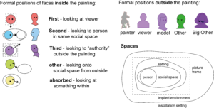
In Figure 1 we find an overview of the faces in the diagrams (see Post 4):

Figure 1:  Formal positions and faces  in Velazquez’ paintings

Actually, the overview presents not all the cases we might like to distinguish in MyManet:

The triad of persons, which are at the centre of Luncheon on the Grass (Figure 2), is not an obvious element in Velazquez’ examples. The triad comprises a gaze (red) to the viewer (the nude), a gaze (blue) to the members of the group (man to the right), and this strange gaze (purple) directed outside the painting (second man).
All three gazes appear in each example of Velazquez, but not in a specific arrangement and they are combined with other gazes.
In MyManet, I want to identify the members of the triad with specific names and formal positions:

The First
The First is making the essential contact with the viewer outside the painting.
As in The Drinkers, this may be more than one person. But then we may conclude that this is suggested by the theme – the joyful group – rather than needed in a more general scheme.
In The Little Cavaliers, we find also two Firsts (red) in the centre groups engaging the viewer. A third person to the right, looking towards the viewer, may be gazing toward the viewer accidentally, not really trying to engage the viewer.
In other paintings, we will find more of these “accidental Firsts”, especially, in paintings with larger groups. In some cases, the person looking toward the viewer will be so “distant” in the middle- or background that the engaging effect does not arise.
A special case is the viewer entering – as it were – the painting and appearing as a backfigure in the foreground (see Post 3). We might say that engaging the viewer is so effective that the viewer steps into the scene and takes the role of the First. An additional First is not needed to achieve the engagement.
In terms of Fried’s “facingness”, the picture as a whole has attracted full attention.
In a diagram we could depict the backfigure as a First (red) from the back (without eyes or face).
For reasons discussed below, I prefer to show the viewer as backfigure within the painting to keep the role of the First distinct. Manet does not use backfigures in his paintings. (With rare exceptions e.g. in the Masked Ball at the Opera with a Polichinelle from the back appearing on the left side.)

The Second
The Second has the role of creating the social space by looking at the other members of the group.
There may be more than one group, like in The Little Cavaliers, so we expect one of them in each group and social space. In some cases, the Second may be seen from the back (no eyes or face), but then we interpret the position to be “accidentally” turned away from the viewer. The position is not specifically calling for the identification of the viewer to take this position and look at the scene through the eyes of the Second.

The Third
The Third is acknowledging the existence of some external “authority” with his or her gaze.
The Third has a role that is crucial for Manet’s scheme – and it is, I think, one of the reasons why Manet is admiring Velazquez.
The best example, among the three paintings from Velazquez above, is Las Meninas with the Master himself (and some of the other figures) looking at the royal couple entering the scene. As indicated previously, all interpreters agree that the painting is celebrating the royal institution, not just the royal couple. And we should add that the dominant figure of the painter himself also aims to emphasize the importance of painting as a cultural institution, not only Velazquez’ personal success as royal painter.
This reference to an external “authority”, we see also in The Drinkers in the gaze of Bacchus; it is not so obvious in The Little Cavaliers, where the gazes (purple) out of the painting may be “accidental” to persons which just happen to be outside the picture frame.

The triad – First, Second and Third – is an essential element of MyManet, i.e. my view of the hidden meaning in Manet’s compositions.
It is not the only one, as we see shortly. But I like to remind you of the etching of the puppet theatre – shown already in Post 2 – where the triad is prominently on stage. (There is a fourth figure, perhaps Polichinelle subdued by the police officer? And there is the cat, which we meet again later!)
There is a painting by Velazquez focusing on just the triad (and a little monkey!) which is shown next to the Luncheon on the Grass in Figure 2.

Figure 2:  The triad in Manet’s Luncheon on the Grass and in Velazquez’ Three Musicians  (1618)

We return to this triad when we discuss the Luncheon in more detail.
Here, I want to point out that the triad can be understood in social theory as a basic social unit:
The first-person represents the subjective perspective of the focused individual, the second-person is the partner in a dialog acknowledging the mutual presence and communicating back to the first-person (and perhaps to others), and the third-person is a participant and/or observer depending on the nature of the interaction.
The sociologist Georg Simmel – mentioned before – was the first to analyse systematically the formal position of the “Third” and its different roles (e.g. as mediating referee or as dividing and dominating the others). He demonstrates that it is the triad which essentially constitutes the basic social unit, because it is the triadic relation in which we experience that a social interaction – like a dialogue – can happen without us as first-person!
There is an objective social reality in front of us which does not depend on our subjective view or any specific individual or viewer. Children learn this around the age of three years (Tomasello 2019).

In MyManet, we assume that Manet had at least an intuitive understanding of this social phenomenon.

That is why he chose three persons in the centre moving the fourth to the back. Moreover, Manet saw that this triad had to situate the activity of painting in a social context:

The First engages the viewer/painter, the Second establishes the social reality of the group in front of us, the Third acknowledges the wider institutional context, the society, or the “world” around the painting.

And Manet reflects in his painting on this reality in a distinctly modern way. He keeps a reflective distance putting this reality “on stage” where he can manipulate it as the painter-puppeteer.
We can understand now why Manet avoids the backfigure. Letting the viewer enter the “stage” as a backfigure would destroy this reflective distance and make it difficult to control the level and the kind of engagement between the First and the viewer.
The social and philosophical analysis of this social reality “on stage” is available only a generation after Manet.
But he experienced already the impact of modernity on his own life and his relations to others, and his literary friends (Baudelaire, Zola, Mallarmé) described it in their novels.

The “Other”
Another crucial element is the figure of the “other” (green) representing an outsider view.
The “other” is placed in parenthesis because it is a rather complex figure with many meanings in the literature, and often put into parenthesis in other texts.
Let us try to clarify its roles and meanings:

On a first level,
the “other” plays just a role within the painting. While the Second (blue) creates the social space by looking at other participants from within, the “other” confirms their social space from outside.
All three paintings by Velazquez show these figures. Especially in The Drinkers, we see the central group surrounded by onlookers. In The Little Cavaliers, the “other” is connecting the frontstage with the groups in the middle.
We could treat the “other” figure as a potential Second – like the figure in the back to the right in The Drinkers, who is communicating with the figure within the group and might be joining as the activity evolves.
Similarly, we could speak of the Second as being the “other” for the First and Third. Just consider how Manet – in Luncheon on the Grass – moves the Second to the right side of the painting looking onto the other two!
In a more general usage, the partners of a first-person in social interaction are often referred to as the “others”, no matter how close or distant the relationship.
In MyManet, I prefer to make a clear distinction between the members of a triad (or ingroup forming a social space) and outsiders.
In the case of The Drinkers, the onlooker to the right – presumably a beggar trying to get some coins or a drink – might even be a total stranger to the group. Again, Simmel has taught us to understand the special role of a “stranger”, especially in the context of modern urban life.
On this level, the “other” is characterized by a cultural role:
the individualism of modern urban life makes us partially “strangers” to each other. We must come back to this meaning of the “other”, when discussing Manet as a “painter of modern life”.

On another level,
the “other” is looking from outside of the picture frame, as it were. Discussing Caspar David Friedrich’s Romantic painting, we saw that the viewer might – in a way – enter the painting from the front to the point that the backfigure appears within the painting.
Similarly, a person with a different perspective – say, a critic or the “alter ego” of the painter – may enter the painting from the back and appear in the role of an onlooker.
The “classical case”, as I pointed out, is the person in the background of  Velazquez’ Las Meninas!

On yet another level,
the concept of “other” has a background in social philosophy (Sartre, Levinas) or psychoanalysis (Lacan). In this case, we have to consider a “deep structure” of social reality – either in society or in the personality – which confronts the self as the “other” – as a stranger to itself – with effects of alienation.
Some art historians apply this level in their interpretation, but they reach beyond the realism guiding Manet in his paradigm of a puppet theatre. (We will see a “depth” in Manet’s realism when we discuss the role of the “uncanny” in a later post.) The concept of “other” assumed in MyManet looks at painting as a social activity, where the participants and “others” are taking roles either within or around the painting as an installation in an imagined setting. We will say more on “deep structures” discussing other views on Manet.

Again, we should distinguish the role of “accidental other” from the “other” in a special compositional role related to the outside.
In The Little Cavaliers and in The Drinkers, the onlookers (green) support social spaces and the wider setting within the painting. The role and the number of onlookers is determined by the theme of the painting; they help to create unity in the composition.
In Las Meninas, however, the “other” in the background clearly communicates also with the outside of the painting. As I suggested in the previous post, the figure in the door in the background is about to “leave the painting through the coulisse”. He is in a double role: playing a role in the scene and representing an alternative view or perspective on the entire scene, including the space in front of the painting or the audience in terms of the puppet theatre.

A special case, again, is the “unrepresented other”. As we will see later, in some of Manet’s paintings the “other” is not depicted within the painting – as in Luncheon on the Grass – but rather implied and deliberately hidden “behind the coulisse”. The “classical” case is certainly Olympia, a painting he is already working on at the same time.

The Absorbed
Finally, we find figures (yellow) in the paintings who focus on something other than a person within the painting or whose direction of gaze is undetermined. Following Fried, we could say that all persons not directly engaging with the viewer are “absorbed” within the painting. Absorption would be the normal case (with the exception of portraits, where the sitter is typically looking at the viewer/painter). In MyManet, we distinguish more roles within the painting, because Manet uses their gazes to engage with different roles inside and outside.

Again, it is meaningful to distinguish between absorbed persons and “accidentally” absorbed persons.
In some cases, rather isolated persons are part of the theme; in other cases, it might simply be difficult to determine who a person is attending to. But in The Drinkers, the absorbed guy (yellow) in the centre plays an essential role.
In Figure 3, we see two persons absorbed in a book or in their own thoughts. Especially in religious themes, say, a praying monk, it might be more adequate to treat this absorbed figure as a Third, since the figure is obviously “looking beyond the painting”, perhaps with closed eyes as in Figure 4.

Figure 3:    On the Beach – Suzanne and Eugene Manet at Berck (1873)

Figure 4:   Monk at Prayer (1865)

As indicated in Figure 1 above, the persons in the painting will take their places either in a social space defined by their gazes and gestures or in a wider setting. The picture frame or the “stage” will delimit what part of the implied environment is actually visible.
Beyond this visible environment, we have to imagine the setting or installation of the painting with actors engaged in the experience of the work of art.
In MyManet, we assume that the borders between the setting, the stage or frame, the environment, and the installation of the painting can be quite fluid – just like in the reality of a puppet theatre performance.

So far, we have identified 5 positions within the painting,
although the absorbed persons seem to depend on the specific theme and will be only “additional” elements in a more general scheme.
The next step is to take a closer look at the formal positions populating the environment of the painting.

So, meet you next week!

Faces in Velasquez and Manet (P4)

In this post, we take a closer look at gazes and faces in Velasquez’ painting.
But first, I like to make a comment:
In the previous posts, I have managed to take a critical position regarding at least four prominent experts on Manet – Fried, Locke, Wollheim, and Greenberg.
That sounds overly ambitious, and I like to clarify my aims again.
I am no expert. MyManet can be understood in different ways:

  • MyManet is my personal view which sometimes does not correspond to views of others (experts or not).
    I keep learning by reading and re-reading the contribution by others, including those cited above.
    I will change my views as we go along. MyManet is just reflecting the state of my journey.
    It is fun, but it is still an open adventure.
  • MyManet does propose a way of “reading” Manet – the puppet theatre model – which may turn out to be more than a personal exploration. But this is up to discussion – with Your Manet.
  • MyManet is an inspiration for my own projects of painting. Whether it is productive, I have to explore by painting – there is no other way.
    I will document this in My Gallery.

So, I will report my sources as we travel along, and sometimes I will be inspired and sometimes I will disagree.
But I will always be very selective, not trying to do justice to the rich content of my sources.

Now, let us take the next step in our journey.
I have to explain more about gazes and social space, and we will first have a closer look at the figures and space inside the painting.

Manet was fascinated by the paintings of Diego Velazquez (1599-1660).
(A rich source on Velazquez and Manet is Tinterow & Lacambre 2003).
The Spaniard was, in Manet’s view, the greatest painter, and he copied his works and borrowed themes for his own paintings.
So, we have a look at three of Velazquez’ paintings.
We focus on the gazes of figures within the painting, and I suggest reducing them to diagrams with their faces.
(The idea of the diagrams I owe to Todd Oakley 2009)

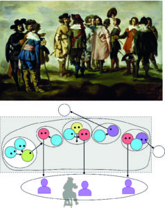
The case of Manet’s copy (1859) of Velazquez Conversing Gentlemen is shown in Figure 1:

Figure 1:  The Little Cavaliers – Manet’s copy (1859)
of Velazquez’ Conversing Gentlemen

What must have intrigued Manet, is the variety of gazes. The gentlemen look outward to the viewer or viewers (red) or at each other (blue) forming little subgroups. There is a group in the foreground to the left and one person (green) is looking over to the group in the middle ground. At least two gentlemen (purple) appear to be looking outside the painting to “unrepresented” persons (white), but not to the viewer. We might see them also as looking onto persons accidentally out of the painting’s frame (in which case, they should be coloured green; see below). One person in the middle (yellow) appears to be rather unfocused (or “absorbed”).
We should also note that there is no background, and the scene might as well be on a stage. The scene is “theatrical”, to be sure, and rather distant from viewer and painter. But the group to the left does not play the role of a backfigure asking the viewer to identify and drawing the viewer in. Rather, the picture space is divided into social spaces, the space to the right being closer and kind of marking the “frontstage”.

So, we take another example “zooming in” to a more optimal scale of communication.

Figure 2:    The Drinkers  or  The Triumph of Bacchus (Velazquez 1629)

The Drinkers (or The Triumph of Bacchus) are obviously having a good time and are intensively communicating with each other (blue) and with the viewer/painter (red). (Manet must have liked the painting, since he reproduced it within his portrait of Emile Zola.)
Again, we have a figure in the foreground (green) looking onto the group. In this case, there are also two figures (green) looking from the side or even from the back (green) onto the central group. On of the group (green) on the right is exchanging the gaze (green) with the figure in the back. In the centre, we find one person clearly “absorbed” in the ceremony (if not drunk).

A special case is the figure in the centre (purple) looking outward to the front, but not to the viewer/painter. He is a somewhat mystical figure (Bacchus) and his gaze is intensively connecting to someone important outside.
He clearly is not looking accidentally out of the frame. The figure outside is not an “unrepresented” viewer in the usual sense, since we feel that the figure is outside in a more fundamental way. The figure, it seems, would not be appearing within the painting, if only the viewer would retreat a few steps (“zooming out”).
For lack of a clear identification of this external agent – at this point – I have assigned to it an icon for the Master Velazquez himself, placing Manet, as his greatest fan, in the position of the painter.

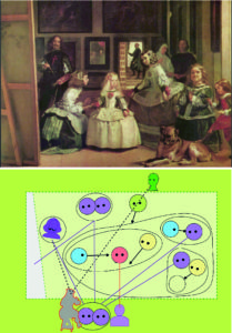
Finally, there is no way to discuss Velazquez and Manet without having a look at Las Meninas – here only a detail with the group of people (there is a vast space toward the ceiling in the upper part showing how Velasquez puts the scene on a “royal stage”). Now, this painting is perhaps the most complex depiction of the process of painting and the role of gazes in the history of art, according to most experts. So, we do not want to be too ambitious, we reduce the masterpiece to our little diagram (we will return to it, no doubt, since it is central for the interpretation of Manet’s work).

Figure 3:    Las Meninas       (detail) (Velazquez 1656)

Let us focus on a few interesting elements. A first impression for most viewers is probably that the girl in the centre (red) – Infanta Margerita, the royal daughter – is looking at them, the viewer. The maid (blue) is looking at her, enforcing the viewers tendency to look at the girl.
But then it gets complicated.
Looking to the left, the viewer sees the Master Velazquez himself towering over the scene, and the viewer starts wondering if the Master is looking at the viewer – or rather at the “unrepresented” person entering the scene and obviously making everybody pause in their activities. The viewer, then, may discover (although everybody looking at the painting in the Prado in Madrid already knows) that the royal couple is entering the scene as shown in the mirror on the opposite wall.

In our diagram, this event creates a lot of gazes directed outward to the royalties or somewhat unfocused.
Actually, the royalties appear to be the only persons to gaze (through the mirror) onto the painting – the viewer is left to guess what is on the painting (as are generations of art historians). The royal couple may be as well the model being painted, since the daughter is, at the moment, not posing for Velazquez. The Master may – moreover- winking at his colleagues, painters looking at his (activity of) painting…

For our purposes, we don’t even aspire to solve all the mysteries and games Velazquez has been hiding in the painting. We just observe that the painting is highly “theatrical” engaging the viewer, creating a social space reaching outside the painting, and, in fact, creating a rather crowded situation in front of the painting.
However, by placing himself into the picture, he is not supporting the imagery of a “stage” in front of an audience. We find us all in that large hall without a specific figure – represented or unrepresented – to identify with.
What is not so obvious, perhaps, are the subtle ways that Velazquez not only draws the viewer into the scene, but also induces effects of distancing. Part of these effects is due to the diverting gazes of some of the figures, and to the interruption of their interaction putting them “on hold”.
We have seen this effect already in Luncheon on the Grass.
Part of it may be, because we as viewers feel somewhat uneasy being crowded there next to the royalties.

The interpretations are endless.
Of special interest for us – for MyManet – is the figure in the back looking from the back onto the scene.
From the point of view of the puppet theatre, he is about to leave the “stage through the coulisse”, and, therefore, he is the paradigm case for the “Other” as represented within the painting. The figure is having his own rather independent view on the scene from “behind” – much like the second woman in Luncheon on the Grass!
Again, as in the case of Bacchus in The Drinkers, we feel that there is more to the figure than looking onto the scene (or toward an external agent as in The Drinkers). The painter Velazquez in front of the painting seems to communicate with himself within the painting and with an external “Other” (or alter ego) ”behind” the painting.
Manet must have been fascinated by the games the Master is playing!
Manet saw the original – rather than prints – only after he painted his Luncheon on the Grass on his trip to Madrid in 1865, but he must have felt confirmed in his own approach to the “painting of painting”.

The study of gazes in Velazquez’ paintings has furnished us with a range of different figures in diagrams, not all of them appeared in all three examples and some appeared more than once.
The next step has to be to characterize the figures and their function in more detail.
Then, we will be able to ask the obvious next question, namely, which figures or how many are necessary in a “painting of painting”?

See you next week!

On “Facingness” and Social Scale in Manet (P3)

In the previous blog, we introduced the puppet theatre as Manet’s model for visualizing the performance of painting. The model included not only the puppet actors on stage – figures within the painting – but also other persons engaged in the performance – the painter, the model, the viewer, and perhaps other persons participating in the event like a friend or critic.

As the puppeteer, Manet has to manage the communication between all those people – actual and virtual.
Thus, we take up the next question in Installation My Manet:

Question 2: How can I show views communicating into and out of the painting?

Manet tries to achieve this communication with the means of painting, more specifically,
by a composition which puts the scene of the  painting “on stage” and
by relating persons by their gazes, gestures and postures.

Let us recall two crucial features of the puppet theatre model:

First, the puppet theatre is more like installation and performance art.
It is not a flat canvas, and – in my view – Manet is not primarily aiming at “flattening” the picture space which is considered to be a feature of modern painting.
Rather, the space has to fit the stage and that determines the activities.

Figure 1 shows again the stage limited by a front plane to the audience and the back plane of the coulisse.
The puppets have to move within this space to be visible.

Figure 1   The structure of social space “on stage” in Manet

Now, this view creates a conflict with interpretations of Manet’s “revolution” by prominent art historians like Clemence Greenberg. In his view, flattening the picture space is a crucial first step by Manet toward modern art. Additionally, elements of other art disciplines – performance, theatre, music, opera, or 3-dimensional sculptures – are eliminated in the development toward modern art, in his view, now representing art as a discipline of its own.
Thus, the model of a puppet theatre is certainly not helpful in placing Manet in this progression toward modernity.

Fortunately, another prominent art historian and expert on Manet’s art, Michael Fried, has already intervened and claimed that it is “facingness” what Manet is creating – “flatness” only being a side effect. “Facingness” refers to Manet’s way of addressing and engaging the viewer, especially by the gaze of figures in the painting looking at the viewer.
In Figure 1, we can imagine the figure outlooking to front moving toward the frontstage facing the viewer. And, in Luncheon on the Grass we already noted how the second woman inlooking from back is pressing forward narrowing the space. For Fried, the impression of flatness arises with such effects capturing the attention of the viewer, not only through the gaze of the central figure. Actually, the painting as a whole is turned into a “face”.

Fried uses as a central concept the “theatricality” in Manet’s paintings (and in other painters). The opposite of “theatricality” is “absorption”, i.e. the creation of a certain autonomy of the painting by eliminating all (or most) effects that would imply the viewer or the painter. A typical aspect of absorption is that figures are not looking out, but are absorbed by some activity or attraction within the picture space. In Figure 1, we see such “absorbed” figures to the left.

“Theatricality” is different from the effect that Richard Wollheim was demonstrating for Caspar David Friedrich and applying in Manet (see previous Post 2). In Figure 1, we see the “unrepresented” viewer (purple) in a “Romantic” picture approaching the painting, then virtually entering the painting as a backfigure in some cases (like Caspar David Friedrich), and perhaps moving way into the picture looking out from the back to the horizon. There is no “stage”, the viewer is sort of carrying the perceptual space with him or her into the painting. Not surprisingly, since Wollheim applies the model of perceptual psychology!

Greenberg and Fried take, in a sense,  the opposite view in Figure 1 . They look from the painting toward the viewer. Modern art – and here Greenberg and Fried agree – does not (or should not) step forward on a stage; it asserts the painting as an “autonomous” object of art.
In the metaphor of the puppet theatre, we might say that Impressionism made a first move by painting directly on the front plane showing how the light played colourfully on the surface. Then, with Cezanne and further with Cubism and Fauvism,  modern art retreated to the back and painted objects of colour and form on the coulisse. With abstract modern art, everything “on stage” which appeared to be representing a “content” is thrown into the audience, as it were. Now the viewer had to interpret the art object with whatever he/she could find and would fit completing the art experience.

Contemporary art – to complete my reckless rush through art history – insists that there is no essential link between the quality of art and its abstractness. There never was. Only, we still are left with the question about the criteria of art and quality in art. Especially, since installation art, performance art, and New Media have completely diffused the boundaries.
Manet did not see this coming. In my view, the puppet theatre was an intriguing model for him.
And puppetry and material performance re-emerge as instructive models in the discussion on contemporary art today
(see Sources: Posner/Orenstein/Bell 2014).

Again, a conflict of MyManet with an expert arises, because for Fried “theatricality” is a feature of painting which is rather problematic from the perspective of modern art. It is not an asset of Manet’s art, but an aspect of his shortcomings as an unambiguously modern painter.
In my view, the theatricality in Manet is an essential element of those paintings considered to be his masterpieces.
Let us see if I can make a convincing argument for MyManet.

Second, the puppet theatre model introduces the social space outside and around the painting as an essential feature. This feature of the model depends on the theatricality of the painting. This means that I have to make a convincing case for the social space of painting created by the persons inside and outside the painting to defend theatricality.

There is an obvious problem with this venture:
The social space will depend on the communication of persons whether virtual outside or presented inside the painting.
That would limit the model to figurative paintings which engage the viewer. Fortunately, Manet is famous exactly for this kind of paintings.
But not all of his paintings seem to fit the model.

One way to cope with this issue is to state the obvious, namely, that a great painter like Manet does not employ just one model or scheme. In fact, Manet is famous for experimenting with different themes, styles and techniques, borrowing from Old Masters, and playing with the styles of his contemporary painters, especially the impressionists. So, I could limit the model to selected paintings – if there would be a clear criterium for the selection.
More promising is the strategy to demonstrate that the model fits a central, “programmatic” painting of Manet’s work – Luncheon on the Grass – and, then, follow the influence of the model onto other important works, even it will not fit totally in each case.
Still, to get started, we need a convincing argument for our model in this programmatic case: Luncheon on the Grass.

Important for the model is the fact that communication in social space happens typically on a certain scale.
In Figure 2, we see a selection of Manet’s painting.

Figure 2 :  Paintings of Manet with increasing scale

The still life of a lemon does not show much of a “face”, although it has been argued that Manet was able to render a “face” even to a little Bouquet of Violets (Barbara Wittmann 2004). We will use it in our model as the icon for a variety of still lives with which Manet characteristically marks the foreground. The lemon re-appears in a number of paintings (e.g. The Breakfast, Portrait of Zacharie Astruc, Young Lady with a Parrot, and Portrait of Theodore Duret).

In a portrait, we see only a face or at most the whole figure without interaction with others. We will return to them in a later blog. Note here that Victorine is coming so close to the viewer that she seems to flatten her nose on the front plane. Similarly, Manet in his self-portrait appears to touch the mirror plane with his painting hand. Manet makes us aware of the front plane.

Small groupings – like Luncheon on the Grass – are obviously ideal for a place “on stage”.
Larger groups or crowds pose a problem, because we might not be able to follow the gazes and to interpret the postures anymore.
In Music in the Tuileries Manet appears to be testing this issue. To the left, the figures mostly are outlooking to the front; in the centre, the persons including the children are “absorbed”; to the right we find a dominant figure looking out to the right, and (rather remarkably, but to my knowledge never mentioned) an obviously oversized gentleman with a grey top hat  looking outward from the back – a rare backfigure in Manet! It is reminding us of the oversized woman looking inward from the back in Luncheon on the Grass with the effect of closing the stage with a back plane (previous post).

In a landscape, persons typically are too small to engage the viewer and often too many for all to engage with each other. In The Fishing, we see how Manet is spreading smaller scenes across the canvas (or a coulisse). The model of a puppet theatre is not really working on this scale.
Although, Manet is playing with it and us:

The thematic focus of the painting is not really the “absorbed” crew in the boat, but rather on frontstage (!) in the lower right corner. Here, we would expect the moderator of the play: Manet himself with his soon-to-be wife and the dog forming a closely engaged group. Manet is pointing the dog with his hand to the little boy fishing on the left side. This nice compositional trick of linking across to the left scene with a gaze does not really work, because Manet is looking at the dog and the dog does not follow the pointing finger!  Dogs cannot do that, and Manet painted quite a few dogs, so I am sure he was aware of that.
Or does it work?
Because, humans do follow the gaze or pointing gestures of others with their gaze. The tendency is so intensive and inborne (more on that later) that art historian Nancy Locke is seeing that “the dog looks intently across the water, apparently at Leon”, the fishing son on the left. The dog does not, she does!
Manet is playing games again.

Focusing on the gazes of figures, rather than the deep psychology of “Manet and the Family Romance” (book title; Locke 2001, p.72), we might ask what the sitting figure in the boat is looking at. He seems to be looking to the upper right corner where two persons – perhaps undressing women? – are sitting between trees at the river resembling the scene of Luncheon on the Grass, only that the gentlemen have politely stepped behind the bushes. We know that both paintings are based on sketches of the family’s estate outside Paris.
Again, a gaze is structuring the composition. But Manet seems to be aware that he is combining scenes in a collage which do not fit on his preferred “stage”.

Manet is not a painter of landscapes; he is interested in social relations, even when he ventures into depicting larger environments like at the sea side. The engagement of an “unrepresented” viewer in a large “romantic” scene creating a mysterious human touch is possible, as we have seen with Caspar David Friedrich. But this is not Manet’s thing. Another option is the “facingness” of the painting as a whole (with or without a direct gaze) capturing the attention of the viewer, as Fried shows. But in as much as Manet follows the model of the puppet theatre, he needs just the right scale, not necessarily of the canvas, but of distinct actors showing their faces.
Interestingly, Fried does not – to my knowledge – address this issue, because his model (and Greenberg’s) assumes one viewer in front of the painting as a whole. Whether individual figures are able – depending on the scale – to effectively communicate inside and outside the painting, is not their concern. But it is for the performance in a puppet theatre! And it is if the painting is (part of) an installation!

We will return to the problem of “facingness” and scale, when we consider other paintings of Manet.
But next, we have to take a closer look at the way Manet is structuring the gazes and gestures within his paintings, as it emerged in the two paintings above – Tuileries and Fishing – preceding and developing the model for Luncheon on the Grass.
To do that, we study three paintings of Diego Velasquez, the Master himself – in Manet’s view!

See you next week!

Manet and the Puppet Theatre (P2)

The model – or at least a source of inspiration – for the way Manet composes his paintings is the puppet theatre or marionette theatre.

That was the thesis presented last week. Today, we take a closer look at the implications of that view.

Most commentators of Manet’s work use at some point the image of a theatre to describe his way of “staging” the scene in the painting. But besides providing a metaphor for the direct relationship which Manet’s tries to establish between the viewer and the painting, the model of the stage is not further employed to characterize his compositional strategies.
MyManet proposes exactly that and – even more specifically – invites you to look at Manet’s paintings through the eyes of children watching a puppet theatre!

Let us consider some of the characteristics of a puppet theatre:

First, the space on stage of a puppet theatre is limited, especially to the front and back. The actors can move to the left and right, even up and down, creating the impression that the world continues beyond the stage on each side. But the actors are restricted in reaching out to the space frontstage where the audience is sitting and in retreating toward the back through the coulisse. The audience is well aware that the space backstage is occupied by the operator moving the puppets, even if they are immersed in the play. And Manet has made a suggestive little etching showing himself in disguise of a puppet peeking through the curtains from the back with some of his favourite requisites littered on the stage. (Note the balloon of My Manet  flying by in the picture within the picture!)

Figure 1    Etching, 1861

Figure 2     Luncheon on the Grass, 1863

Looking at Luncheon in the Grass in that perspective, we sense that the three central figures are sitting on a kind of stage (in the studio), and we can almost see the background as a painted coulisse fencing off the backstage. The figures are somewhat crowded together. The man to the right is leaning out to the right, since he has no other direction to move.
Especially telling is the flat green background of the hand in the centre. In fact, this colour sets the tone for the entire painting (and for My Manet).

Manet is playing games with us, though.
He suggests a limited stage space, but he does not employ the obvious strategy to paint a frame, say, with curtains like Vermeer (see previous blog). The tree appears to be on the edge toward frontstage, and puppets could clearly leave the stage to the right. The situation remains “open” to the sides, not boxed in. Then, Manet moves the second woman “painted on the coulisse” forward, she is obviously too large, and, thus, is closing off the background. We cannot readily look past her into a background, she pushes forward and pushes the viewer backward.

But on the left side of the painting, Manet shows a realistic view into the far depth creating an inconsistency for our perception – we have to look back and forth – which further enhances the impression that all is just put on stage.
In support of this perception, Manet emphasizes the front of the stage – to the right by the tree, to the left by a wonderful still life, both not really connected to the central figures. Rather, they reach out frontstage to the viewer.
Violating perspective and the “proper” scale of objects – like the woman in the back – is a charming feature of puppet theatre as Manet’s friend Duranty pointed out – which may well have intrigued Manet (as noted by art historian Michael Fried 1998, p.474).

Thus, the pictorial space is full of “tricks”, but basically, we have a rather narrow space for the “action” and a frontstage and a backstage supporting, but also delimiting the pictorial space.
This feature, we will find again and again in Manet’s paintings, up to the “finale” in his famous “A Bar at the Folies-Bergére” twenty years later.
We return to that.

Now, I like to point out another feature of this “stage”.

We have three actors on this stage, or four, if we count the “virtual” person painted on the coulisse.
From a social point of view that is remarkable, since three is the minimal crew for any decent drama on stage.
One person can hold a captivating monologue, two can have a love affair, but the dynamics depend on the third person introducing alternatives and shifting alliances.
This is a formal aspect characterizing the potential for action.
Typical for Manet, there is no evident on-going action, the protagonists are somehow arrested in their postures for the moment.
They look quite vital and ready to resume whatever they have been doing. But for the moment they pause.

This impression has puzzled many interpreters of Manet, but – in my view – nobody has proposed a convincing interpretation.
Typically, art historians relate the fact that these persons do not communicate or interact in any meaningful way to the situation of modern life isolating or even alienating the individuals. A possible “modern” interpretation, but this does not contribute to any understanding of the composition in pictorial space.
We do have the feeling that something important is going on – the painting is obviously fascinating people for some 160 years – but what are they doing?
It is as if the actors are saying “Look, this is a play with three people. We are distinct persons playing specific roles”.
Unfortunately, we are not told the story line, only their positions. The way they look is obviously important for the whole composition, but their gazes do not create a closed space between them. Their common activity is interrupted, the space of their relationships is “opened”, and the attention of at least two of them is distracted.
The man to the right is kind of sustaining the relations within the picture space with his outstretched arm, but he is interrupting his communication.
On stage, it would be clear what is going on: the actors are attending to the audience and have to interrupt the “story”, they pause to establishing the contact with the people in the audience.

The philosopher of art, Richard Wollheim, proposed a somewhat similar interpretation:
Manet is introducing an “unrepresented” viewer entering the scene. The gaze of the woman establishes the presence of the viewer in a way that makes the viewer aware of himself or herself. This, in turn, motivates the real viewer to search for additional layers of meaning in the painting which this “unrepresented” viewer might see in the painting, but the viewer does not see yet  exactly what the painter, Manet, intends to achieve.

Not all painters strive to achieve this specific type of active engagement of the viewer.
Following Wollheim, most of them don’t in most paintings. This also means that Wollheim is here introducing an element, the “unrepresented” viewer, which is not essential for “Painting as an Art” (his book title; 1987) in general.
Therefore, we might question his particular interpretation of Manet without taking a stand toward his general art theory (which would be beyond this blog). What is relevant in our context is that this “unrepresented” viewer is a formal element of composition which is quite independent from any content or “story” that might be going on in the painting.

To some extent, we encounter the viewer we already met looking at Vermeer’s painting, although now not in the corset of a perspective system. But not quite.
Wollheim compares Manet, on the one hand, with Caspar David Friedrich, a German “romantic” painter (1774-1840), and on the other hand, with the early Edgar Degas, his friend and painter (1834-1917). (Degas is famous for his paintings of ballet dancers, but he started his own “revolution” a few years later.)
In Figure 3, we see an example from both artists, although I chose different paintings to enhance the correspondences with Luncheon – and marked a “zoomed” detail in Friedrich.
Figure 3:
Comparing: Caspar David Friedrich – Edouard Manet – Edgar Degas

Looking at the Degas, I agree with Wollheim that the figures in Degas are just lined up to be portrayed.
The girl to the left establishes a contact with the viewer, but the essential content of the painting is not influenced. The relations in this bourgeois family are obviously problematic (look at the mother!), and this is what Degas wanted to present to the viewer.
In Manet’s painting, the figures have much more presence for the viewer, even though not all are looking outward. This involvement we “see” also in Friedrich’s painting. In fact, the entire painting is impressing itself onto the viewer. In this particular case, the viewer even sees him/herself represented within the picture space, because we tend to identify with the figure in the foreground approaching the group in the middle ground.
Friedrich succeeds here in presenting the experience of a represented viewer to the viewer. In other cases, he is attributing the experience of the scene to an “unrepresented” viewer whose intense experience gives the scene its “romantic” flavour, in Wollheim’s interpretation just like in Manet.

In my view, there is a crucial difference.
In Wollheim’s view, the “unrepresented” viewer is, in a way, outside the painting and might be approaching the picture plane until he is actually seen within the painting. This viewer is an integrated element of the perception of the scene, as if looking from within even if not represented inside. Wollheim is not employing some “deep” psychological or psychoanalytical processes (e.g. no Sigmund Freud; we have to return to this kind of interpretation of Manet’s paintings by other authors). Rather, it is our everyday imaginative capacity at work, similar to our dreams “mobilizing our memories of what nightly goes on in our heads” (p.164). No real mystery here, although – like with dreams – the world may appear sometimes mysterious and the space uncanny – like a castle ruin in the moonlight in a painting by Friedrich.
Wollheim assumes for Manet a similar naturalistic or scientific attitude towards our perception and the perception of the – represented or unrepresented – viewer.

But there is a difference.
As noted by Wollheim, the figures in Manet’s painting are disturbed from outside the picture; the distance to the viewer is preserved and with it the autonomy on both sides. Their gazes contribute somehow to the meaning of the painting without invoking some “story” and engaging the experience of the viewer in it! Note that Friedrich’s painting is loaded with symbolism. It is called “The Stages of Life” with people of all generations in a somewhat mystic landscape.
Originally, Manet’s painting had the generic title The Bath with hardly any “story” indicated – just a scene one might encounter around Paris at the time (which contemporary viewers found quite puzzling).

To understand, why I consider this difference important, we go back to the distinction of the space inside the painting and the space outside the painting.
For Manet, there are more persons outside the painting than an “unrepresented” viewer. There is the painter himself, the model, a friend, perhaps a novelist and art critic like Edmond Duranty or Charles Baudelaire (who visited almost daily), and they are all – virtually – sitting in front of the stage in the audience.
And unlike in a normal theatre, with actors on stage and a director and stage crew supporting them, Manet – like the operator in a marionette theatre – had to address each one of them through the figures in the painting.
No wonder the figures look in different directions, they have different roles to play in the communication with the audience outside the painting!

Figure 4
Social positions inside and outside the painting

The viewer is not fixed by perspectives in a certain position or in the privileged position of an “unrepresented” viewer. We are not invited into the perceptual space of the painter/viewer, but rather into a social event.
The viewer is quite autonomous, changing positions, even walking around as a critical observer and checking what is going on “backstage”. (Certainly, children try to go around to see what is back there!) The viewer can, virtually or metaphorically, look from the “back” as indicated in Figure 4. The position can be imagined like the second woman within the painting looking at the group from behind. Or like Manet, peeking through the coulisse – see above. The viewer may even take the position of the model.
Interestingly, Manet painted just this situation a year earlier (1862) portraying Lola de Valence, a Spanish actress and dancer. Manet was kind of “interviewing his model backstage”. On the left side, we see the audience looking at the stage and towards you, the viewer – and past two layers of coulisse – the pictorial space. This position or perspective is the view of the “other” in social space (or the “alter ego” of the painter in psychoanalytical terms).

Figure 5:   Edouard Manet,  Lola de Valencia  (1862)

Besides, the painting is an example of the great interest of Manet in theatre, opera and circus, not only the puppet theatre, documented in paintings over his entire career.

We will return to the position of the “other” in the next post. In a later post, we also have to pick up the way Manet is avoiding any great “story” – unlike Caspar David Friedrich above or his “romantic” precursors and teachers Delacroix and Thomas Couture. He literally starts a “postdramatic” painting which makes us jump right into 20th century discussions on art and theatre!

For now, I like to emphasize two things:

On the one hand, the puppet theatre provides us – and, I argue, also Manet – with a model for real and virtual spaces inside and outside the painting or the pictorial space. These spaces form an installation inviting us to enter and walk around – much like installations in modern art over a hundred years later!

On the other hand, we realize that the spaces are constituted essentially by gazes and gestures of persons inside and outside the painting and between those inside and those outside. These spaces are social spaces and, therefore, we will take a closer look at how Manet paints the communication between the persons involved in the painting process.
Again, the model of the puppet theatre will prove to be helpful!

See you next week!

Painting the Activity of Painting (P1)

Contemplating in 1863 about Luncheon on the Grass, Manet might have asked himself:

How can I paint the activity of painting in a modern way?

This is the first question I posed in the “Installation My Manet” introducing the ideas behind my collage shown at the exhibition of the Järvenpää Art Society. (You will find the collage here. )

The collage was originally planned as a more elaborate installation occupying a whole corner of the room and inviting the viewer to step into a puppet theatre or marionette theatre. The figures of Luncheon in the Grass would hang from the ceiling onto a stage framed by curtains and backed by a coulisse with the second woman and the landscape. The painter (Manet in the costume of Vermeer) was to sit in front on a bench with the viewer as another spectator next to him. The “real viewer” approaching the installation would be invited to sit next to them (or at least, stand close to them). The puppet theatre would look somewhat like in the etchings of Alfred Legros at the time – a painter and friend of Manet – who looks himself invitingly at the viewer of the etching.


In the installation, the model would be peeking from the left side of the stage; Velazquez would drift somewhere on the upper right side flying in a balloon with Jupiter painted on it, hanging from the ceiling …
Some background material on the wall would explain what this was about. Additionally, I wanted to discuss the ideas with visitors.

That was the plan.
Then, Corona hit – and the installation was not possible anymore, let alone the discussion.
The gallery was closed.

Then, the Art Society came up with another idea to cope with the pandemic.
Each artist had the opportunity to create a piece of art over the span of one day and the activity was recorded and published on the society’s website. So, our painting of a painting would be documented on video.
Taking part in this event changed My Manet drastically. Now, I had only a day to produce a collage. (Actually, I took more time preparing the installation at home.)
The burden shifted to a presentation of the basic ideas as a text on the wall, and the discussion had to move into virtual space connecting My Manet with Your Manet.

As it turned out, this made me even more aware of what I wanted to do – and what not. Showing the activity of painting in a painting (or video) was – in my view – Manet’s aim.
But he did not want to be in the picture – let alone in a video, I am sure.
More precisely, Manet would have loved the new media and, perhaps, created multi-media installations. But he wanted to let the painting speak for itself about the realities of painting in modern life. Manet never talked or wrote much about his art – he painted!

What was – in my view – Manet’s approach to the problem of presenting the activity of painting without the painter?

I will address this question in two posts.
Still learning how to run a blog, I realized that I have to cut my contributions into digestible chunks.
Here is the first part:

Let us look at an alternative, Johannes Vermeer’s The Art of Painting (1665) (Figure 3).
Note that the painting is about 200 years before Manet, but he admired the Dutch Old Masters.

A problem with Vermeer’s approach is that we hardly see what he is doing.
The painting seems to be unfinished, so we can assume that Vermeer wants to show the process as on-going. But the painter covers up the process. Moreover, Vermeer places the viewer in the space behind the painter, even makes room for the viewer to stand this side of the curtain conveniently drawn aside. Now the “real viewer” in front of the painting is induced imagining the “real painter” behind this imagined viewer as in Figure 4.
Now, this game of “who’s viewing whom or what?” is a lot of fun for art philosophers (we will return to it later), but not so much for Manet, who wants to paint. The “action” is taking place between him, the canvas and the model, not some 1-2 meters behind his back.

One issue is about showing the on-going process on the canvas.
One solution for this issue is for Manet to keep the painting “unfinished”, at least in part. The viewer (sitting next to him, see above) can finish these parts with his or her imagination while looking. The viewer might not even be aware of this active role.
Manet offers a painting “open” for interpretation, not a “final” product. Such strategies, keeping the viewer active, we will encounter again and again. But now, I want to look at the way Manet treats this space occupied by the painting, the painter, the model, and the viewer.

Actually, there are two spaces: one inside the painting and one outside or around the painting.
Both spaces are treated by Manet in a new and innovative way, which – in my view – is not adequately attributed to him in the literature. He is recognized as “revolutionary” in many ways, but there are still secrets to discover. His strategies are not new anymore, we learned from him, but he is not given due credit.
At least partly, this is a consequence of treating Manet as a precursor of impressionism. But Manet never was or wanted to be an impressionist, in fact, he never exhibited together with his impressionist friends, although they urged him to. Impressionists – roughly speaking – focused on the play of light on the surface of objects or landscapes.
Manet never abandoned the materiality and 3-dimensionality of his subjects or his space.

First, let’s look at the space inside the painting.
Most interpretations of Manet emphasize at some point that he is “flattening” the picture space and even his subjects; typically, this is seen as one of his “revolutions” which initiated modern art as we know it. Modern painting, so the story goes, accepts and starts with the fact that there is a 2-dimensional, blank, white canvas waiting for the marks of the painter. In my view and experience – this white surface is, actually, a horror stifling any creativity – especially, in its modern perfect fabrication. One sits in front of it and any search for “handles” to hang on your imaginary ideas are absent, and the hanging of them is frustrated. To make any mark on the surface, to splash any colour on it to get the inspiration running is better than this flat white.
The artists living in caves thousands of years ago had it easier, in a sense, the rocky wall suggested all kinds of marks. As soon as there is anything on the surface, we tend to see a “space”. The mark “stands out”, the colour creates “depth”. Then, we start to paint in this space and change it – even when we want to experiment with making it “disappear” or appear “flat”.

I think, Manet never worried about “flattening” things to a surface (of the objects and/or the canvas).
He wanted to escape the confines of the conventional approach asking you to create a “window” through which one would look onto real or imagined worlds structured by more or less perfect perspectives.
From Manet’s realistic point of view, it is even questionable to stick to a system of perspective, since we don’t see in “real life” the world in strict perspective.
This can be observed in Vermeer’s painting. He applied a perfect perspective – and the painting appears somewhat artificial and constructed exactly because of that. If violating the perspective meant creating “flatness” in the painting – so what?
Steps toward “flatness” look especially desirable from hindsight – from the point of view of abstract art.

Manet was trying something else.
He wanted to put the painting “on stage”, to create a pictorial space similar to a puppet theatre or marionette theatre. The model for this approach was readily available. His friend Edmond Duranty, a young novelist and critic, revitalized the tradition of marionette theatre at the time creating a public theatre in the Tuileries garden. Manet and his painter friend Alfred Legros, who depicted the theatre as shown above, were actively engaged in this venture. The art historian Michael Fried (1998) has described this engagement as a source of motifs in Manet’s paintings. But Fried does not exploit this model for the understanding of Manet’s pictorial space.

In the next post, we will take a closer look at the influence of the puppet theatre on Manet’s organization of the pictorial space inside the painting and the implied view of the setting outside of it.

Meet you next week!
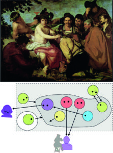
Welcome to My Blog

Sticky post

To read from the start,

click    “Go to Post 1

To look for topics on Manet, go to    List of Posts  below.

For an introduction, go to    Overview   below.

I want to encourage you to comment!
Read more on the project in About
and in “Installation My Manet”.

List of Posts:

Post 1     Painting the activity of painting

Post 2     Manet and the puppet theatre

Post 3     On “Facingness”
               and Social Scale in Manet

Post 4     Faces in Velazquez and Manet

Post 5     System of Faces and Gazes

Post 6     Beyond the Viewer:
               Who is looking?

Post 7   The Emergence of
             Manet’s Scheme

Post 8   The Composition
             of Luncheon on the Grass

Post 9   Manet’s Scheme:
             Composition in Social Space

Post 10 Manet’s Realism

Post 11  Manet, Baudelaire,
              and realistic Formalism

Post 12 Manet’s Self-Portraits
             – Seeing Oneself Seeing

Post 13  My Manet – looking back
              and looking forward

Post 14 Manet Painting Christ

Post 15 Painting Christ
             – Another Self-Portrait?

Post 16 Manet and Emotions

Post 17 On painting a modern nude
             – Manet’s Olympia

Post 18  Manet’s Enigma
              – Breakfast in the Atelier

Post 19  More on Manet’s Enigma
              – Breakfast in the Atelier

Post 20  On Manet’s Balcony

Post 21  Manet and Political Power

Post 22  On Paintings, Diagrams
              and Exhibitions

Post 23 More on Diagrams
             and Paintings

Post 24 Seeing Being Seen
             – Manet’s Perspectives

Post 25 Manet and the Mirror
             – A Bar at the Folies-Bergère

Post 26 Manet’s Scheme in the Mirror

Post 27 Manet and the Male Gaze


Introduction and Overview:

In my view,
Manet aims to paint the activity of painting in Luncheon on the Grass.
He does this not directly by showing himself as painting in the painting, but he paints in a way that the painting is personally addressing and engaging the viewer.
It leads the viewer to think about what is happening before his or her eyes.
This “happening” I want to analyse – first in 7 questions and 7 answers posed in “Installation My Manet”.
Then, we will go beyond to other paintings.

Post 1 
will tell more about the implications of this view. Sitting in front of an easel with a brush in your hand, an empty canvas before you, and perhaps a model inspiring you is a social activity.
The painting of painting – in my view and supposedly in Manet’s view – assumes at least two people, the painter and the viewer, and – typical for Manet – the model as a third person. The painter is his or her “own first viewer” and the other persons may not always be present, but the activity nonetheless is a (virtual) interaction.
This implies a certain scale of the scene within the painting:
At least two persons communicating with each other face-to-face and in a certain setting,
typically in the atelier.
Thus, still lives, larger crowds of people, and landscapes will raise different questions. We might decide to look at them later.

Manet depicts this in Figure 1 in a social scene – with a painter looking pretty much like Velasquez.

Figure 1: Scene of a Spanish Studio (1870)

We know that Manet loved this studio situation and immersed totally in the activity!

In Post 2 and 3, a model or paradigm for Manet’s view – the puppet theatre – is described.
Manet puts the social activity “on stage”.

Starting with Post 4 and 5,
we will introduce the diagrams which I will use to visualize what Manet was thinking
– or what I suggest he was thinking.
The starting point are paintings by Diego Velasquez.
We know that Manet admired Velasquez as perhaps the greatest painter ever!

The diagrams introduce the actors on the “stage”.

Then, in Post 6,
I will look at painting as a “social form” and reaching beyond the stage into the atelier.
We don’t need any theory to realize that the interaction in the  atelier assumes that persons will play certain roles or fulfil certain functions.
Actually, this is shown in a painting by Gustave Courbet on “The Allegory of Painting”.
We will have a look at it.
We know that Manet considered Courbet as a rival for the title of the “true realist”,
and he knew this painting!

In Post 7, we see the emergence of Manet’s scheme. 
I will elaborate more on the steps Manet takes to develop a scheme guiding the selection of perspectives and roles in his painting of painting.
He reduces the complexity of the situation by deleting “unnecessary” personnel.
This can be inferred by looking at two paintings he produces just before embarking on the Luncheon in the Grass.

The following Post 8 and 9,
will finally take a closer look at the Luncheon in the Grass itself.
Since this is one of the most frequently interpreted paintings in art history, we might expect that nothing new can be said about it.
But it speaks for the greatness of this painting that even some 160 years later it inspires new views – also by other viewers – and we will have a fresh look, too.
The result will be the “formal scheme” of Manet’s figurative paintings!

Figure: Manet’s “formal scheme” of multi-figure paintings

In Post 10 and 11,
I will say more about Manet’s “realism”. Comparing his innovative approach to other painters of his time, we might think that he actually is less “realistic” than, say, Courbet, Corot, or the early Degas. And then, Impressionism is seen as a kind of new realism, but Manet is – not only in my view – not an impressionist.
So, what is Manet’s realism? In the perspective of science, we may say that Manet creates “reasoned imaginations“.
His position is a “realistic formalism” and I will try to explain this  also by comparing his view to the realism of his friend, the novelist and critic Charles Baudelaire.

In my view, the paradigm of a “Puppet Theatre” or Marionette Theatre helps to understand how Manet sees the social reality of painting similar to the reality on stage.
This is what the little installation or collage, presented at the end of “Installation My Manet”, tries to capture.

Figure: The “Installation My Manet”


Page 3 of 3

Powered by WordPress & Theme by Anders Norén