The “story” of Luncheon on the Grass has been told many times, and the interpretation usually focuses on two themes:
The scandal provoked by the female nude, and the fact that
Manet borrowed the basic composition from two Old Masters, Titian and Raphael.
As far as the scandal is concerned, I tend to agree with Robert Herbert (1988), among others, that Manet himself did not intend to produce a scandal. The “story” of Manet, the rebel, causing a scandal, is based on the reception of the painting by the public and the rejection by contemporary criticism.
To some extent, we have to attribute the interpretation of the Luncheon to the reactions to the other painting causing an even greater scandal, the Olympia (1863). The latter painting does show a prostitute or, rather, a courtesan reclining on an impressive diwan who could afford a coloured woman as a maid presenting a quite expensive flower bouquet from a well-to-do customer.
There were literally hundreds of paintings with nude women in the Salon in 1863 when Luncheon was rejected, or in 1865 when Olympia was exhibited.
So what exactly caused the scandal?
Figure 1: Two scandals starting Manet’s career – Luncheon on the Grass and Olympia

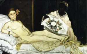
The relationship between the two paintings is, indeed, very interesting. But in my view, the fascinating relations are not linked to the presumed allusion of both to the issue of modern life and prostitution in Paris of the time. I do not think that Luncheon on the Grass is about prostitution at all, although it is about modern urban life.
I will return to the theme of social scandal in a following post.
What I find interesting has more to do with the second theme, the question of composition of the Luncheon.
The two paintings are created at the same time, and yet they seem to be totally different in their approach to composition. This is easily explained, if we are content with pointing out that they cite very different Old Master paintings.
This causes a problem, however, if we propose – like in MyManet – that Manet developed in Luncheon a programmatic scheme for other paintings to follow.
How are the two paintings related on a structural level?
We have to return to this question when discussing Olympia, and after clarifying the scheme for Luncheon on the Grass.
So we ask:
Question 6: How can I paint a female nude following the formal scheme?
As Michael Fried – an expert on Manet – describes the painting:
It is “his sheerest, most intractable masterpiece” (1998, p. 57; emphasis added).
He notes that Manet’s “use of previous art was highly conscious, even programmatic, though it has not yet fully emerged what that program was” (p. 81). He goes on to argue that Manet aimed at a new synthesis of the French art tradition with Italian, Dutch and Spanish traditions. Manet’s way of achieving it, Fried sees in a certain kind of “theatricality” found in the realism of the French tradition, especially in the Le Nain brothers and Antoine Watteau.
Aspects he describes as “essentially theatrical – that the figures are grouped, that they either confront the beholder or in effect pose for him, that they participate only in the most formal or conventionalized of actions – were experienced not just as compatible with realism but as intensely, even uniquely realistic in their own right. The crucial notion, here as elsewhere, was that of naiveté” (fn 111, p. 485; italics added). Thus, Manet found “a new paradigm of what a painting was” (fn 97, p. 482).
But what is the compositional aspect in that paradigm of grouped figures?
I learned immensely from Fried’s analysis about the sources and the meaning of elements in Manet’s painting. However, his way of composition is not explained by the selection of elements, especially, since it is generally agreed that Manet did not simply “borrow” entire compositions.
John Rewald (1961, p. 86; emphasis added) detects a “curious lack of imagination” leading Manet to “borrow” subjects from other artists. But Manet certainly demonstrates a lot of creativity in integrating these citations into an own composition.
This is not John Richardson’s view, he flatly states: “Manet’s sense of design was faulty”(1982, p. 9f; emphasis added). He initiates a discussion on “Manet’s compositional difficulties” referring to the Luncheon on the Grass as well as other paintings in the 1860ies.
Anne Coffin Hanson tries to defend Manet discussing critical reactions to Richardson’s evaluation. But in the end, we are left with few remarks on more formal principles of composition such as proportional systems, diagonals and triangles. “Of all the qualities of Manet’s art, his picture construction has been least understood”, is her resume (1977, p. 197ff; emphasis added).
For Sandblad (1954, p. 93f), Manet makes “efforts to transform the pastoral idyll which he had set up on the floor of his studio into a decorative and ordered picture on the surface of the canvas” … ” the three strictly contoured figures in the foreground appear like paper dolls pinned to the surface of the canvas”… “(Luncheon on the Grass) did not become the definitive work which Manet had presumably dreamt of” (emphasis added).
This – according to Sandblad – was achieved in Olympia.
Robert Herbert offers a brilliant description of the “social form” of picnics and the Parisians’ concept of leisure and landscape comparing it especially with Claude Monet’s version of the same theme two years later.
While pointing out Manet’s ironic way of “mocking history and its guardians, the academy”, Herbert also has his difficulties with the figures: “Not only do they appear as virtual cut-outs, arbitrarily transported from the studio, but their wooded clearing seems as artificial as a stage set. Among other things, our view back to the water on the left cannot be reconciled with our view through the center (the foliage over the nude’s head is too obvious a device to bridge the two perspectives successfully). … Manet’s painting, in fact, is built upon the juxtaposition, rather than the integration, of its separate parts.” It is not yet “a piece of contemporary leisure that embraces a more satisfactory narrative” (1988, p. 172f; emphasis added).
I find it amazing that one of the most famous paintings in European art history evokes such puzzled reactions from the art community!
The most convincing analysis I have found so far in the literature is the one by Michael Lüthy (2003).
His approach focuses directly on Manet’s use of gazes in the “internal” order of the painting and the “external” relationship to the viewer, and it places Luncheon on the Grass in the context of other paintings of Manet to discuss an emerging pattern.
MyManet is inspired by him, and I will return to his book for guidance in other cases, also discussing the differences of our approaches.
The emerging scheme is obviously only one perspective among many others, but it confronts the issue of Manet’s “compositional difficulties” directly. Interpretations of the composition are quick to demonstrate that Manet was inspired by at least two paintings. What is typically overlooked is the question:
Why these two – and not any of the countless other paintings in the Louvre museum?
Manet did not copy either one, he selected elements from both and combined them in a new way.
Why did he choose these elements and combined them the way he did?
Let us take a look at the first painting Pastoral Concert (1508) by Titian, attributed to Giorgione at Manet’s time. The painting was (and still is) in the Louvre museum and Manet made a free copy of it earlier.
Figure 2: The Pastoral Concert by Titian (1508)
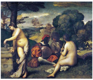
The painting delivered the basic idea of two nude women and two dressed men. They have interrupted their music, and the female to the right seems to wait patiently until the two men have settled some issue, while the second woman gets the drinks (sounds somewhat familiar?).
In the background, a shepherd is tending to some sheep, but no one is alarmed; there is no sexual activity interrupted here. In the good old days (over 3oo years ago) painting this scene was no scandal, and it hanging in the Louvre at Manet’s time was no scandal either.
So, Manet transposed the scene into modern urban life – only, now it was a scandal if people did that sort of leisure activity in the Bois de Boulogne, the park near Paris! And a metaphorical interpretation – like long ago – was not acceptable by the viewers (and not intended by Manet). After all, these people could quite readily be identified as contemporary, living individuals, at least by insiders of the art community.
Again, I am not worried about the scandal, but interested in two other aspects.
Therefore, I did a little transformation of the piece by mirroring it and moving the lady at the left edge into the background – see Figure 3.
First, this way it is obvious that Manet borrowed the theme and the basic composition from Titian. Mirroring images was something very common to him since he worked often with printing techniques.
Second, we see that Titian used a split horizon with a different perspective into the depth toward the shepherd, now on the left. We find the same split in Luncheon, and in both paintings the areas are separated by dark bushes and trees, as noted by Herbert (see above; although without mentioning the same element in Titian).
The relationship between the two paintings was generally recognized by contemporary critics.
Figure 3: Modifying Pastoral Concert to match Luncheon on the Grass
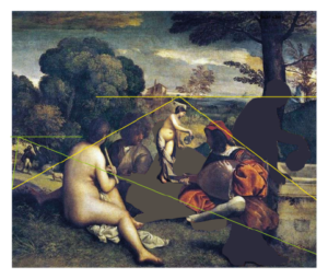
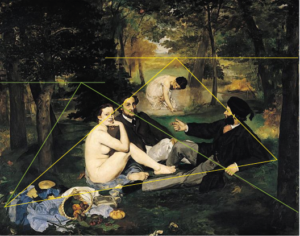
But there is an important difference which was not mentioned then, and not in later discussions.
In Pastoral Concert the three central figures are looking at each other – they are “absorbed” in their activity.
Why did Manet change that if the composition was so suitable?
Noticed by the art critic Ernest Chesneau at the time, Manet had a second inspiration from where he took the arrangement of the central triad, an etching by Raimondi of Raphael’s Judgement of Paris (ca. 1475).
Here we see three river gods sitting in the right-hand corner in the same arrangement as the triad in Luncheon.
In Raphael’s composition, the triad and especially the outlooking woman has the function of introducing the viewer into the picture. This relation to the viewer is exactly what Manet is aiming at – only that he is not interested in leading the viewer into an allegory or “story” shown in the main part of the painting.
The viewer relation is the “story”!
Figure 4: Etching by Raimondi of Raphael’s Judgement of Paris – with markings of Manet’s scheme
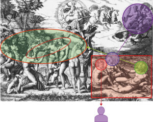
The elimination of the rest of Raphael’s painting induces certain changes – marked in Figure 4 following our scheme.
The basic orientation of the figures with the female (First, red) turning toward the viewer and their gazes away from each other is maintained.
But the male to the right (Second) is leading into the whole painting or onlooking (green) toward the scene to the left – his right hand extended by a palm branch behind the group. In the Luncheon, he is only looking at the other two (blue). His right hand is not needed to point to the scene beyond; in Luncheon, a somewhat indistinct pointing or arguing finger has to do. The oar in his left hand is substituted by a fashionable cane supporting a main diagonal in the painting.
The other male (Third, purple) is in the Luncheon not looking up and backward toward Jupiter arriving from heaven. In modern urban life in Paris, you might see the balloon of Manet’s friend Nadar drifting by in the sky, but this would occur more to the front where the light is coming through the foliage. (Remember, Manet was making lithographs of this balloon.)
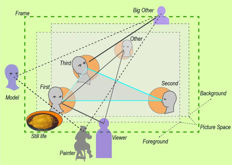
For the interpretation of the Third in Manet’s triad we have previously identified the function of relating to some external “authority” or Big Other. This interpretation is readily supported in Raphael’s painting!
After all, Jupiter is the final authority arriving to confirm the judgement of Paris (the figure to the left in the inner circle) on the beauty of Venus (the female hugged by the little angel). I am sure, Manet appreciated the “theatricality” of the scene with a backfigure, the nude in the centre, wisping away the cloth hiding her beauty. But this kind of storytelling is exactly what he was trying to avoid.
Another intriguing element in Raphael’s painting is the figure of Hermes who is in the inner circle looking from the back onto the scene! So far, I found no reference to this element in the literature on Manet.
Quite clearly, Hermes is completing the inner scene to a group of four figures which again form a mirror image of Manet’s composition. Thus, Hermes is in the position of the “other”! Since Hermes is the messenger and mediator between humans and the divine, there hardly could be a better figure in Greek mythology to fill that position in Manet’s scheme.
Manet did not talk or write about the choices he made in the composition of Luncheon on the Grass.
We know that he made his decisions deliberately with knowledge about traditions in literature and art and with a witty irony directed both toward traditions and modern society. The choices for inclusion of elements and their arrangement in the Luncheon are no exception. What he deliberately modified into a composition of his own were the gazes of the figures establishing a relationship between an “internal” and an “external” order.
Manet was developing a programmatic scheme, a “new paradigm of what a painting was” characterized by a new realism and naiveté (Fried).
In the next post, I will pull all these elements together in a diagram of Manet’s scheme.
See you next week!
Leave a Reply