Explorations of Edouard Manet's paintings with diagrams

Tag: Manet’s Scheme

A Bar at the Folies-Bergère – Manet’s Scheme in the Mirror (26)

The “12 Views” of  A Bar at the Folies-Bergère  (Collins 1996) discussed in the previous Post 25 had two topics in common:
the role of the barmaid as picturing Manet’s view of women in Parisian society and the spatial inconsistencies or violations of perspectives caused by the mirror.

But there are other aspects which are neglected or featuring less prominent in the discussion.

Let us consider some of these aspects taking a fresh look at the painting
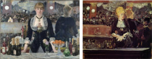
and a sketch in Figure 1.

Figure 1:  Edouard Manet

A Bar at the Folies-Bergère  (1882) and Sketch for A Bar at the Folies-Bergère (1881)
First question:

Disregard for correct perspective is not a new feature in Manet’s paintings.
But why using a mirror to close up the background rather than a curtain, a wall or a dark space or some other partitioning as in previous paintings?

Staging the figures in a limited “flattened” space – in a “puppet theatre” – and leaving the viewer in a shifting position in front of the scene – that is a feature which is characteristic of Manet’s scheme as proposed in MyManet.
But, using a mirror – which is typically used to open up a space – to close off the scene in the back is counterintuitive. We should think that it simply does not work. It does in this painting.

The viewer is fully aware that the barmaid is standing in a very narrow space between the bar and the mirror. Manet is moving the balcony on the left side forward like in a magnifying mirror, as Flam (166) observes, and he uses a loser, impressionistic brushwork painting the background.
The black back of the reflected barmaid effectively closes off the view on the right side (an effect not achieved in the sketch!).

Using the mirror in ways obviously violating optical laws creates problems for his realistic style.
Why is Manet inviting doubts about his realism?

Second question:

The barmaid reflected in the mirror seems to be a different woman.

The mirror image has rather loose hair while the barmaid has her hair tightly pulled back. Flam (166) even suggests that she might have a ponytail. The cheeks of the mirror image seem to be rounder, her waist somewhat fuller, and her posture leaning forward and more attentive and friendly to the customer – if not inviting and “eager to please” (Flam 167).

But, does she look more like a casual prostitute than the barmaid confronting the viewer with her tight waist and low neckline, as many interpretations suggest?
Or is this a view following from an assumption that the gentleman in the mirror surely must be a potential customer?
As Lüthy (2003, 164) observes: In interpretations that follow T.J. Clark’s focus on prostitution in Paris at the time, it seems that “the interpreter approaches Manet’s painting like the customer the counter” trying to find out whether she is a prostitute or not (own translation).
Is Manet – perhaps critically – presenting the “male gaze” or is he playing with the expectations of the viewer?

Third question:

The viewer seems to be standing at a comfortable distance  from the barmaid
(about 2m following Flam).
However, the gentleman in the mirror is uncomfortably close leaning over the counter and looking down into the eyes of the woman. He is scaled a little too large and looming in the upper corner at a position which does not correspond to any possible place in front of the barmaid.
It is not even clear whether she is returning his gaze or looking somewhere through and beyond him. (Both facts are somewhat at odds with the interesting interpretation of Duve – see Post 25.)

In the sketch for the Bar in Figure 1, a smaller customer is positioned lower and looking up to the barmaid looking down on him. Their gazes in the mirror seem to meet. The barmaid herself is looking to a place to the right of the viewer where the gentleman actually may stand.
Why the changes?
Why is the barmaid in the final version looking toward the viewer but avoiding eye contact?
Why is the mirror image of the assumed customer now moved into an implausible position in the upper right corner?

Fourth question:

In the final version, the left side is on closer inspection a confusing collage of detached elements:
– The balcony is too close compared to the right side (compare also the width of the columns);
– the legs of the artist on the trapeze are too small and certainly not above the stage;
– the counter with bottles in the mirror is floating in the air;
– the balcony appears to be zoomed in to avail a better look at the people on the other side.
Art historians have identified the three women sitting around an empty chair, two looking toward the stage to the left, one seems to look at the viewer.
A fourth person, a gentleman with a black moustache, looks similar to the gentleman in the upper right corner and he seems to direct his gaze at the barmaid (or the viewer’s back).

Manet is clearly citing people he knows. We see a “little cabinet of perspectives”  (Lüthy p.178) in the focus of the left side.
How should we explain this grouping and the direction of their gazes?

So, what to make of these questions in view of MyManet and applying Manet’s scheme?

As a starting point, the painting has been described as a “testament” by several authors.
If it is true that Manet is looking back and citing many of his important paintings, and
if MyManet is capturing with Manet’s scheme some relevant feature of his work,
then we should find aspects of his scheme in the composition of the Bar.

On first sight, this is not really promising:

There is only one figure in the painting – and two or more reflections.
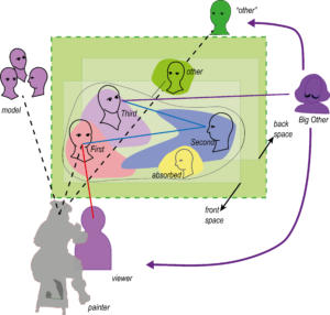
Manet’s scheme as developed in discussing the Luncheon on the Grass (1863) provides for four positions and gazes within the painting (see Post 9 and 24):

The First      – looking at the viewer:
“seeing being seen” by the viewer

The Second – looking at someone within the picture space supporting the internal “stage”:
“being seen seeing” by the viewer

The Third     – looking out and beyond the picture space:
“seeing without seeing being seen” by some other

The “Other” – looking from the back:
seeing from a position other than the viewer.

The barmaid is clearly puzzling since she is not really looking at the viewer.
If anything, she is gazing at some unidentified spot beyond the viewer – seeing without seeing being seen.
This would qualify her for the position of the Third.
An example of this variation of the scheme we found in Breakfast in the Atelier with the young man standing very up front and looking past the viewer (Post 18 and 19).
The couple reflected in the mirror would have to take the role of the First and the Second.
But that seems quite a stretch for the scheme.
The woman in the mirror as the First (seeing being seen) would use the mirror and look backward at the gentleman who takes the role of the viewer in front of the painting.
Conceivable; however, this leaves us without the Second.

The gentleman in the mirror seems to meet the gaze of the barmaid in the role of the First, establishing a relation between her and the viewer represented by him.
For the role of the “Other”, looking at the scene from the back, he is clearly much to close to her.
The ”Other” could be identified readily in the mirror on the balcony to the left.
Especially the gentleman with the moustache, as Flam (166) describes him, is literally looking from the back onto the scene.

Thus, to satisfy Manet’s scheme we need an interpretation for the missing Second.
(Somewhat like Sherlock Holmes and the dog that did not bark.)

For a solution, we consider the role of the couple in the mirror again.

What if their role is just to provide the viewer with a clue on how to “read” the painting and to see

the painting that Manet did not paint ?

 What is the clue?

Manet clearly invites the viewer to take the position of the gentleman in the mirror and to see what he is seeing.

Basically, that means that the entire scene is turned around and the reflected viewer is now in the position of the “real” viewer looking into the eyes of the barmaid who is gazing at him. The “real” barmaid will turn into the mirror on the left side looking toward the back. The “real” viewer will take a position in the mirror to the left, only that – keeping his distance from the barmaid – her reflection will appear more behind the barmaid in the centre.

The new “painting not painted” would look somewhat like in Figure 2 !

Figure 2:    “The painting not painted”:
The original painting and the Bar seen with the eyes of the man in the mirror
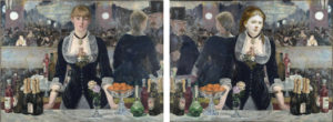
The “new” painting is actually based on mirroring the original painting vertically,
thus, it combines a mirror image – like in a lithograph, an operation quite familiar to Manet – with the turning around of positions.

Some “photoshopping” is also needed. The waist of the barmaid is adapted and a ponytail introduced (following Flam). Most importantly, the face of the friendly barmaid has to be inserted. I took the liberty of utilizing the face of Manet’s favourite model of his earlier period – an undated portrait of Victorine Meurent.

But why using a reflection of the painting?

Unlike the small angle assumed in Duve’s interpretation (see Post 25) turning of the mirror – we now assume an almost 180 degrees turning of the painting and moving the position of the viewer. Duve wants to explain the positions of the two figures within the painting (barmaid and customer) keeping the place of the viewer fixed. This is still a meaningful layer of interpretation.

Given the positions, however, MyManet tries to explain:
Why are the mirrored figures painted as they are?
– clearly not as realistic reflections of the figures assumed in front of the mirror, as Duve implies.

Now, if we apply Manet’s scheme to the “painting not painted” – it works!

In Figure 2, we see the missing Second now impersonated by the (imagined) former viewer.
The barmaid is perfect in the role of the First leaning slightly forward and engaging the viewer.
The “Other”, the gentleman on the balcony, has switched sides, but is still onlooking.
The Third, the mirrored barmaid, in this variation is looking somewhere off to the back. She is “seeing without seeing being seen by some other”.
This is a variation in the direction of the gaze compatible with the scheme. And we still have the original barmaid with her evasive gaze in front of us (reminding us of the Third) when we – as viewer – imagine looking with the eyes of our reflection in the mirror.

Revealing the role of Manet’s scheme in the composition supports interpretations of the painting as a “testament”. It is not only citing previous own paintings but also revitalizing and creatively developing a basic compositional scheme.
Already since Olympia (1865) – as demonstrated in Post 17 – Manet has applied variations of the scheme with fewer figures. In the 70ies, after The Balcony (1868), he has used the scheme only partially in paintings with two figures (for instance,  Nana). We will have a look at the major paintings in the 1870ies in following posts to see the continuing influence of the scheme.

Here, in A Bar at the Folies-Bergère, Manet goes one step further and ingeniously – so the view of MyManet – applies the scheme with only one central figure and with a counterintuitive use of a mirror to set the “stage”.

The view that Manet is searching in the Bar for a new and innovative variation of his scheme can explain some of the changes from the study to the final version (Figure 2).

Moving the barmaid in the centre and giving her this famous avoiding gaze is designed to radicalize the attempt from Breakfast in the Atelier placing the Third front and centre – this time as the only “real” figure.
Already in the Atelier, we interpreted the gaze of the young man as looking into his open future. The role of the Third, more generally, signifies in the scheme the orientation to some “authority” outside the picture space.
Both aspects gain obvious significance in a painterly “testament” by a painter expecting his death.
With the gaze of the barmaid directed somewhere passed the viewer, the right side of the study (Figure 4) does not work anymore. Manet had to find a new solution which preserves credibility as a realistic painting, at least on first sight, and which allows for the application of the scheme to the other figures.
The result is the juxtaposition of a painting with a “painting not painted”.

The study and the first impression of the final version do not conform to the scheme,
but a viewer accepting the invitation to imagine looking through the eyes of his (or her) “impersonator” in the mirror will have the benefit of seeing the scheme – an important element of his “testament”.

But there is another clue on the left side. One is tempted to say, for those of us (including me) who do (or did) not readily recognize the clue on the right side pointing to the presence of Manet’s scheme.
Interpreters typically focus on the figures on the balcony only as representing friends and colleagues.
The “little cabinet of perspectives” (Lüthy p.178), however, can also be seen as a citation of Manet’s scheme!

The empty chair creates a space distinguishing the three adjoining figures.
The figure to the left reminds of Berthe Morisot in The Balcony posing for the Second (although she has been identified as another friend of Manet’s);
the figure to the right is citing a painting by Mary Cassat, and she is using her opera glass to stare beyond the picture space – a candidate for the role of the Third;
the woman in the next row (clearly accentuated by the empty chair) is looking straight at the viewer – taking the role of the First.
The gentleman to the far left plays already the role of the “Other” but – given his reflection – he can also be seen as doubling as an “Other” in the “little cabinet”. (The lady and the gentleman could change roles as First and “Other”, but I think that the empty chair is meant to join the lady to the triad.)

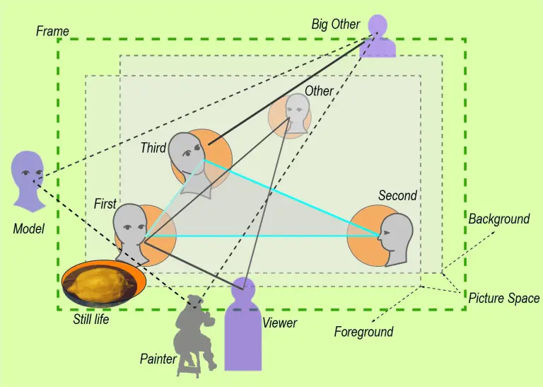
The complex composition is summarized in the diagram in Figure 3:

Figure 3:       Diagram of the scheme in A Bar at the Folies-Bergère
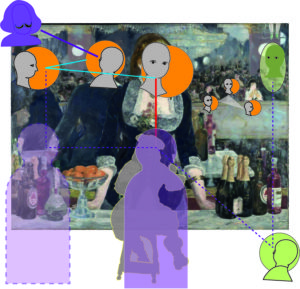
On the left and centre, now we see Manet’s scheme with the roles of the First, Second and Third. Additionally, the shifting position of the viewer is indicated. In the original, the viewer is induced to move slightly from the centre to the right trying to align with the mirror image within the painting. In the “painting not painted”, the viewer is motivated to shift to the left as indicated in the diagram.
This shifting from outside to inside and from right to left will motivate the viewer (if he or she is trying to solve the puzzle)  to look “from the side” on the level of the mirror plane – a position supporting identification with the Second and establishing the picture space.
On the right side, we see the “little cabinet” reminding of the scheme and the “Other” doubling inside and outside the painting.
Besides the painterly challenges of using a mirror as a background, Manet has solved the problem of staging his 4-figure scheme within a painting featuring essentially one figure.

Two questions (1 and 2) are still open from our list above:

Manet is playing games with the “male gaze”.
In view of the “painting not painted”, is there a clue that there is also a “female gaze not painted”?

And:

Manet seems to put into question a realistic interpretation more radically than in any previous painting.
This is especially troubling in the case of the looming face of the gentleman placed in the upper right corner.
Should we reassess Manet’s self-claimed position as a realist?

Good questions, but let us address them in the next post.

See you in about two weeks!
Manet’s Enigma – Breakfast in the Atelier (P18)

Most commentators agree, including the first reactions of critics in the Salon 1869: Breakfast in the Atelier (1968) is perhaps his most enigmatic painting.
It is puzzling to understand what is going on in the scene.
Already the changing titles of the painting in different sources reflect that we cannot even be sure if this scene is before or after a breakfast or  rather a luncheon than a breakfast, taking place in a studio or at Manet’s home. We use the title above especially to distinguish it from the Luncheon on the Grass.
Manet submitted it together with The Balcony which left the visitors equally puzzled.

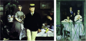
Figure 1:  Breakfast in the Atelier (1968)       and       The Balcony (1968)

For the contemporary critic Castagnary, both paintings were arrangements “without reason or meaning”; for him, recording the appearances of modern life was not enough.
Manet demonstrated too much “fantasy” and too little “sincerity” and traditional finish (Hanson 1977, p. 30).

Looking at the two paintings next to each other (Figure 1), I find it especially astonishing how different the paintings are in their style and composition although Manet created them in the same year.

Michael Fried (1998) pointed out that the two paintings show a return to the multi-figure paintings after a “Spanish phase” with single-figure paintings following Manet’s travel to Spain.
Here he tried to recover from the harsh criticisms of Luncheon and Olympia by getting new inspirations from his admired Diego Velazquez.

As the art historian James Rubin (2010) suggests, the two paintings document a transition in Manet:
– from Charles Baudelaire to Berthe Morisot;
– from the romantic and naturalistic novelist who died the year before in 1967 to the young impressionist painter whom Manet first met in the summer of 1968.
Both were very close friends but had a very different influence on Manet.
Well, one was an old male friend deserving a memory in the most Baudelairian painting (Rubin), and the other a charming young lady who turned out to be one of the most important members of the impressionist movement.
Quite a transition of friendships!

Since the two paintings were presented in the same Salon exhibition in 1869, they are often compared.
But the first is somehow looking back to paintings in the Spanish and Dutch tradition, the second is moving forward integrating impressionist influences.
So, it is not surprising that The Balcony is getting usually more attention and is seen easier to understand as testifying to Manet’s modernity.

In view of MyManet, this is not doing full justice to either painting, because there is a focus on the differences marked by the transition, while the common aspects are neglected.
Both paintings – as the reactions confirm – are riddled:
– by the interpretation of the gazes and the (lack of) emotions shown by the figures, and
– by the logic of the composition.
In fact, the divergent gazes seem to seriously disrupt or endanger the composition.

In view of MyManet, let us consider both aspects.
In this post, we take a closer look at Breakfast, in the next post at The Balcony.

Developing Manet’s scheme in the previous posts, we have seen already how Manet varies the application of the scheme shifting the emphasis between the roles of the figures (First, Second, Third, Other, Big Other) and their position in the picture space (frontstage, middle ground, background, backstage).
In some cases, he might substitute a position by another figure (e.g. the cat for the Third in Olympia).
In some cases, he might omit a position, but implicate it by other means (e.g. omitting the “Other” by closing up the backstage in Olympia).
Additionally, basic emotions are indicated by gestures and postures depending on their relations to each other, to “unrepresented” agents outside the painting, or to the viewer (e.g. the empowered and defiant gaze of Olympia toward the viewer).

Breakfast in the Atelier shows – in this perspective – another variation of Manet’s scheme!

To start, let us look at the dominating  figure of the boy (or young man) standing right in front of us (the viewer).
The undetermined age of the fellow gives rise to interpretations that we observe the transitional state of Leon (the model and Manet’s son) between childhood and adulthood.
The gaze of Leon is directed somewhat to the right of the viewer, not looking at the viewer or anything else specifically. He might be contemplating his future as an adult.
Gisela Hopp (1968) suggests that the painting itself shows a kind of dream world, so the boy may be looking at this dream presented to the viewer in the atelier behind him.

Hanson (1973) discusses the painting in her chapter on Manet’s “still lives”, since the boy seems to stand in an arrangement of “still lives”: the weapons in the left forefront, the breakfast on the table (if, indeed, it is a breakfast), and the flower in the left background.
Actually, the figures are also quite “still”: the maid holding the coffee pot, the man peacefully smoking, and the boy holding on to the table without any signs of intention to go anywhere.

The whole painting has a nostalgic or retrospective atmosphere, and as Hanson notes, it invites psychological interpretations: some reference to an underlying or hidden “drama” which the unfocused gazes are “hiding” and all those requisites are “betraying”.
And as Richard Wollheim (1987) has pointed out, this “drama” is not an effect of the portrayal of individual characters. The figures have presence and energy, but no clear personality or motivations to act, whether alone or together (see also Post 2 and his comparison with Edgar Degas).
Still, art historians like Wollheim (and Nancy Locke , among others) have tried to uncover a deeper psychological layer – a personal or family drama – by exploiting, for instance:
– the similarity of the Dutch looking maid with Manet’s Dutch wife Suzanne,
withdrawn in the background,
– the signature “M” on her coffee pot,
– the similarity of the man to the right with Manet himself,
not paying attention to the other figures, and
– the fact that the boy is modelled by their son Leon,
looking out of the painting into his own future.

These interpretations provide interesting contexts, although they do – in my view – not reckon enough with Manet’s inclination to stage an ironic and self-reflexive “theatre”,
and with his sincerity as a painter in designing the scene.
So, I like to pursue another suggestion about the meaning of the gazes in the painting offered by Charles Stuckley    (cited in Fried 1998, p.592 in a footnote fn 205).

Stuckley argues that what realist painters like Manet “truthfully reveal are the necessarily artificial underpinnings of the activity of painting per se.” These underpinnings are the reality of the model’s work in the setting of the atelier. Stuckley suggests – in Fried’s words – “that the strangeness of Manet’s Breakfast in the Atelier was the work of Manet’s models, not the painter himself”. And citing Stuckley:
“As if irked by their model’s roles, Manet’s sitters seem to sabotage his efforts at Realism, for they refuse to remove their hats and they leave the table at which the artist had presumably instructed them to remain for as long as it took to complete the picture. Resigned to their lack of cooperation, Manet’s only option was to record people unwilling to hide their genuine impatience with a slow painter.”
(Fried wonders if Stuckley means this humorously, but I think he makes a serious point humorously.)

This imagery of models – coming to the setting of the painting process like to the set of a theatre performance – is also vividly described by Carol Armstrong (1998). In her case the setting is the Luncheon on the Grass, and she also sees Manet purposefully keeping the artificial and theatrical appearance of the scene alive in the painting. The models in her imagery are very cooperative. Nevertheless, their actual behaviour in the setting is reflected in the painting to enhance its Realism – not to “sabotage” it (Stuckley).

Models should – in Manet’s view – act and pose as natural as possible, that is like in everyday life. This is also reported in an often-cited anecdote from Manet’s time of studying in the studio of Thomas Couture. Here Manet is angry with a model striking a classical pose, and he ask him whether he would behave like that when buying his groceries down the street.

I suggest combining this imagery of somewhat detached models with another imagery evoked by the description of performance training in a practical guide for teachers, dancers, and actors.
The authors, Anne Bogart and Tina Landau, describe their method in “The Viewpoints Book” (2005), a method developed in close interaction with postmodern painting and postdramatic theatre in the 1960ies.

Like Manet’s models, a group of dancers or actors enters the stage. Then they are asked to focus their awareness as much as possible on the immediate situation and their position in relation to the other persons on stage.
They are asked not to focus on the others, but rather to keep them in “soft focus”, i.e. in their peripheral vision and in their perceptual and bodily awareness of each other including all the senses.
In this state of “soft focusing” on the “between” of their relations in space and time and embedded in the architectural setting of the stage, they are then instructed to move in different patterns. They are asked to take their impulse to move or to shape their body from the others rather than from their own impulses.
Obviously, it takes training to create in this way coordinated and harmonized group movements on stage.
It is, actually, quite astounding that it works at all! (Visit the examples on Youtube!)

Now imagine Manet’s models taking their places under the guidance of the painter in this spirit.
They got a general introduction into the theme (e.g. scene after a breakfast) but no great “story”. They are assigned their position, but they have to find a posture, gaze, and gesture with which they are comfortable. They know that they have to keep the pose for a while to allow for the painting process.
But as long as their relations are harmonized by their mutual awareness of each other, Manet is not intervening.
This way the models have a certain freedom to “interpret” their gaze, role, and position.

As Struckley correctly observes, this exactly allows for the realism of the scene, and this is what Manet wants to paint!
It is also clear that with a “soft focus” on their relations rather than on their individual mental states and emotions the models will not “strike a pose and keep it” but adjust within a frame of relations with all others.
Their pose will appear somehow “arrested” – if you are looking for “meaningful” activities – but not lifeless!
I think, Stuckley is wrong when seeing “genuine impatience” in their faces and postures, there is something relaxed but intensive about them.

The authors of “Viewpoints” use the metaphor of an act of shooting an arrow with a bow to a target.
The most intensity rests in the moment when the arrow is pulled back, the bow is under pressure, the whole body of the shooter is lining up with the target, but the arrow is not yet released.
The eventual act of releasing and shooting might carry most of the purposeful meaning, but this moment displays the potential energy.

Now looking at Breakfast with this imagery in mind, the three figures show a presence and energy which flows from their awareness of the presence of the others, including the viewer/painter, without directly gazing at them.
This is the reality Manet tries to capture!

To be able to achieve this, Manet is relying on models with whom he has personal and trusting relationships and who engage with his practice – family, friends, or models like Victorine Meurent.
This may also be a reason why Manet preferred multi-figure compositions to portraits, because in this case he himself has to perform in the double role of the “Other” and the painter.
And, obviously, that becomes especially complicated when the person portrayed is an adorable woman like Berthe Morisot…

Certainly, the models cannot just do what they please.
Manet is communicating with them to create the situation he wants – there is a programmatic dimension in the arrangement, and everybody has to take their position and role.
And in each modelling session his vision has to be communicated again, most likely with some changes.
After all, Manet is likely to have scraped off the sketch from the last session – as his models report – and for a reason!
In view of MyManet, an important part of this programmatic dimension is Manet’s scheme.

In Breakfast, Leon has to take the position and role of the Third in the scheme, as I show below.
This implies that his posture cannot be simply “natural”.
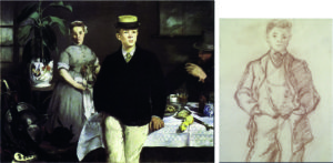
In Figure 2, we confront the painting with a sketch of the boy from the same year in preparation of the painting:

Figure 2: Breakfast in the Atelier     and    Drawing of Leon   (both 1868)

The sketch demonstrates that Manet is perfectly able to make a lively and “naturalistic” drawing of his son.
But in the painting, he is asked to take his hands out of the pockets and to look out of the painting. He also has to lean slightly back to rest on the table connecting with the man behind him resting his elbow on the same table, while the maid is arresting her approaching them.

The energy of dancers with a “soft focus” on their spatial relations to the others permeates the atelier!
This is less than the dynamics of a “good story” or a “family drama” but capturing the reality before Manet’s eyes.

This brings us to the second riddle of Breakfast, the logic of its composition.

Comments on the painting agree that the painting shows an arrangement of somewhat arbitrary figures and other elements in a rather strict composition. The elements seem all related to Manet’s biography and previous paintings, but the logic of their composition appears non-transparent.
Lüthy describes it as “situative incoherence” bound by a “planimetric order” (2003, p.35).
It is as if Manet is taming the diverging forces on the social content level – produced for the viewer by the uncoordinated gazes and the unrelated meanings of the requisites (still lives) – by a compositional order.
This order creates a unity for the viewer on the design level of shapes, colours, and spatial relations. Lüthy sees the logic of the composition in these dynamics of incoherence and order between the elements of the picture and the relationship to the viewer.
In view of MyManet, these dynamics capture an important aspect of the composition. However, there is more structure in the dynamics as the opposition of inner “incoherence” and stabilizing order for the viewer suggests.

Above, I have already argued that the inner “incoherence” might better be understood as “unfocused” unity created by the figures being aware of each other. This compositional unity is supported by the hidden order of Manet’s scheme: the figures have a position and are aware of their roles.

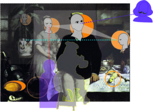
This hidden order becomes apparent when we apply the scheme to the painting as in Figure 3:

Figure 3:     Manet’s scheme applied to The Breakfast in the Atelier (1968)

The most striking variation in the scheme is clearly that Leon in the position of the Third is moved onto the frontstage.
This creates a dominant position and role for him. We have indicated already that interpretations see the boy looking “at his future”, his future role in society. In view of the daring position he occupies almost encroaching onto the viewer and breaking the “fourth wall” separating the stage from the audience, we should interpret his role also as challenging painterly traditions of composition.

Comparing the position of the boy as the Third with the positioning of Christ as the Third in Christ Mocked by Soldiers, we see how dramatically the Third is moved against all rules to the front (see Post 14).
Thus, the boy’s gaze is directed at the Big Other in Manet’s scheme.

The maid is taking the position of First engaging the viewer.
However, she is doing that from a position in the background. Nancy Locke (2001, p.130) rightly observes that the triangle of the Luncheon – with the nude (First) in front and the man (Third) behind her – is here reversed.
This position provides some depth to the triad, although the effect is more to push the Third even more to the front, since behind her is only the wall (or painted coulisse) sealing off the back. (In an earlier draft, there was a larger window behind the triad which Manet has painted over hanging a small painting on the dark wall.)

The Second, the man to the right, also shows a striking variation of the scheme.
He is moved far to the right, even cut off by the frame. From this position, he is looking not at the others but straight across the picture space to the left. He is focusing on nothing in particular, may be even lost in his own thoughts.
But he is establishing the middle ground of the painting – occupied by him and the table – as an own layer between the boy in the foreground and the maid in the background.

This distinct distribution of the three figures over three different layers of the painting must have been an essential element in Manet’s experiment with the scheme!

The dominant role of the figure frontstage must have been a compositional challenge which Manet balanced with a prominent still life in the front:
the theatrical arrangement of weapons and, again, the black cat, his signature animal from the Olympia (orange circle). Additionally, he lets the bright yellow lemon almost drop from the table to the right (orange circle).
So, this scene of the “puppet theatre” is clearly talking to the audience from the frontstage.

Finally, the white flowerpot to the left plays an interesting role in the composition.
On the one hand, it is placed somewhat behind the figure of the maid; on the other hand, it is painted surprisingly bright and colourful, even with Japanese motifs. It is pushing forward from the back – and in this feature – the pot is reminding of the second woman in Luncheon on the Grass looking from the back! The pot is also somehow “too large”, not a face but clearly “facing” the scene and the viewer.
Indirectly, it is accentuating the void space between the pot and the weapons supporting the independence of the middle ground across the composition.
Thus, we may see the position and role of the “Other” taken by a flowerpot!

We see an inversion of the scheme from Luncheon on the Grass and, as I would like to show in the next post, the painting The Balcony is displaying yet another variation of the scheme!

See you in two weeks again!

On Painting a Modern Nude – Manet’s Olympia (P17)

Olympia is certainly one of the most reproduced and discussed paintings in Western art.  Together with Luncheon on the Grass it is considered to be a “founding monument” of modern art (T.J. Clark). However in direct comparison their evaluation is somewhat controversial. Between the two paintings, the opinions of art historians are divided as to which painting deserves a higher ranking as “founding monument”.

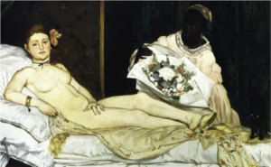
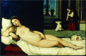
Figure 1 :    Olympia by Manet (1863)

                 and  Venus of Urbino  by Titian (1538)
While Luncheon is seen by the art historian Niels Sandblad as “troubled” in conception and painting lacking the “greatness of the self-evident”, Olympia becomes the “definitive work” which Manet clearly wanted to achieve (1954, p.94).
Picasso, on the other hand, found Luncheon so inspiring that he devoted over 200 works to it, more than to any other painting of another painter (Wollheim 1987, p.243-48).

Manet’s Olympia is inspired by another painter like most of his early works, in this case by Titian’s Venus of Urbino (1538). He made two copies of Titian’s Venus while he was on a study trip to Italy.
The resemblance of the two paintings is quite obvious (Figure 1) and has been commented at length by countless critics.
An interesting difference is that

– Titian used a courtesan as a model but painted her as a nude wife in her home environment, presumably looking lovingly at her husband, with her hand resting on her pubic area rather innocently, and exerting a subdued eroticism, while

– Manet used a model posing as a courtesan apparently looking at her customer with her hand covering her genitals in a way that rather enhanced the sexuality of her naked body.

The problem is that the critics and the public expected an idealized nude with a “story” justifying her presented beauty, while Manet showed a contemporary woman which reminded the viewer pretty much of photographs of naked women available in Paris at the time.

As Clark has argued, the scandal exploded especially, because Manet made it not sufficiently clear whether the viewer was looking at a – somewhat acceptable – courtesan of the bourgeois high-society or at a disreputable lower-class prostitute. Actually, there was no accepted way that a respectable contemporary woman could present herself in the nude in a painting. The model had to be from the lower class, only posing as a courtesan and the credibility depended on a “story” making her posing respectable as art.

Manet, however, did not provide the alibi-story, and, worse, lacking the story motivating her gaze, the direct gaze seemed to be produced by the lower-class model herself confronting the viewer. As Clark notes, the scandal was all about class identity, not about Olympia looking straight at the viewer – like other nudes in the exhibition. Her look is “not the simple, embodied gaze of the nude”. She “looks out at the viewer in a way which obliges him to imagine a whole fabric of sociality in which this look might make sense and include him – a fabric of offers, places, payments, particular powers, and status which is still open to negotiation” (1984, p. 133; emphasis added).

Thus, Olympia raised issues of the relation between prostitution and modern class society (”the price of modernity”) and of the precarious position of women inside and outside the respected role of a married wife. Women depended in their social status on men and found themselves always balancing their sexuality between asserting their integrity and independence or commercializing their “assets” in forms of prostitution.

This societal context of Olympia in Paris around the 1860ies has been described extensively, often inspired  by Marx (e.g. T.J. Clark) and complemented with analyses inspired by feminism (e.g. Carol Armstrong 1998,  Nancy Locke 1998, Anne McCauley 1998, and Linda Nochlin 2019).
These approaches are interesting and illuminating, but in MyManet, I would like to pursue two own questions:

  1. Why did Manet in painting a modern nude take up the issue of prostitution in this explicit way by depicting a courtesan?

and

  1. How does Manet’s scheme relate to Olympia – if at all?

Considering the first question:
We might point out that Manet was well aware of the social problem and political debate on prostitution and the role of women, also discussing it presumably with his friend Charles Baudelaire. Following Rubin (2010), Olympia is the most Baudelairian painting among Manet’s work. But this perspective leads us back to the societal context.

I find a remark by Clark quite interesting that Olympia has “two faces”, a face characterized by “hardness” and a “closed look of its mouth and eyes” and a face “opening out into hair let down” over her left shoulder (p. 137). The first is “close to the classic face of the nude”, the second seems to indicate the model herself as a person, “it is her look, her action upon us, her composition of herself” (p. 133). Both faces are placed by Clark into a “taxonomy of woman” (p. 137), moving again to the level of social and cultural classification of women.

I would like to stay for a moment in the concrete situation of the atelier with Manet and his model Victorine. As said before, the concrete situation of the atelier is the reference frame for Manet’s realism – that’s where the (painting) action is!

Olympia is painted by Manet parallel to Luncheon on the Grass and finished somewhat later.
The early drafts of Olympia around 1862 do not show the “hardness” observed by Clark.
The face is smiling rather sympathetically, and the hand is not always demonstratively covering the pubic area. It is tempting to suggest that the self-asserting gaze of Olympia entered the painting under the impression of the reactions to the Luncheon on the Grass.

After all, Manet and – we should expect – Victorine Meurent were shocked by the interpretation of the woman in the Luncheon as a prostitute having fun with a couple of young students. While Victorine certainly was participating in the “loose” Bohemian lifestyle of artists, no art historian has claimed that she was a prostitute in Clark’s sense. And we have every reason to assume that Manet was not seeing her as a prostitute modelling for him, nor was Victorine seeing herself as one!

In fact, Manet is credited generally with a deep respect for all the women he painted including clearly lower-class street singers or waitresses in the bar.
The explicitness of the presentation of a courtesan with all the accessories identified by art historians (e.g. the black cat, the coloured maid with flowers of a customer) may be, in part, motivated by reactions of the artist and his model to the derogative reception of Luncheon.

Manet is confronted in the reality of the painting situation with “two faces”:
– he is “seeing” the model impersonating a nude courtesan ironically citing the painting of Titian
and
– he is recognizing that there “exists” in front of him a woman challenging and resisting the implications of “being seen” as a prostitute.

The first “face” is troubled by the problems of painting a contemporary nude courtesan:
Directing her gaze at the viewer, she engages him in the “fabric of sociality” implied by prostitution, destroys the art conventions of painting a nude and arouses a public scandal.
The second “face” looks at Manet himself – the “fabric of sociality” is here the situation of painting – with Victorine reminding him defiantly that she is involved in a power game with the viewer, if not with Manet.

The point is that Manet depicts this power game on both levels – societal and situational – at the same time:
By violating the conventional strategies of idealization of female nude beauty and presenting her realistically, he allows Victorine to express her challenge of social norms in a direct personal confrontation with the viewer. He deliberately places her high on the bed looking down on the viewer, while Titian had the loving wife looking up to her husband.
The fact that Manet identifies the painted courtesan as a contemporary living woman must have motivated Victorine even more to her gaze.
Thus, Olympia is a perfect example of Manet’s realism painting with self-awareness and self-reflection what he “sees” and what “exists” in the social situation of painting.

This reflection on the power games leads back to the second question:
How does Olympia relate to Manet’s scheme?

As a reminder, the scheme is proposed as a generic template which is realized – with variations – in other paintings. Especially since Olympia is produced in close connection with the Luncheon, we should expect some formal relationship to the scheme, not only the content relation due to Manet’s ( and possibly Victorine’s) reaction to the interpretation of Luncheon as involving prostitution.

The relation is certainly more complicated than in the case of Christ Mocked by Soldiers (see Post 14):

First, there is the question of the number of persons or positions in the painting:
Can the gazes and gestures of two people effectively instantiate the scheme?
Lüthy (2003) sees only two persons depicted, which constitutes for him a favourable reduction of the complexity of the viewer–painting relation (in 3-4 person scenarios), a relation which he considers central for the interpretation of all multi-person paintings of Manet.
In view of MyManet, the abstract viewer-painting relation (inspired by the subject-object relation of Hegel) is not differentiated enough to capture the social space of painting.
We want to identify more positions inside and outside the painting, more “polyperspectivity” (Lüthy). Notably, Lüthy is not discussing the role of the cat in the composition – an important actor, as we will suggest below.

Second, there is a problem created by the dominant gaze of Olympia.
It tends to reduce all other elements to decorative functions – like in a portrait. Her gaze is not an invitation to enter the scene but a confrontation challenging the approaching viewer. It takes some reflection on part of the viewer to become aware of the multi-layered power game described above and to see more than “she” versus “me”.
This narrowing of perspective is an effect of power games!

The hesitating and deferring gesture of the maid offering the flowers is a revealing indication of the on-going power game. The maid is almost retreating behind the flowers, as it were, and all but merging with the dark background. (Manet might have chosen a coloured person as maid to enhance this effect.) It is only by moving Olympia’s face far to the left and dividing the scene by a vertical line that the maid gains sufficient independence as an actor in this game.

Third, the cat becomes an important player in the game!
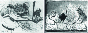
Interestingly, contemporary caricaturists like Cham and Bertall (Figure 2) acknowledge the importance of the cat more than many art critics.

Figure 2:  Caricatures of Olympia by Cham  and   Bertall  (1865)

Manet clearly felt the need to introduce a counterweight to the dominant outward-gaze. But unlike Olympia’s gaze, the gaze of the cat is not so evidently focused on a single viewer in front of the painting – a fact also recognized by the caricaturists. The cat’s gaze is more starring at the public out there, and in Cham’s graphic is even scared by the reactions of the public.

The cat represents the position of the Third!
Her gaze places the bilateral confrontation of Olympia with the viewer (and the painter) into the wider context of public reactions and institutions.

As noted by Rubin (p. 88), the cat is not only an erotic symbol – fitting into the discourse on prostitution in most interpretations – but also a symbol of freedom – fitting into the role of the cat in the power game in view of MyManet.
Rubin (p. 95) recognizes that Manet’s interest is “far more socio-psychological than erotic” and “focused on the woman’s power over her commercial transaction”. Manet underlines his intentions by avoiding “seductive use of paint”, since a dominant marketing attitude of the courtesan would suggest enhancing seductive beauty, while in a power game we oppose exactly the “commodification” of our own self (p. 96).

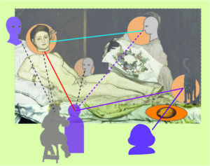
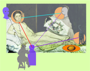
So far, we have identified the elements of Manet’s scheme as shown in Figure 3:

The triad of “First”, “Second” and “Third” is represented by Olympia, the maid and the cat engaging the viewer in front of the painting. As noted above, we should also include the “second face” of the model “behind” the courtesan which communicates especially with Manet, the artist.
The scheme also shows the rather flat “stage” which Manet typically uses to push the scene toward the viewer. The background – the coulisse of the “puppet theatre” – is closed by curtains and the frontstage is minimalized by the drapery hanging over the edge of the raised bed (the “still life” in the scheme).

Figure 3:  Olympia represented in Manet’s scheme – a first version

Figure 3 makes aware – perhaps more than any words could – of a central focus of the composition, namely, the hand covering defiantly the pubic area for the viewer.
The move has clearly a meaning in the power game, although critics usually propose some erotic or even psychoanalytic meaning. But I agree with Rubin that the main game played by Olympia (and Manet) is about dominance and defiance rather than erotic.
With Rubin, I would also emphasize the importance of the hand in Manet’s paintings. In Post 14, we have seen that in the case of Dead Christ with Angels the hands can play the role of persons or positions in the scheme. In the centre of Luncheon, the hand of the man to the right (“Second”) mediates – with the pointing finger and the up-raised thumb –  between the triad in the middle ground and the woman (“Other”) in the background.

Thus, the hand suggests that another person might be allowed to “see” what is hidden from the viewer.
This position or alternative perspective is “The Other” in Manet’s scheme!

Figure 4:   Olympia represented in Manet’s scheme

In Figure 4, this virtual “Other” is introduced looking from the back. Additionally, Figure 4 slightly modifies the role of the cat with her gaze now directed toward the institutional “Big Other” of the scheme.
Again, I think the graphical representation supports this role of the cat more than words could, opening another dimension or perspective in Olympia.

To sum up this analysis of Olympia let us return to the evaluation by Sandblad in the beginning.
Olympia – this was his evaluation – is the “definite work” Manet wanted to achieve, at least in this phase of his development. Sandblad reaches this conclusion, because he sees Manet achieving a synthesis of “Japonism”, the fashionable influence of Japanese woodcuts, with the French, Spanish and Dutch art tradition. This interpretation relies heavily on the decorative and unifying qualities of contemporary Japanese art adapted by Manet to his own style. For Sandblad, it also means that Manet is anticipating the Symbolism of e.g. Paul Gaugin and actually overstepping the bounds of his “analytic realism” (p. 86) by painting “paper dolls pinned to the surface of the canvas” (p. 94).

In view of MyManet, I would agree with Sandblad to the extent that Olympia is taking a step forward to more unity in painting techniques and composition. Although, I would insist that Manet is not painting on the “surface of the canvas” (except in a trivial sense), but that his “dolls” are more like puppets on a stage – with all the layers and depth required to arrange the social relations between the actors on stage and relating to the agents beyond the picture space.
Manet’s “analytic realism” never relies on the naturalistic realities of “what is seen” alone but tries to capture “what exists”, i.e. the reality of relations created by gazes and gestures. Although I have to agree with Sandblad that Manet is playing here with a symbolic or “uncanny” dimension both with the cat and the “hidden other”. We have to return to this “depth” in Manet’s realism in a later post.

Olympia offers a special application of Manet’s scheme reduced to a two-person scenario; in this sense it is not the “definitive work” but a more specific work.
The impact of the dimension of power on the compositional aspects of the scheme is, however, important. We have seen already (in Post 16 about emotions) that the scheme has to be further differentiated to accommodate the basic structural realities of social relations, namely, the influence of power, exchange, truth, and trust.
We will keep this in mind when we take a closer look at the next multi-person painting following Jesus Mocked by the Soldiers (1865), namely, the Breakfast in the Atelier (1868).

In between, Manet had to recover from the shock and disappointment caused by the negative reception of, especially, Luncheon and Olympia. In 1865, he travelled to Spain to get re-assurance from his “Master” Velasquez. Following the trip and – relevant for our purposes in MyManet – he produced for about three years paintings which either chose the scale below the multi-person interaction (like still lives) or above (like the Execution of Maximilian). I will return to these paintings later.

In the following week, I will concentrate on painting myself rather than interpreting Manet.
Hopefully, I can contribute then to my neglected gallery!

So, see you again on September 23 !

Painting Christ – Another Self-Portrait? (P15)

Both paintings of Christ – Christ Mocked by the Soldiers and Dead Christ with Angels – have been interpreted as hidden self-portraits.
A certain likeness exists, especially in Christ Mocked (see previous Post 14).

But I agree with James Rubin (2010) that the relation is more metaphorical:
Manet is presenting himself as a painter through the painting rather than representing himself as a person in the painting.
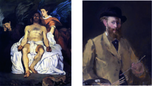
This prompts Rubin to draw a connection to the Self-Portrait with a Palette
(see Post 12).

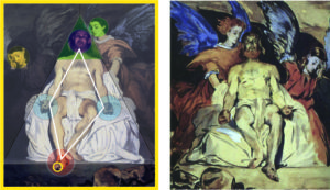
Figure 1:  Comparing Dead Christ with Angels(1864)  and Self-Portrait with a Palette (1879)

Here, I like to cite Rubin (2010) at length:

“Additionally, Christ’s body is so intensified  by its life size, frontal position, and proximity more blatant than in any art-historical precedent that as an image in reverse it could connote a literal mirror image of whoever contemplates it … imposing on the viewer’s actual space and forcing a response. “(p. 102-3; emphasis added)

“In his paintings of the 1860s, Manet responds not just to the eye but to the gaze; he represented not just the hand but its creative function; he imagined not only the appearance of the body but its vitality. The body, whether nude of clothed, was rarely neutral but rather powerfully present and communicating with the viewer’s realm as well as bearing the marks of the process of its creation.
The Dead Christ with Angels is the painting in which these characteristics are perhaps most compelling.
For here the marks of a corpse coming into being within art ironically suggest the opposite processes of decay and death….The drama of life and death, creative power and inanimate substance, is represented by the hand
– the hand of Christ as represented by the painter and, as in the self-portrait, by the painter’s hand painting itself.” (p.156; emphasis added)

Three themes are suggested by Rubin:
– Manet’s motivation to present himself in the image of Christ
– the meaning of the mirror
– the role of the eye and the hand in the representation of the painter and painting.

For all three themes Rubin offers an interpretation which goes beyond the limits of this post, and I recommend Rubin for deeper insights drawing on philosophy (Schopenhauer) and psychoanalysis (Lacan).
But I would like to add some comments in view of MyManet looking through the eyes of the painter in his aim to engage the viewer:

First, Manet does not imply a direct identification – the artist Manet as God-like – but Rubin points out that Dead Christ with Angels is an “optimistic work” (p.105). The artist, the viewer, and Christ’s realistic body are sharing a rather intimate space and a close relationship in the experienced presence meaning that there is a potential for transcending suffering and being creative not only as an artist.

Second, the mirror is an important means of self-reflection, not only in the process of painting a self-portrait, but also for the reflection of one’s identity and role in life.
The mirror is not shown directly in either painting; in Figure 2, I have added a yellow frame indicating the mirror. Rubin points out that the paintings create the impression of a close distance as taken in front of a mirror.
This is obvious in case of the self-portrait but also in both paintings of Christ.
In the case of Dead Christ, the wound of Christ from the spear (under his heart) is on the wrong side – as if reflected in a mirror. Critics at Manet’s time were quick to point out this “mistake”. Manet refused to correct this, apparently because the effect of a mirror was intended.

Figure 2: Christ embodying Manet’s scheme   and   Study to Dead Christ with Angels (1864)

In fact, in the study (Figure2), the image is not mirrored and the wound on the “correct” side.
Since the study is not a print (where we might expect a reversed image) but in oil, Manet is experimenting again.

Another clue for the existence of a mirror is not mentioned by Rubin.
Looking closely at the toes of Christ’s foot extending toward the front, we see a strange diffuse spot reminding of the painting hand in the self-portrait (Figure 1).
The toe seems to be touching the mirror! (yellow circle in Figure 2)
In the study this detail is not indicated and the foot is not extended so far forward.
Thus, Manet made the change deliberately.

The self-reflective gaze into the mirror draws the viewer (and the painter) into the space of the painting.
At the same time, by making explicit the role of the painting as a mirror image beyond the picture plane, the painter/viewer can distance himself or herself from the image and take a fresh and objective look.
In the case of the self-portrait, we saw that the painting initiated and mediated a communication between the painter, his image and the viewer by having the painter “seeing you”. In case of Dead Christ, both painter and viewer are asked to reflect on themselves as if “seen as Christ”.

Moreover, a special effect of Dead Christ resides in the fact that Christ is not looking at the painter/viewer but presumably to God Father – though with an inward or “absorbed” gaze. The mirror supports an expectation of Christ “looking at you”, while Christ’s gaze redirects your gaze to God or the “Big Other”.
In the study (Figure 2), Christ is looking more toward the viewer establishing a direct contact in the role of the First. In the finished painting, Manet redirects the viewer’s gaze toward the body and the hands, and directs Christ’s gaze away from the viewer.

Third, the redirection of the viewer’s gaze creates a very complex situation which leads us back to Manet’s scheme. Christ looking at God Father places him into the role of the Third looking outward. The two angels are “absorbed” in mourning (yellow); perhaps the one holding Christ from the back may be seen as doubling in the role of the “Other” (light green). I prefer interpreting the angels as creating the mourning atmosphere or a “coulisse” (this effect is stronger in the study) while Christ is presented “on stage” (light middle ground).
In the case of the self-portrait, I suggested that the self in the mirror may be seen in either of the four roles of the scheme.
In the case of Christ, we might see him incorporating all four roles:

The illumination on the “stage” creates a strange depth in the painting:
The foot reaches forward into the darker frontstage (enhanced in red), while the head recedes into the darker backstage (green triangle).
The gaze of Christ is directed inward/outward relating to the external “authority” or the “Big Other” (purple circle).
For the roles of the First and the Second, we return to Rubin’s interpretation relating the painter’s eye and hand. Eyes or gazes and hands or gestures constitute for Manet the space of painting.
In the self-portrait, the eye is “seeing” and representing reality, the hand is “performing” and presenting the reality as seen by the painter.

Christ is not looking at the viewer (or painter) but reaches out with his foot which bears the mark of a wound like an eye. Similarly, the two hands are opened and presented to us with their wounds like eyes.
Christ is “facing” us with his wounds.
The “eye” on his foot takes the role of the First (red circle), the “eyes” on his hands mediate in the middle ground taking the role of the Second (blue circles) and preserving the unity of Christ’s vulnerable body.
We have seen this unifying role already in the Luncheon on the Grass, where the hand of the Second – the person to the right – is placed in the centre of the triad with an inclusive gesture.
Finally, compared with the study, Manet places Christ’s head further back into the dark and moves the head of the caring angel into the light. This supports a double role of Christ:
– as the Third, he directs his dying gaze toward God Father;
– as the “Other”, he is looking from the dark background increasing his distance from the viewer who is focusing on the illuminated dead or dying body.

We need not agree on one or the other interpretation. Clearly, Manet is creating an ambiguous space, as Rubin characterizes it, with a dynamic of intimate approach and mourning retreat, of an optimistic view of life and a process of decay and death – “the drama of life and death”(Rubin).
The point is:

While Manet’s scheme is not immediately guiding the composition, as in Christ Mocked, we still can sense its influence in the way the dynamics of eye and hand, of gazes and gestures unfold in the painting and engage the viewer into an intimate social space.
Although the “drama of life and death” is the theme, Manet does not draw us into a dramatic narrative.
Again, Manet is presenting a “moment in between” and not telling a “story”.
Still, the two paintings of Christ are loaded with emotion compared with the other paintings we have considered so far.
But, typical for Manet, the emotions appear to “arrested” like the activities.
How does this fit into his formal scheme?

See you next week!

Manet’s Self-Portraits – Seeing Oneself Seeing (P12)

In the previous posts, I have developed a scheme which – as proposed by MyManet – is guiding Manet’s composition of Luncheon on the Grass. The claim is that this scheme is not only a scheme for this painting but is a “hidden scheme” informing also the composition of following paintings.

To show this, I first want to apply the scheme to his self-portraits.
Manet painted only two self-portraits late in his career 1878-9. He inserted small images of himself in early paintings like The Fishing and Music in the Tuileries, as we have seen, and later in Masked Ball at the Opera. But they were not self-portraits in the narrower sense, more like ironic comments.

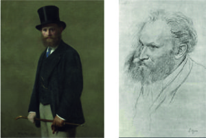
It seems that he did not especially like to paint self-portraits, although he liked his painter friends, for instance, Henri Fantin-Latour and Edgar Degas to picture him. Figure 1 shows two often reproduced pictures.

Figure 1: Portraits of Manet by Henri Fantin-Latour and Edgar Degas

The pictures and the self-portraits below show Manet as the “dandy” enjoying his life as a painter. And most references to the paintings just use them for illustrating this point. But there is more to them.

So, one question concerns the Why?
Why did Manet paint self-portraits rather late in his life?
An interesting remark by James Rubin (2010, p.372) suggests that “Manet’s self-portraits certainly look back to the dialogue of gazes in his pictures of Victorine and Morisot” (e.g. Luncheon on the Grass and The Balcony – RP).
Rubin does not elaborate this remark and goes on to suggest that they also “set the stage for A Bar at the Folies-Bergére”, the last great masterpiece by Manet.
This seems to imply that the self-portraits demonstrate in some way the scheme of MyManet, and that the scheme, in fact, never loses its relevance in Manet’s painting over the stages of his career.

But, obviously, a self-portrait is not the kind of painting to which we would expect the multi-person scheme to apply.
On the other hand, if I can show that the scheme helps to interpret Manet’s view of himself, that would be a great test for the scheme.
So, let us try!

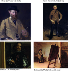
Figure 2 shows the two self-portraits by Manet and below a detail from Las Meninas by Velasquez with the master himself, and a painting by the very young Rembrandt standing somewhat lost in his bare atelier. Velazquez we have met in earlier posts as Manet’s idol. The little painting by Rembrandt I found in An Introduction to Art by Charles Harrison (2009).

Figure 2:  Manet’s Self-Portraits and Self-Portraits of Diego Velazquez and Rembrandt

Self-portraits typically show what Lüthy (2006) has described as “seeing oneself seeing”, the painter looks at himself or herself in the mirror (or in a photograph) and sees the image looking back.
This reflexivity is a welcome starting point for philosophical interpretations which the painter may or may not have entertained himself or herself.

I want to set these interpretations aside and rather take the view of MyManet. In this view, Manet is foremost a realist and attempts in all sincerity to “show what exists and what one sees” (see Post 10). This includes for him to place the activity of painting into a setting which implies a social space and an environment (e.g. his atelier) with actual (e.g. the model) or virtual (e.g. the viewer) others.

In this scheme, the figure in the self-portrait can be seen in different roles:

Case 1: The figure is the First looking and engaging the viewer and/or painter.
Most self-portraits, not only Manet’s, chose this role. The painter is presented as a person ready to communicate with the viewer, even when the figure is shown in different emotional states and signalling the incapacity or unwillingness to engage with the viewer and rather addresses himself or herself. In these cases, the painting demonstrates even more the reflexive engagement with the painter.

Case 2:  The figure is the Second, typically alone in the painting and looking outside the frame, although only to present the (half-)profile to the viewer.
The objects in view of this figure are irrelevant to the painting, of relevance may be the very fact that the painter does not show his frontal face. This creates a distance from the viewer which can signal, for instance, a social distance of a person of status.
Manet’s self-portrait standing in his atelier may be seen as a version of this case.

In fact, I think that this self-portrait is made exactly to experiment with this case, while the self-portrait with palette experiments with the other cases. Both paintings are created at the same time.
He can be interpreted to look critically at the painting itself rather than at the viewer, quasi looking from the side. The figure in the mirror (Manet) will be standing to the left of the painting and may even have a (virtual) view of the painting. This is suggested by Barbara Wittmann, although she sees the gaze of Manet both as “absent” and “intensely” observing, which appears to me incompatible and stretching the interpretation (2004, p.223).

I agree that a painter choosing to present himself as not looking at the viewer does present himself as an “Other” (p.220), but only in the general sense of being “objectively” represented. Thus, Manet shows himself in the role of the model, and the model in the mirror substitutes, as it were, as a kind of double for the unrepresented Second. The viewer, not being the centre of the figure’s gaze, might imagine that there is somebody else just outside the painting. This would be a normal reaction when looking at someone who is not looking at you.

This case 2 raises the interesting problem that Manet as the painter cannot see himself with the gaze of a Second
(or an absorbed figure) – the figure not looking back at him – in the mirror!
Nobody can – again, a great starting point for philosophical interpretations.
In the age of photography, already at Manet’s time, we can look at our image in profile or as absorbed gazing at some other object. Or we might have a friend like Degas who can draw us (see Figure 1). But we cannot see it in the mirror.

For a naturalistic realism, this is a problem because one cannot see and paint what one knows to exist – one’s view in profile – because one cannot see it. The realist Gustave Courbet famously said that he would paint an angel but only if he could see it. Well, he painted his self-portraits – like the image in The Painter’s Studio (Post 6) and many other self-portraits – without ever seeing it exactly that way. Following the tradition, he corrected the reversion by the mirror – showing the “real” Courbet he could not see –  sometimes on the basis of a photograph.
For Manet’s realism, this is not necessarily a crucial problem. It is a fact of everyday life that we do not see e.g. all sides of an object and that we have to infer the “hidden” views which show what exists.
In his self-portrait with the palette, he must deliberately have chosen to paint the mirrored image – showing what he sees! Why?
In the self-portrait standing he also shows the mirrored image. But he shows a face that he cannot have seen in the mirror! Why?

Case 3: The portrait can imagine the role of the Third.
In Figure 2, a charming example is the self-portrait of Rembrandt. Harrison apparently loves this little painting as much as I do. But I do think that he misinterprets the gaze of the young artist. Harrison points out that Rembrandt is not looking at his painting, and he suggests that the artist is looking at an imagined viewer (p.8-10). He provides a detailed view of the painting to prove his point. However, Rembrandt is not looking at the viewer of his painting, his gaze is directed slightly upward, and the imagined viewer would have to stand in a some elevated position more to the right. Actually, his gaze is very similar to the gaze of the Third in the scheme of Luncheon on the Grass, the male sitting next to the female engaging the viewer.
As indicated already in Case 2 about the Second, this is not a sight of himself which Rembrandt could have seen in real life or in a mirror. We have also no reason to assume that he looks at anyone or anything in particular existing unrepresented just outside the picture frame. Rembrandt presents himself as gazing at some idea or “authority”, perhaps inwardly in wonder about his future as an artist.

In the following unique and amazing series of self-portraits Rembrandt demonstrates how he explores his inner potential through a reflection expressed in self-portraits. Thus, the “Big Other” of Manet’s scheme, toward whom the Third is directing the gaze, might turn out to be the most inner self of a genius.  Georg Simmel in his analysis of Rembrandt (1916) has described how Rembrandt expresses his genius as a force from within the painting (like an actor expressing subjectively-involved his role on stage), while Velazquez and Manet are examples of artists who express a principle they experience in reality (like an actor presenting objectively-detached his role in a script). Applying the analogy of the theatre, we keep in mind that in painting the activity of the painter combines – like in a puppet theatre – the roles of the author, director, and performing artist. The sociologist and social philosopher Simmel, as I indicated earlier, is a key reference for MyManet.

Case 4: The portrait can express the role of “the Other”.
In this case, the viewer must have reason to believe that the painter has presented himself or herself as seen from an alternative viewpoint. As Lüthy argues, Manet does this by modelling himself in the pose of Velazquez (see Figure 2). In a sense, Velazquez is looking over Manet’s shoulder in the painting “from the back” just like the second woman in Luncheon on the Grass takes the view from backstage. But there is more to it. As I try to show shortly, Manet himself is looking “from the back”.
Here the point is that the painter looking in the mirror (or at a photograph) may take “the role of the other” and try to communicate something about himself or herself, showing not only what one sees, but showing what exists with clues in the painting. Manet consistently avoids “telling stories”, whether about other persons or himself. We expect that “the Other” will appear in his self-portrait only as the formal option of an alternative view, not as some more or less revealing information about his inner mental life.

As suggested above, Manet deliberately shows what he sees, i.e. the mirror image.
Except, the painting right hand holding the brush is not clearly depicted!
This has provoked interpretations by Fried, Wittmann, Lüthy, and others that Manet tries to show “realistically” his fast moving hand making bold brush strokes. He cannot paint it clearly – this “speed-model” holds – because he is moving his hand too fast. Wittmann offers additionally the view – the “close-up model” – that when moving his hand toward the mirror image it comes too close to be focused sharply.
I think both interpretations are not tenable:

The “speed-model” – as I like to call it here – conflicts with the overall impression of the painting.
Manet is clearly striking a pose, probably trying to simulate Velazquez. There is nothing hasty about it, not in his self-portrait and not in the model of Velazquez (see Figure 2). When painting any model, whether somebody else or your mirror image, you want the model to keep the pose, you study the pose, imprint it in your short-term memory, turn your eyes to the painting, and try to make the appropriate marks on the canvas correcting the painted image while doing it. Your head may be turning a bit and perhaps the body, too, but your hand “waits” until you secured an impression and turn to the painting.
A problem arises, when you try – like Manet – painting yourself in the pose of reaching with the brush hand toward the canvas. Still, there is no need to be quick, you just turn and move your hand toward the mirror creating the image of your hand close to the “canvas”. The problem is that in reaching out toward the mirror the mirrored hand also reaches out toward the “back” of the mirror plane and your brush hand will cover up its image! As Manet’s painting shows, you might only see your fingertips, since your eyes are somewhat to the left of the hand.

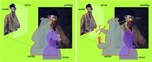
Figure 3 tries to reproduce the stage of painting and, then, the stage of leaning over to the left to create the mirror image with Manet’s brush hand close to the mirror plane. The mirror image follows his movement, and the hand covers its own image.

As to the “close-up model”, in this movement his mirrored hand never gets closer to his eyes than the mirror. So, we have no basis to assume a blurred perception of the brush hand.

Figure 3: Diagram of Manet painting
and Manet leaning to the left to move his brush hand close to the “canvas”/mirror.

In the movement, Manet has to be careful not to come too close to the mirror with his other hand holding the palette. Apparently, he was not careful enough, since the tips of the three brushes have touched the mirror surface. Being the true realist, he truthfully paints the three little dots – show what one sees!

The three dots, now indicate the mirror surface in the painting – although Manet does not show the mirror explicitly, say, by showing the frame. Manet is playing games with us, again.

Another problem arises with depicting the eyes. Manet is close to his mirror image – remember the three dots – and in this near distance one cannot look at both eyes at the same instant. Manet has to focus either on the left eye (his illuminated right eye) or on the right eye (his left eye in the shadow). Lüthy (2006, p.194) calls the left eye the “active eye” because it actively engages with the viewer, and the other eye the “passive eye” being only looked at by the viewer.

But Manet has again an optical problem. Looking at the active eye, he gets an impression of his gaze to the assumed viewer, but he cannot see his passive eye clearly. Shifting his focus to the passive eye, this eye is not passive anymore but actively looking at him!
In the painting, we now see a little cross-eyed Manet, since being the truthful realist he shows what he sees – just painting first one eye and then the other.

At this point, Manet is clearly leaving a naturalistic realism and accentuates what exists but cannot be seen by him when looking at the viewer with his presented, active eye. The eye in the shadow is somewhat enlarged and the face appears to be a little more frontal. The “other Manet” is looking at him – and at the viewer who shifts the focus to this “other eye”. We are reminded of the too large woman in the back of Luncheon on the Grass or of  The Absinthe Drinker representing Manet himself in the background of The Old Musician.

We return to the question why Manet is painting these self-portraits so late in his career.
Most interpretations refer to the increasing health issues which made him reflect more on his mortality, and, in fact, lead to his death only a few years later. I like to propose an interpretation which follows up on the remark by Rubin cited above, namely, that Manet wanted to reassert his version of realism in view of the growing success of impressionism and to return to the “dialogue of gazes” (Rubin) realized eventually in his last masterpiece.

The self-portrait can be understood as an impressionist painting if taken literally – painting your impressions or what you see. But Manet is deliberately showing the mirror image, not – as Fried suggests – because he wanted to show that his quick impressionistic style does not leave the time for reversing the image (1996, p. 397). Manet is playing games with this “realism of visual perception” and demonstrates his own “realism of the body” by showing the inconsistencies arising in the attempt to reduce the world to the visual image.
This emphasis on his self-critical realism against the impressionist explains also, why Manet is referring to Velazquez again after avoiding citations of the Spanish master in the 1870ies.

Manet does not even show the mirror, because it poses no genuine problem for him. For Manet, “there is no mirror to be penetrated” – as Pierre Courthion puts it – “Manet was not a painter of impressions, but of composed instants” (2004, p.33). His art is a “space inhabited by mankind – it is the poetry of space in painting” (p. 35).

I think even his self-portraits testify to the influence of Manet’s compositional scheme. So let us take a closer look at other paintings following Luncheon on the Grass where the influence is more explicit.

See you next week!

Manet’s Scheme: Composition in Social Space (P9)

Two essential features of composition in Manet’s scheme – in MyManet – are the figures’ gazes and the setting of the puppet theatre, or:
the relation between the social space of gazes and gestures and the material space of the setting on stage.
Manet made deliberate choices on both features when he created Luncheon on the Grass.
This we understand better looking at two studies for the Luncheon
and the X-ray visualizing Manet’s first draft underlying the final version.

In Figure 1, the four versions are compared, scaled to the same size, and supported by diagrams indicating perspectives:

Figure 1:   Comparison of four versions of the Luncheon on the Grass

A – the final version of Luncheon on the Grass 1863
B –  a later copy made by Manet himself dated between 1864-68
C –  a study in watercolour with pen and ink dated between 1863-65
D –  a print from an X-ray of the final version revealing a first draft

All four versions are presented and discussed by Juliet Wilson-Bareau (1986, p. 37ff)
– including a comparison with the painting Pastoral Concert by Titian and the etching by Raimondi after Raphael’s Judgment of Paris (see previous Post 8). Her X-ray analysis is a much acclaimed and quoted source in the discussion.

Wilson-Bareau proposes that the study (C) was made from the final version, and that the copy (B) was probably made even later. She concedes, however, that the sequence is only hypothetical since the exact dating is unresolved.

Her analysis demonstrates convincingly how Manet was experimenting with elements and their composition directly on the canvas and even at a late stage (like inserting and deleting a little dog to the left of the nude).
She concludes:
“One of Manet’s major problems with the Luncheon was evidently his difficulty in integrating the very solid, sculptural group into the original open and airy setting” (p. 39; title adapted as Luncheon).

In view of MyManet, I suggest a slightly different sequence and interpretation of his “problems”.

Two major changes are occurring between the draft in the X-ray (D) and the final version (A):

–  On the left side,
in the X-ray an open view reaches from the foreground to the open landscape beyond the river,
with grass and bushes in the foreground instead of the clothing of the nude in the final version.

–  In the group,
the gaze and position of the head of the man next to the nude is changed;
in the final version, he looks slightly upward into some undefined distance
rather than connecting with the other man as in the X-ray,
while his head – in relation to the nude’s face – is a little moved upward and forward in (A)
placing the three faces almost onto the same plane in the picture space.

Looking at the final version, the X-ray, and the study C, it is remarkable that all three versions show the same “solid, sculptural group”. This is indicated by the identical white triangles connecting the faces and by the position of the background female in the diagram of perspectives.
“Sculptural” may not be the appropriate term, since the triad is rather “flat” with the second woman set backward and too large in perspective. But I agree that the impression is rather “solid”; the formation of the four figures appears to be the same and clearly predetermined in all three versions, and rather independent from the landscape in the X-ray.

Taking up the first change:
Manet may have seen a “problem” with the integration into the landscape, but he resolves this “problem” in a rather unusual way by enhancing the difference between the landscape on left side and the solid group!

He introduces the “split horizon” from Pastoral Concert (the two perspectives in the diagram) and accentuates the vertical divide (left red line) by dark bushes and trees above the nude’s head.
Then, he keeps the “too large” woman pushing the background forward and the horizon upward and promotes the artificiality on the centre and right side – the “stage”.
He paints the background rather indistinct as “coulisse” and fits the triad into a middle ground with reduced depth. To maintain the balance under these conditions, he introduces in the foreground the elaborate “still life” to the left and a dominant dark tree to the right.
All this makes sense, when he is determined to preserve the formation of the group though violating a “natural” perspective. He is not caring about integrating the group “into the original open and airy setting” (see Wilson-Bareau above).
Manet invents a programmatic scheme.

Taking up the second change, the gaze of the man next to the nude:
This change raises the question of the role and dating of the study (C).
Wilson-Bareau suggests that the study is made after the fact, after completion of the final version. Her argument appears to be that the study reflects too closely the original to precede it.
Placed before the X-ray, the differences of the study with the X-ray become incomprehensible.
Placed between X-ray and final version, Wilson-Bareau apparently would expect more resemblance with the X-ray.
But why would Manet do that kind of study after the fact?
Certainly not to prepare the later version (B) which is in many ways different again, as I will show below.

An alternative interpretation is suggested in MyManet.

First, it is telling that the left side of the painting is not explicated in the study. This side includes in the final version the attractive “still life”. Why would this be neglected in the – admittedly, unfinished – study?
Second, it seems that Manet wanted to clarify the formation of the group before changing the left side:

The crucial change from the X-ray appears to be the face and head of the man next to the nude!

For the direction of this gaze Manet has no example in either Pastoral Concert or Judgement of Paris. He has to decide where the man should look, and he is not satisfied with an internal communicating gaze to the other male or with an “absorbed” gaze within the triad – as in the X-ray.
If Judgement of Paris is to be the model, then the gaze has to be directed toward the “authority” or Big Other – the god Jupiter arriving from the sky.
Thus seeing the study as an experiment for the gaze of the Third – in terms of MyManet – also underlines the importance that Manet attaches to this gaze!
To my knowledge, only Gisela Hopp (1968, p.23) has declared the gaze of the Third, in connection with the gaze of the nude, a decisive centre of gravity in the design of the painting, although she tries to derive this crucial role only in terms of internal design of areas, colours and perspectives.
(In her words: “Sein Blick ist erst der endgültige Kernpunkt des Bildes, nicht zu lösen von dem der Frau, aber auch für diesen Ausgangs- und Anziehungspunkt.”)
MyManet could not agree more!

It is interesting or puzzling that the nude’s gaze in the study (C) seems to follow the gaze of the man next to her – not gazing to the viewer! This is difficult to understand, if the study is made after the final version, as Wilson-Bareau proposes.
Rather, experimenting with her gaze in conjunction with experimenting with his gaze demonstrates what Manet is attempting: designing the interactive effects of the gazes in constituting a certain social and pictorial space.
When the nude is not looking at the viewer, the interaction with the viewer is lost and the gaze of the man is not effective anymore either, because it loses its singular force.

Finally, we have to consider the later copy (B).

Wilson-Bareau offers a questionable interpretation – from the view of MyManet.
She perceives in the copy “a more coherent, close-knit relationship between the foreground figures, while … improving the perspective view of the bather in the background” (p.39).
In my view, Manet appears to be testing after the fact and after receiving all kinds of harsh criticisms about his “failures”, whether his programmatic scheme is successful in achieving what he wants to achieve.
He revises all the major changes which account for the originality and modernity of Luncheon on the Grass:

  • The perspective is “improved” by reducing the size of the background woman, setting her lower and lowering the horizon, and creating a more integrated background across the painting breaking the dark vertical above the nude.
  • The man to the right is moved closer to the other two figures creating more intimacy (see right red line and perspective). He is also positioned a little bit lower and to the front (white triangle), while the other man appears a little smaller following the perspective toward the woman in the back.
    Together, these changes produce a less “flat” middle ground extending into the depth of the painting.
  • The man next to the nude is now modestly looking toward the man to the right – sinking back into insignificance.

The result is a more “natural” setting which might have caused less of a scandal, because viewers could “read” those pastoral scenes – but we certainly would not be talking about this painting as a starting point for modern art!
The dynamics in the composition – the perceived lack of intelligibility, of inconsistencies and ambiguities – aroused the criticism of the art community, but caused also the later recognition of its ingenuity.

No wonder that Manet did not finish or exhibit this version!
Maybe he kept it ready at hand in his studio to show it to anybody worth to be engaged into a discussion about his innovative great scheme in the final version.

To be sure, this scheme is a hypothesis about the concepts guiding Manet. But I think it demonstrates two things:

  • It is necessary to consider not only the sources inspiring Manet to understand his compositions, especially, since he is substantially changing and adapting them to the needs of the emerging painting.
  • It is not enough to interpret Manet’s composition as “defined in terms of their rejection of academic conventions” (John House 1986, p. 12). The rejection is a critical attitude certainly shared by Manet, but it does not yet explain the programmatic choices and specific innovations introduced by Manet.

Time to summarize the elements of this scheme in form of a diagram integrating the results so far:

Figure 2:   Manet’s Scheme – Composition in Social Space

The diagram should not be understood as a “manual” which Manet is following in the composition of Luncheon on the Grass, or in the creation of any of the other paintings to which we will apply the scheme. The diagram is mediating between the painting itself as experienced by us today and the process of painting as an event happening about 160 years ago. It is a tool for understanding – as are all diagrams – not a “theory” of the painting.

The essential dynamic is the interaction of social and pictorial space, of the roles outside the painting with the roles inside the painting.
Obviously, such a dynamic is – in the strict sense – only meaningful in figurative painting. And not all figurative paintings, and not all of Manet’s figurative paintings, are exemplifying this scheme as developed in Luncheon.
To understand our experience of other types of painting, we will have to introduce new concepts and schemes which appeal to different ways of relating to “What do pictures want?”(Mitchell 2005).

Manet is inspired by the structure of the puppet theatre which provides a model or stage for the activity of painting.
As anybody who has witnessed a puppet performance knows, there is no clearly defined inside and outside in the relation between audience and performance. The relationship is negotiated as the “show goes on” in each performance.
In terms of painting, we should imagine a situated installation artwork with the painting presenting certain elements “performing” on the “stage” carried by the canvas. The essential medium for this “performance” is the way our eyes move through the painting following the network of gazes and gestures of figures in the painting while engaging us and other agents outside the painting. In a sense, the relations are the “spiderweb” that stretches the social and spatial relations “in mid-air” reaching beyond the frame.

As indicated in Figure 2, Manet does not see these relations as realized on the flat surface of the canvas, although he is certainly aware of the material vehicle. He creates his own version of a socio-spatial “reality” which does not follow the rules of perspectives but stages figures and objects in a layered way, similar to a collage.
The “stage” is structured into a picture space rather narrow in depth and delimited by a front plane and a back plane. The front plane defines the foreground and is often accentuated by a “still life”, symbolized in the diagram by the lemon.
The picture space holds the triad of social roles with the First relating to the viewer and the painter, the Second integrating the relations on stage, and the Third linking to the “world beyond”, to society and tradition, symbolized as the Big Other or – in Manet’s case – by his idol of painting Diego Velazquez.

An interesting role in Manet’s scheme is taken by the “Other”. The “Other” reflects Manet’s insight that placing the scene “on stage” – like a puppet theatre performance – implies that there is an alternative perspective “from the back”. This “Other” may be represented within the picture, “painted on the coulisse” as in Luncheon, but the role may be only implied by the way the scene is staged.
As we will see in some interpretations of Manet, this “Other” – besides the relation between Third and Big Other – provides a welcome entrance for psychological or psychoanalytical interpretations looking from an unconscious “deep back stage” (often symbolized by a dark background) or for sociological interpretations emphasizing societal influences.

Similarly, the other external agents may be presented or unrepresented and only invoked by elements in the painting. Manet strongly reminds us of the presence of the painter by the very style of his painting. The viewer is, obviously, engaged by the outward gaze of the First; only on rare occasions does Manet introduce a “represented” viewer. The Big Other is implied by the diversion of the gaze of the Third, which avoids the gaze of the viewer and makes the viewer aware that looking at the painting is not only an individual subjective affair by the viewer – there is a “world beyond”. Finally, we have seen that Manet produces an awareness for the model – in case of Luncheon, by the amused gaze of Victorine Meurent who contacts the painter Manet in the process of painting.

The diagram offers a tool especially for the structural features of Manet’s scheme.
In that sense, it can be understood as representing aspects of the aesthetic form of the painting. However, the scheme is not simply aesthetic, it is incorporating a social form. It reflects how Manet (and, consequently, how the viewer) experiences the social reality and transforms it aesthetically in the painting.
This interaction between social form and aesthetic form, between the social reality of the painter and the development of new ways of seeing and expressing the reality in painting, has been brilliantly described, in the case of impressionism, by Robert Herbert (1988).

Obviously, the diagram does not tell us everything about Manet’s approach to painting.
There is much more to be told about the form and content of Luncheon on the Grass.
The diagram must be placed in a broader context to be meaningful.

Two important themes, we have already identified and postponed:
One theme is about the question how the paradigm of a puppet theatre can be aligned with Manet’s avoidance of “telling stories”. His figures are typically not engaged in clearly identified activities.
Another theme is closely related; it is about Manet’s realism which seems in conflict with the idea of a puppet theatre as well as with the application of an abstract compositional scheme.
Enough stuff for another post!

Meet you next week!

Powered by WordPress & Theme by Anders Norén