For some critics, Manet is foremost a painter interested in the subject only as an occasion to paint – and avoiding a clear political message.
For other interpreters of his art, Manet is one of the most political painters of his time and an engaged participant in the political events.
His most political painting – The Execution of Emperor Maximilian – is claimed as an example for both positions:
Figure 1: The Execution of Emperor Maximilian (1867) 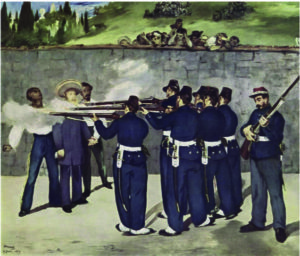 and The Barricade (1871)

On the one hand,
the painting is seen as a case for Manet’s search for “pure art for art’s sake”.
How else can you account for the lack of great emotions and dramatic action in a painting of an execution?
On the other hand,
Manet is seen as searching for an alternative to traditional, pompous history painting and making a political statement exactly by frustrating expectations.
Usually, The Barricade (1871) – depicting a dramatic scene of soldiers shooting activists of the Parisian Commune is shown to demonstrate that Manet is also a political artist.
In this post, I will not comment at any length on this debate.
Certainly, being a political painter in Manet’s time was totally different from today. The execution in June, 1867, was the result of Napoleon III’s attempt to install Maximilian as Emperor of Mexico. The Mexican insurgents under Benito Juarez liberated their country, and captured Maximilian who was left behind by the French army retreating to France.
Napoleon III strictly prohibited any artistic comments on the event.
So, Manet used “a razor-sharp irony” (Rubin) hiding his political commentary in subtle ways.
The sergeant to the right looked much like Napoleon III in the second version. The soldiers’ uniforms were similar to French uniforms. Thus, it could seem that French soldiers were executing the Emperor.
Although Manet changed that in later versions, the painting was excluded from the Salon exhibition. The painting was not shown in France during his lifetime (only on an exhibition in the USA, without any great success). Manet himself, however, considered it one of his most valuable paintings.
For the description of the historical event itself, I refer to the extensive literature.
A most informative account, I have found in Joachim Kaak (2014) who discusses Manet’s political paintings and demonstrates the political undercurrent also in other works (unfortunately only in German; but see Sandblad 1954; Hanson 1977; Fried 1998).
For MyManet, two aspects provide an important background:
First, there was an intensive public debate about the event (not only) in France. Manet followed it closely and produced five versions of the painting starting already in July and incorporating new information about the event as it became available.
This in itself testifies to his political engagement and his determination to create a realistic as well as symbolically convincing representation.
Second, the public reception and evaluation of the event changed during the process, at least for republicans like Manet, from seeing the execution as an horrific crime of Mexican bandits to recognizing a regular army legitimately liberating their country from a foreign regime.
Accordingly, for instance, the uniforms of the soldiers changed after the first version (Figure 3).
At least equally important for the changes – as “updating” the content and evaluation of the event – were the compositional problems encountered by Manet.
Some problems are best understood as resulting from his new realistic approach to historical painting. These issues are usually addressed by commentators.
Other problems concerning the structural composition and resulting in changes over the versions are often noted but not sufficiently explained. These are questions as to why Manet experimented with certain changes.
In view of MyManet,
these WHY-question may be better understood as motivated by Manet’s scheme!
This does not turn The Execution into a clear case of the scheme but throws some light on the development of the final version.
Let us look first at the approach of Manet to painting historical scenes.
An illuminating way may be the comparison of The Execution with one of the “most famous History paintings” (Lüthy) by Manet’s idol, Diego Velazquez The Surrender of Breda (1635) and Goya’s The Third of May (1814) which is even more widely known.
Both paintings are certainly great examples of history painting and motivating Manet.
But they also demonstrate what Manet not wanted to do.
Figure 2: Comparing history paintings
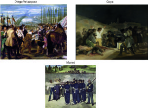
Velazquez’s painting is showing a simple interaction – the surrender of the key of the city of Breda – and he places the scene into an impressive setting of two opposing armies and a burning city in the background. The painting is lacking the pathos of most history paintings which Manet despised. It displays a realism which Manet admired without failing to express the symbolic importance of the event. It rather shows a quite human touch between the two generals exchanging the key. It even includes the viewer by at least four participants (and a horse) looking directly out of the picture, one at the edge to the left in a position Manet chose for himself in Music in the Tuileries. Another central soldier in a white uniform (inspiring Goya?) is rather absorbed in own thoughts reminding of the soldier to the right in The Execution.
Manet follows Velazquez in avoiding the pathos and showing the human side of the event, but he clearly wants to simplify the scene by a focus on the interaction and by eliminating the extensive historical setting.
Goya succeeds in bringing the focal interaction – the shooting – to the forefront.
But he loads the scene with emotion in a way which for Manet is too much drama.
Now, the violent event clearly calls for an emotional reaction in the viewer.
But Manet seems to have asked himself if there is a realistic way of showing a historic event in its timeless importance beyond the description of particular scene and avoiding Romantic “story telling” and “emotional drama”.
Critics often imply that Manet had to choose between emphasizing a Romantic narrative about the historical event or the formal structure of “pure painting” – less content implying more reliance on pictorial structure (Lüthy 2003).
But there is a third option: Showing an enduring social reality beneath the contingencies of the concrete historical event.
Manet’s realism wanted to capture the “universal symbol” (Sandblad) in the historical event,
or the “human condition” expressed in the “cold actuality” embedded in the action rather than a “gestured drama “(Hanson).
Beth Archer Brombert offers the wonderful formulation: “For Manet the human figure replaced nature as the source of meaning – human frailty, human mortality, human futility. And the light he cast on it has no beginning and no end; it is a light as eternal as nature.” (1996, p.215)
In MyManet, we would add – looking at The Execution – that realism of human figures replaces naturalism throwing an “eternal light” on a social reality encompassing not only the suffering of victims but also the exercise of power – and supporting reflection on the legitimacy of human actions (symbolized by the detached sergeant to the right).
The paintings by Velazquez and Goya are both political in the sense that they describe an important political event. They message is, however, very different.
Velazquez shows the moment after violence when building up trust is the political goal – even including the viewer in the hope for a future, legitimate regime.
Goya shows the moment of violence when the demonstration of brutal power is the goal of the regime while destroying the legitimacy of the act by the overwhelming tragedy imposed on victims and onlookers.
While Velazquez’s painting is inclusive, Goya’s is confrontational – within the painting and in relation to the viewer!
Obviously, Manet faces a problem:
How to show an act of political violence against an Emperor – perceived personally as a man of human dignity – without questioning the legitimacy of the quest for political freedom by the Mexicans? (Especially, when Napoleon III looms in the background as responsible for the event.)
The dualism opposing “good” on the left side and “evil” on the right side in Goya’s painting does not apply that readily in Manet’s case. The political dimension – the content of the painting – causes the problem of reflecting the complexity in a compositional form.
Usually, art historians point out that Manet was inspired by Goya’s dualistic composition, but the differences are often neglected or underrated. A major difference is that Manet distinguishes three major parts – the victims to the left, the soldiers in the centre, and a separate figure (or two) on the right (Figure 3).
Figure 3: The Execution of Emperor Maximilian – five versions 1867 to 1869, distinguished by their current location “Boston”, “London”, a lithograph (London), “Copenhagen”, and “Mannheim” (final version with added markings)
 Mannheim

Juliet Wilson-Bareau (1986) in her detailed analysis of the five versions and the underpaintings (visible by X-ray) argues that Manet did not especially like Goya’s paintings. He “may have been more impressed by his prints and by the striking reproduction of the Third of May, just published in Paris. In the final analysis, Manet’s design was no doubt based as much on general patterns of representations of an execution, and his own deeply felt response to the accounts of the drama, as on any specific source (p. 51; emphasis added).”
She does not elaborate what these “general patterns” are, but she does emphasize that the most striking fact about the five versions is that the basic structure of three major parts was not changed.
This “general pattern” does not correspond to the dualistic opposition in Goya, and we should look for some other source.
So, let us consider Manet’s scheme as the underlying compositional pattern!
As a starting point, we should look at the overall strategy.
Especially in the first “Boston” version, Manet is moving the figures closer to the front, so they occupy nearly the whole canvas. “Zooming in” places the focus squarely on the participants, the historical scene is reduced to the scale of the human interaction.
The picture space is divided into three parts for the victims, the soldiers, and the figures to the right (black verticals in Figure 3). In the final version, the figure to the right, the sergeant, takes less space but is clearly distinguished. The three spaces appear to be illuminated by different light sources throwing shadows at distinct angles.
With this strategy, the figures are “on their own” – overarching historical or societal contexts of interpretation are eliminated. The interaction is unfolding between these individuals. This makes their gazes and gestures, their positions and relationships, all the more important and symbolic.
The three spaces help also to cope with another challenge, the number of participants.
Clearly, Manet’s scheme is blatantly overpopulated by three victims, six soldiers, a sergeant, and an officer, besides the crowd overlooking the wall. Sticking to a realistic approach, there is little he can do about it.
Therefore, spaces serve to group the participants; they are standing collectively for a position in the scheme.
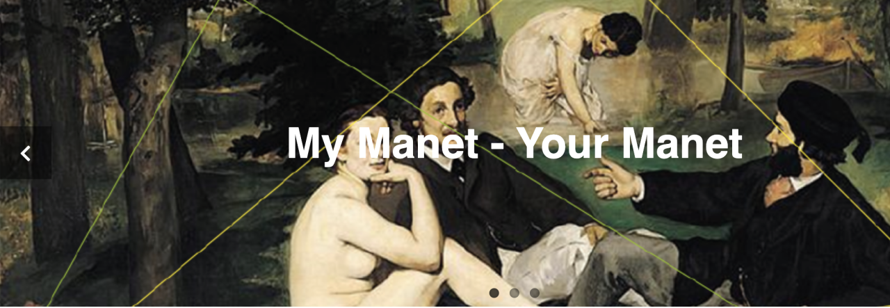
This invites the application of a reduced version of Manet’s scheme to both Goya and Luncheon on the Grass as in Figure 4 (agents outside the picture space are left out here):
Figure 4: Reduced version of Manet’s scheme comparing
Goya’s Third of March and Luncheon on the Grass

Goya distinguishes only to spaces, “good” and “evil “or “white” and “black” figures, and perhaps the onlookers (green).
Manet differentiates a triad of First (red), Second (blue), and Third (purple), “Other”/onlooker (green), and absorbed figures (yellow) (as optional, not included in Luncheon).
Two differences are crucial:
- Manet has to deal with the position of the First engaging the viewer, and
- the relations within the picture space between Second and First/Third are now a dominant power relation which cannot contain a First directly engaging the viewer without distracting and subtracting from the force imposed on the victims.
The differences amount to (at least) six challenges or issues Manet must resolve – each answering to a question typically asked by critics:
- WHY does Manet introduce the figure on the right?
In the “Boston” version, the answer seems obvious: Manet wants to engage the viewer like Velazquez above (Figure 2). The figure is clearly distinguished by his Mexican peasant dress from the other soldiers, while the second figure, presumably the commanding officer with a saber, is only indicated.
The problem is, as already mentioned, that this distracts from the central theme – the shooting. Manet seems to decide that an overt First (red) does not serve his purpose, the action has to speak for itself and confront the viewer.
But he does not give up his triadic scheme, he rather changes the role of the First. The separation and detachment of the sergeant preparing his rifle creates a very compelling focus engaging the viewer exactly by the contrast with the tragedy he seems to be oblivious to.
His space seems to call on the viewer to reflect on the meaning of the event. His role is exactly the same as the First in Luncheon, it is only defined by a gesture rather than a gaze. (Fried (1998) even suggests that the figure is an allusion to the painter Manet – with the soldier contemplating his rifle as a painter would his palette; this underlying relation, we also saw in Luncheon.)
- WHY does Manet move the soldiers into the centre and detaches one soldier slightly from the group almost joining the space of the victims?
Many commentators see the soldiers as a compact group. This is certainly intended by Manet to enhance the impression of a brute force directed toward the victims. The direction is not only signified by the rifles, there is also a horizontal rhythm moving through the group created by the white patches of their belts, swords, and gaiters.
Still, the left soldier is somewhat detached and marks an own vertical line (white in Figure 3) running from his shoes (pointed in different directions!), through the white cloud above his head to the left edge of the onlooking peasants, even dividing the background into a rising hill and the cemetery with cypresses to the left. In the lithograph, Manet is even experimenting with a corner in the wall (black vertical) accentuating the soldier, and with a wall running now diagonally behind the victims distinguishing their space.
Manet has to find a solution for six or seven people (including the officer) to stand in for the position of the Second. Moreover, he faces the issue that those soldiers are neither clearly the “bad guys” nor the “good guys”. They are Mexican freedom fighters shooting French nobility. Manet choses to accentuate the position of the Second as a symbol in one soldier while grouping the others as an anonymous collective. Additionally, he signals the ambiguity in their mission by the slight separation and by diffusing the boundary between their space and the space of the victims by overlap or intrusion and by gun smoke.
- WHY are the victims depicted rather blurred by smoke and not expressing their tragedy like in Goya?
One reason, certainly, rests in the ambiguous role of the victims. In one political perspective, they are the victims of violence; in another perspective, they are foreign imperialists, the Emperor, if not traitors to their own country, the generals. Manet surely wanted to avoid openly taking sides and to highlight the human tragedy beyond national politics. His political convictions were known, and he indicated them by subtle ironies to those who could “read between the lines”.
Another reason might be that Manet wanted the three victims forming a unity signifying the position of the Third. This position in his scheme addresses the “higher authority” beyond the picture frame. Their heads rise above the gun smoke, and their space has a strong vertical orientation continuing in the cypresses beyond the wall. Most important perhaps is the bright yellow rim of the Emperor’s sombrero reminding of a Christian saint (and Manet certainly did not miss the irony that a Mexican sombrero signified the Emperor’s appeal to a higher authority).
In the final version, Manet accentuated the individuality of the three victims in their gazes and gestures. Presumably, he did it to balance their impact against the prominence of the soldiers. But, perhaps, he wanted them to communicate with their gazes also across the painting to the sergeant appealing to his (and the viewers) reflection on the event – and closing the triadic relation in the scheme.
- WHY is the officer eliminated in the final version?
Descriptions and photographs clearly contained the role of the commanding officer who gave the signal for the execution with his saber. Manet included him in all but the final version (white circle in Figure 3). In a social science perspective, I would have liked Manet to find a place for the officer, because it is somewhat questionable to leave the soldiers “on their own” in such an event. Micro politics must include the lowest level of management, as it were.
But it seems that Manet had compositional challenges to solve. For once, the saber introduced a distracting and disturbing directionality intersecting with the direction of the rifle of the sergeant exactly in the space between the soldiers and the sergeant. Moreover, the officer himself was closing the space between them. As discussed in WHY 2, the relative isolation of the sergeant was crucial for his role engaging the viewer. Thus, Manet deleted the officer in the final version and kept a sober greyish wall.
- WHY did Manet give up the open background in the first two versions and introduced a wall?
Velazquez and Goya both staged their interaction in an open space signalling the historical and national relevance of the event. Manet “zoomed in” – as we said above – eliminating most of the context. The experiment with an open space in the “London” version was apparently so disappointing that Manet cut up the painting leaving us with fragments. Producing a wall as a background instead, is not very realistic; we would expect at least that the wall runs diagonally behind the victims as indicated in the lithograph. Equipped with Manet’s scheme, however, we should not be surprised. Closing the background with a coulisse, creating a narrow stage, and pushing the figures to the front is a familiar strategy by now.
This is the “puppet theatre” setting of Manet’s scheme!
- WHY does Manet attribute a more prominent and defined role to the peasant crowd in the final version?
Again, referring to Manet’s scheme we should not be surprised. The onlookers, obviously, fulfil the role of the “Other” looking from the back. They create the social space of the scheme in their relationship to the scene and to the viewer in front of the painting. The onlookers, moreover, help to define the space of the soldiers by hovering exactly above them marking their space.
Manet does not always include this role explicitly, as we have seen, but in this case – compare Goya – and with a widely and controversially discussed public event, it is clearly asked by the scheme to include the “Other”. Fried (1998) confesses that he wished Manet had eliminated the onlookers. In his view, Manet made a great effort to control the “theatricality” of the painting in suppressing emotion and drama – and the onlookers convert the scene into a stage event!
Well, Fried may have a point here, but the enhancement of the role of the “Other” strengthens the view of MyManet. It demonstrates again the relevance of Manet’s scheme in explaining the changes to the final version.
In summary, we have seen that Manet’s scheme helps to interpret the “logic” behind the changes Manet introduced in the development of the final version. The painting is not a straightforward application of the scheme, but its composition is still inspired by it. In view of MyManet, the often attested “emptiness” or the impression of “absence” of meaning (Bataille 1955) is at least partly due to two fundamental problems Manet had to solve: the moral ambiguity of the event and the representation of positions in his scheme by groups rather than individuals. The result is a history painting which impresses by its lack of individual emotions and by the presence of a timeless tragedy.
I tried to demonstrate that Manet was a political painter. I also pointed out that Manet had to cope with an interdependence of content and form, of expressing social relations of power and representing these relations in his scheme. We encountered this interdependence between content and form already in the case of emotions. In the next post, I would like to take a closer look at this interdependence.
See You in two weeks!
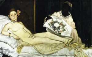 and Venus of Urbino by Titian (1538)