In the previous post, I raised the question what I have learned from submitting paintings with a strong diagrammatic element – applying concepts and ideas from MyManet – to the Annual Exhibition of my art society.
One conclusion was that I still have a lot to learn as an aspiring painter.
But I also learned from the experience more about Manet and how the diagrammatic element in his scheme results from the content, from the objects and relations depicted.
If diagrammatic structures are intimately related to the content of Manet’s painting, then “painting diagrams” is one way to understand his art.
Figure 1: Compairing two Group Portraits

How innovative Manet’s approach is can be understood better, perhaps, when we compare it with the tradition of group portraits in the Dutch painting tradition of Rembrandt and Frans Hals.
Two examples are shown in Figure 1.
Heike Baare (2009) has offered an inspiring analysis of Manet’s multi-figure paintings comparing them with those group portraits. (Actually, she refers especially to the art historian Alois Riegl who is cited also by other critics of Manet, e.g. Michael Lüthy and Richard Wollheim referred to in previous posts.)
Here, I will extract – irresponsibly simplifying her and Riegl’s arguments – only one interesting observation on the problem of group portraits:
Group portraits show a number of persons which are identifiable as particular individuals, for instance the participants of a lecture (Rembrandt) or of a board of an institution (Hals). The painter needs to arrange the portraits (or whole figures) in a composition and has two options,
- either to arrange them in a formal composition distributing them somehow balanced in the picture space,
- or to show the figures engaged in some activity which assigns each figure a meaningful position and provides a “story” about their relations.
Obviously, these are not alternatives but can be combined in varying degrees.
Rembrandt choses to provide an underlying “story” showing the participants of a lesson;
Hals arranges the portraits formally in the picture space just indicating a common physical space.
The more the painter refrains from offering an internal “story”, the more the viewer is put into the position to provide a unity to the group and will feel the need to invent an external story to make sense of the painting.
This is especially the case, because some of the figures – following the logic of portraits – may look at the viewer and engaging him or her.
In the case of Rembrandt, the figure in the upper centre is looking into the general direction of the viewer, but not engaging the viewer; in the case of Hals, two women appear to engage with the viewer, while the focus of the other three is unclear to the viewer just as in many portraits.
In as much as the viewer fails to detect some unifying relationships, the unity of the painting will rely solely on the formal composition.
Balancing the composition becomes a formidable issue, since all portrayed individuals want to be adequately represented. Nobody wants to play a side role – unless the role is grounded in the social position in the group, as in case of the lecturer in Rembrandt’s painting.
To solve the problem, Rembrandt finds a quite ingenious solution:
He shows all of the figures as being attentive to the lecture and five of them to the book in the foreground.
This way, everybody is sharing the same role, except for the lecturer who is obviously in a special position but not enhancing his role by engaging the viewer.
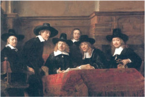
More radical is Rembrandt’s solution in The Syndics (Figure 2), where the figures are attentive to somebody next to the viewer outside the picture space and in front of the painting.
At the same time, Rembrandt is refraining from “telling a story” – like he did in The Anatomy Lesson. Instead, the gazes create a dynamic which, on the one hand, is much more compelling than the additive portraits by Hals, while, on the other hand, avoiding the impression of a genre painting telling a story about everyday life. And the viewer is assigned a very important role in the composition.
Rembrandt is quite daring in The Syndics, and the painting must have fascinated Manet on his visit to The Netherlands.
Figure 2: Rembrandt The Syndics of the Draper’s Guild (1662)

Rembrandt’s reaching out to the space of the viewer invites a comparison with Manet’s scheme:
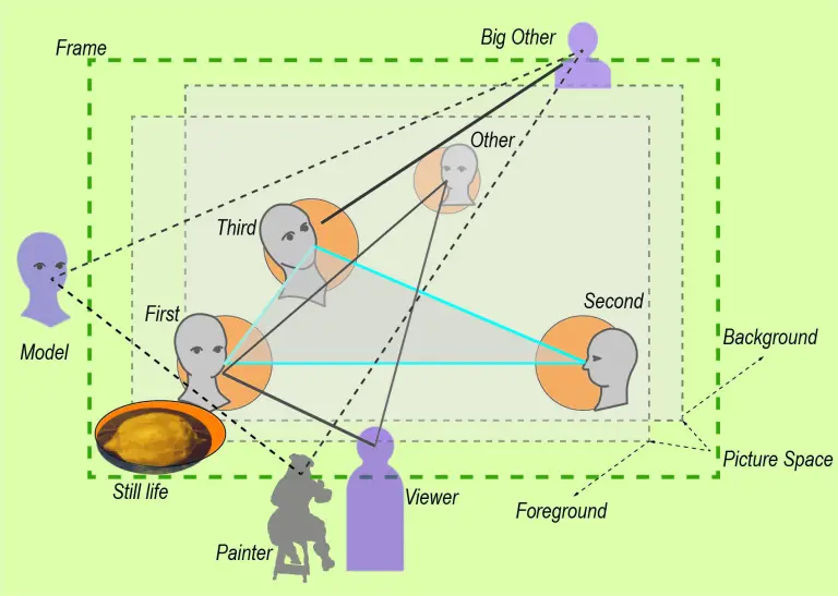
The central figure might best be seen as thinking with a gaze beyond the painting – as a Third in Manet’s scheme.
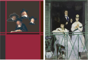
The gazes of the three figures to the right and the figure on the edge to the left dominate the painting paying attention to an unrepresented “other” outside the painting. Their role in Manet’s scheme is comparable to the Second (Berthe Morisot) in The Balcony gazing outside of the picture space to the left (see Figure 3).
Figure 3: Relating the gazes in Rembrandt’s The Syndics to the gazes in Manet’s The Balcony

Rembrandt shows three figures in this role accentuating this gaze. We can assume that this is partly due to the fact that he has to somehow accommodate six figures. Comparing it with Manet’s The Balcony (left side of Figure 3), we might, therefore, eliminate two of them as redundant.
Then, Rembrandt applies the strategy of The Anatomy Lesson of creating dynamic tension by a common focus of these gazes. But there, he captured their gazes by the book within the painting (see Figure 2), now their gazes reach out of the picture space. But the three gazes are crossing the picture space meeting the gaze of the fourth figure at the position of the unrepresented “other”. Thus, they are more contributing to the unity of composition than the disrupting gaze to the left in The Balcony. Re-arranging the gazes in Rembrandt following the composition of The Balcony (see the left side of Figure 3) demonstrates the disruptive effect. Manet is anchoring the composition with the gaze of the First (the lady to the right engaging the viewer).
This role of the First has no direct counterpart in Rembrandt’s composition. However, there is another interesting feature: The second figure in Rembrandt (from the left) might imply another unrepresented “other” to the right of the viewer. Thus, the viewer finds herself or himself between two other persons in front of the painting which has a similar engaging effect as Manet’s First.
In Manet’s scheme, this figure would occupy the role of the “other” completing the social space by a perspective on the group from the back (see left of Figure 3) rather than – like Rembrandt – populating the space in front of the painting with another viewer. With Michael Fried, we might say that Rembrandt produces a “facingness” of the whole painting without implying one viewer at a specific position in front of the painting. Still, the painting is showing a unity arising from the gazes within the painting, which is missing in the “additive” faces in Frans Hals’ composition.
Manet’s approach is even more disruptive by confronting the viewer with very diverging gazes which appear not to be harmonized by a unifying interaction with the space of the viewer. Worse still, the space of the viewer itself is ambiguously defined, since in front of the picture space the viewer seems to be hanging in mid-air (or standing at an opposite window?) and in the background the viewer is confronted with an almost totally black space which only indicates that someone is or could be looking out toward the group and the viewer.
In view of MyManet, comparing the paintings by Hals, Rembrandt and Manet, we see that
- Hals presupposes that the viewer – guided by the formal composition – will be coordinating the group of portraits into the unity of a painting.
- Rembrandt creates a dynamic of gazes within the painting producing a unity which engages the viewer in front of the painting.
- Manet creates a complex social space through gazes relating the figures within the painting to unrepresented “others” – including the viewer – outside the painting and risking the unity of the painting in the process.
As pointed out in Post 20 discussing The Balcony, Manet supports the unity of the composition with a very strong frame in bright green colour. However, standing in front of the painting (as I had the opportunity a few months ago) one cannot help but realizing the tension created by the divergence of the social space of gazes that is only tamed by the physical space of a railed balcony.
The problem of the traditional Dutch group portrait, as sketched out above, was to decide (and to solve by composition) which role the viewer had to assume. The viewer could be enlisted to coordinate externally the portraits of the group by an interpretation, or the activities and relationships of the figures within the painting would internally provide a unity (“story”) which the viewer could readily engage with. The latter strategy ran the risk that the internal relations would assign roles to the portrayed persons which they would not readily accept.
This problem is, obviously, also important in Manet’s multi-figure paintings. Although his problem is not so much that the individuals want to have a fair place in the painting. Manet’s figures are identifiable, but not intended as a group portrait. They are typically family members, friends or professional models who will accept their assigned role (Fanny Claus, the second woman next to Berthe Morisot in The Balcony was apparently not so happy with her role.)
However, the basic problem applies also in Manet’s case. Since he aims to reduce the “story” regulating the relationships among the group and with the viewer, the issue of the “unity” within the painting shifts to the formal composition and/or to the unifying role of the viewer. The problem is enhanced by the fact that Manet deliberately violates the rules of perspective breaking up the physical space within the painting and, thus, not extending the picture space into the space of the viewer. The viewer finds herself or himself in a rather insecure position in front of the painting, or – as MyManet suggests – as viewing a scene “on stage”. Manet’s paintings show not the unified space of naturalism, his realism is a re-construction of “what is seen” and “what exists”.
The interpretation of Manet’s paintings is, therefore, often driven by an alternative between
- focusing on the formal composition providing a unity with painterly means, and
- focusing on the “story behind” the illegible gestures and activities of the figures.
Thus, the “modernity” of Manet’s painting is interpreted either as revealed in his first steps away from naturalism and toward abstraction in modern art (in the following generation of painters), or in Manet’s representation of the fragmented and socially alienated life of contemporary Paris with painterly means.
Regarding the first alternative,
with the loss or avoidance of a narrative, the “facingness” or expression of the painting becomes important, but the viewer is losing a “face” because he or she is addressed as an increasingly anonymous viewer (if not customer) who is as alienated as the portrayed figures.
Regarding the second alternative,
Baare refers especially to the sociologist Georg Simmel – cited often by other critics as mentioned in previous posts. Baare misses, however, an essential feature of Simmel’s sociology. A generation after Manet, Simmel is not only the analyst of modern urban life and culture, he is also the founder of a “formal sociology” and social network analysis. Today’s diagrams of social relations or “sociometry” is heavily indebted to Simmel. Just like Manet – in view of MyManet – tries to establish the internal and external unity of his group paintings not through a “story” but through an underlying model of social relations in social space within and around the picture space, Simmel is looking for the infrastructure of social relations which is carrying the diversity of cultural lifestyles. (Interestingly, Simmel sides with Rembrandt’s internal vitality in his view on art, while the focus on external form is characteristic of his sociology; see Georg Simmel, Rembrandt, 1917).
In the Post on Manet’s Realism, I have suggested that Manet’s realism is inspired by “reasoned images” – by drawings of scientific objects like the human body or animals and plants. In case of Manet’s scheme, the “scientific object” is the human group and the structure of basic human relations as constituted by the gazes within the picture space and to agents not represented in the painting.
Formal or compositional aspects are closely interrelated with aspects of content.
Unlike Rembrandt, however, Manet is not trying to engage the viewer by the imposing vitality and subjectivity of the figures. The content of social space – created by the gazes and gestures – retains in Manet an objective formal character. The role of the viewer is more complex, the viewer is asked to reconstruct the social space within and around the picture space, not just to “face” the painting.
In “Seeing Being Seen”, I tried to capture the role of the viewer in reconstructing a social space by “walking around” the group. The painting assumes the character of an “installation” as pointed out in the first post.
“Seeing Being Seen” addresses directly the content of Luncheon on the Grass – the way gazes structure the social scene depicted.
In the next post, I will take a closer look at the different meanings of “Seeing” and “Being Seen”.
See You in two weeks – in 2022!
