Explorations of Edouard Manet's paintings with diagrams

Tag: diagrams Page 1 of 3

Manet’s Theatre: Painting “On Stage” (P28)

Manet is putting his figures “on stage”, so: how realistic is the scene unfolding on the canvas?
In our view on Manet’s A Bar at the Folies-Bergére, we have seen surrealistic elements questioning his self-claimed realism (Posts 25-27). He clearly arranged the basic scene in his studio and wanted the arrangement to represent the situation in the Folies-Bergére as realistically as possible. He even hired a barmaid from the place to model for the central figure. But then he experimented with the mirror violating optical laws within the painting with impossible reflections undermining a realistic interpretation.

Figure 1: Luncheon on the Grass “on stage”: The positions of chairs
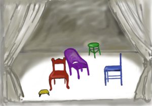
Let us follow up on the image of a stage like in Figure 1. The play given is Luncheon on the Grass, and – since Manet is avoiding telling a “story”- let us assume the curtain has just opened and we only see the positions for the actors (call them: First, Second, Third and Other) marked by different chairs. In Figure 1 the red chair is placed for the First (the female nude), the blue chair expects the Second (a male) and the violet chair kind of looks off stage as the Third (another male), and the woman onlooking from the back – the “Other”- will sit on the green stool. A little bench (yellow) is added on front stage indicating the typical still life. The chairs are positioned and turned following the composition according to Manet’s scheme indicating the direction of gazes.

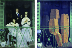
In Figure 2, the Luncheon is compared with three major paintings discussed earlier which Manet submitted to the Salon. In 1865, Christ Mocked by Soldiers was exhibited together with Olympia (painted already in 1863), Breakfast in the Atelier (1868) and The Balcony (1869) were presented together in 1869. Manet clearly wanted to make his claim as a leading painter of his time with those paintings.

For each painting, a little stage indicates the position of the chairs, and each painting is reduced to a little diagram describing the gazes of the central figures. The diagrams contain the four gazes, except Breakfast and Christ Mocked where the background figures – the green stools – are missing. In Breakfast the prominent white flowerpot may stand in for the fourth figure.

Figure 2 a-d: Variations of Manet’s Scheme “on stage” and reduced diagrams

a) Luncheon on the Grass (1863)
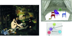
b) Christ Mocked by Soldiers (1865)

c) Breakfast in the Atelier (1868)
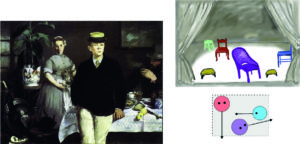
d) The Balcony (1869)
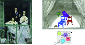
As the diagrams reveal, Manet is varying a basic scheme by changing the direction of the gazes and moving the position of chairs on stage, creating different painterly challenges:
On one level, these changes prompt changes in the composition, because the figures have to be balanced within the frame of the painting while their gazes produce their own “force fields” or a social space affecting the compositional balance.
On another level, we might link the composition to (possible) content.

Luncheon (Figure 2a) meets the viewer with a friendly direct gaze of the nude as First (red). Although the viewer is not directly invited to join, there is no embarrassment or rejection. The composition is open to the wider setting, even bridging to the viewer with the still life in the front. The fourth figure in the back (the “Other”; green) mirrors the position of the viewer, who might as well imagine standing there. We see a quite harmonic scene, although on closer inspection, we have the disquieting feeling that there is a potential for disruption, because the triad is not effectively communicating within the group and the onlooker is somehow looming too large. The diagram shows the tension between the – unexplained – inner divergence of the triad. Stability is induced from outside through the explicit relation to the viewer and the anchoring role of the figure in the back (more in Post 7-9).

Christ Mocked (Figure 2b) presents Jesus surrounded by figures emphasizing his vulnerable position as a human among humans (see Post 14). As the diagram shows, now the Third (purple) is placed in the centre, the First (red) is moved further back, and two figures create the unity of the group gazing at Jesus in the role of the Second (blue). The figure looking from the back at the group (green) is missing, unless we interpret one of the soldiers to the left as doubling in that role (like in The Drinkers by Velazquez; see Post 4). But there is a possible reason why Manet chose to introduce two Seconds. Placing the Third in the centre and the First behind him uses up the space on the narrow “stage”. Placing an onlooking other person behind the First would great a depth of the “stage” distracting from Christ. Thus, the back is closed off by a dark “backstage”, instead, pushing the figure of Christ closer to the viewer. The alternative view by the “other” is now taken by the other Second up front.
The interpretation of the gaze of the Third is no mystery in this case. Christ is obviously turning his gaze toward God, the ultimate “authority”, who also seems to illuminate the stage from above. And Manet did not forget the still life, here in the very front to the right. (The basic composition seems to be “stolen” again – see Post 14.)

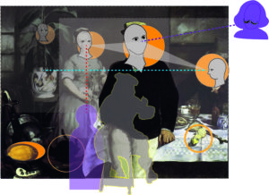
Breakfast (Figure 2c) puts the Third on front stage almost into the viewer’s space: the young man is looking beyond the viewer as a youth might look into his future, detached from the male (“father”) and female (“mother”) figure in the middle ground. Since the young man is modelled by Manet’s son Leon, it is fair to assume that Manet was well aware of the uncertainties belabouring the boy in his passage to adulthood, created by the lack of an accepted “authority”.  The painting is regarded by art historians as his most “enigmatic” (Rubin), although seeing it as variation of Manet’s scheme takes away much of the mystery (more in Posts 18 and 19).
Manet is experimenting moving the Third (purple) now frontstage even slightly before the still lives to the right (lemons) and the left (theatre requisites and the cat).  The First (red) is again placed in the back. With the youth frontstage, this creates now an “empty stage” in the middle only partly occupied by the table. (By inserting his monogram on the carafe in the “empty” centre, Manet is certainly being ironic.) The Second (blue), the gentleman to the far right, has now to “fill the gap” by directing his gaze across the “stage”.
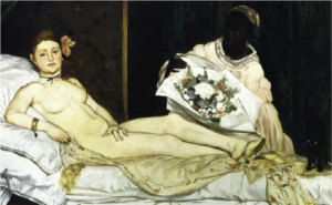
Comparing this again with Luncheon, we see that Manet is exaggerating a task the Second had already in the previous painting. There, looking between the other two, he was located somewhat out to the right, the outstretched arm helping to integrate the group. The triad is even more diverging than in Luncheon. Manet is “zooming in” on the triad and, at the same time, drawing the figures further apart. As in Christ Mocked, the onlooking “Other” (green) is missing, although the somewhat unmotivated and too large white flowerpot in the back to the left might be seen in that role. Rather than including the view from the back, the wall of the atelier closes the room toward the back (the “past” of the youth) pushing the young man even more toward the viewer or his future. The “enigmatic” and even unsettling experience of the viewer is certainly enhanced by the pitch-black coat of the Third almost punching a hole into the “empty stage”, with a black cat in the dark middle-ground, no less, reminding of Olympia.

The Balcony (Figure 2d) seems to violate the scheme, but Manet chances another experiment (Post 20). The Second (blue), the figure originally assigned to the role of integration within the painting, is now sitting front stage and looking outward to the left. But this figure is focusing her attention on somebody (or some event) which is unrepresented (white circle) but very present through the intensity of her gaze. She is not gazing “beyond” the scene implied by the painting (like a Third) but stretching the social space outside the picture space. The role of the Third (purple) is occupied by the gentleman behind her. The First (red) is standing shyly next to her (not to distract from the intensity of the Second). The scheme is completed by the boy (green) looking from the back barely noticeable in the dark background. (Again, all figures are identified as specific persons; prominently, Berthe Morisot – see Post 20).

The intense outward look of the Second including someone not represented creates a great tension, both on the level of composition and on the level of content.
On the level of composition, Manet copes with it by rather dramatic means: boxing the whole scene in on a balcony with glaring green shades and railing and closing it off with the darkness of the room in the back. The “stage” shrinks to hardly more than 2qm.
On the level of content, Manet allows the Second to stretch the setting of the triad out into public space. The entire scene on the balcony is floating on the border of the (dark) private space behind the figures and the public space in front of them – the audience. The viewer is engaged by the gaze of the First, but even more captured by the daring movement of the triad out and into open urban space – or the audience of the theatre.

The theme of Manet’s scheme has again changed and with it the content of the formal roles.
In Luncheon we found a rather intimate scene lacking, however, internal relations; in Christ Mocked the religious tradition promises guidance (although the vulnerable figure of Christ has to look up for it); in Breakfast any guidance for the youth looking into an open future was uncertain; and in The Balcony the integration of the triad is questioned by turning to others in public space.  Moving the “chairs” on the “stage” opened for Manet new avenues for interpretation – form and content interact.
The analogy of the theatre with changing positions of chairs helps to explain the somewhat strange lack of movement or activity in his paintings. Manet focuses on relations between the actors before they start enacting a “story”, or as they pause to acknowledge the presence of an audience. Manet was over his entire career in close friendship with prominent writers like Baudelaire, Zola, and Mallarmé, and kept close relations with the theatre world. He was perfectly aware what it means to set the stage, position the actors, and create an atmosphere quite independently from the general plot about to occur.

Between the Luncheon in 1863 and The Balcony in 1869, there are three other multi-figure paintings which seem to be exceptions to Manet’s scheme: Olympia (1863), Dead Christ with Angels (1865), and The Execution of Emperor Maximilian (1867). We have seen the influence of Manet’s scheme on these paintings in Post 17, 15, and 21, respectively. After the Prussian-French war 1870-71, we find a number of important works (The Railway 1873, Argenteuil 1874, Boating 1874) which seem to reduce the scheme to a relation between two persons. I will return to these paintings in later posts. The unfulfilled love with Berthe Morisot (whom he first met in 1869), the French-Prussian War, and the impact of his Impressionist phase (at least partly motivated by Morisot) may have distracted him from experimenting with his programmatic scheme – we don’t know. But then the scheme re-surfaces albeit in subtle ways – most clearly in Nana (1877) and At Pere Lathuille’s (1879) – and emerges, as we have seen (in Post 25 and 26), as a hidden “painting not painted” in A Bar at Folies-Bergère (1882).

In Figure 4, I try to picture the “stage” of A Bar at Folies-Bergère. The mirror might turn into a transparent background behind which we can see the chairs of figures in the mirror while the chair of the barmaid (as the Third) is placed on front stage. Such transparent screens were already in use on stage at the time. Hubert Gassner (2016, p193-204) has offered a fascinating analysis of Manet’s studies and the final portrait of his friend and actor Jean Baptiste Faure (1877) (Figure 3). Manet tried to capture the actor in the role of Hamlet seeing the ghost of his father. The study suggests that the actor sees the ghost – very likely projected on a transparent screen next to the viewer (or Manet himself) throwing a shadow onto the stage while the audience is looking on from behind. In the portrait the viewer and the screen are in front of the picture space, in the Bar a mirror is behind the barmaid showing the audience and the viewer in front. Both “Hamlet” and the barmaid are looking at something (or someone) which is not quite real.

Figure 3: Portrait of Jean Babtiste Faure in the Role of Hamlet
by Edouard Manet (1877)
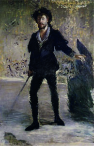
Figure 4: Setting the stage for A Bar at Folies-Bergère

As the little diagrams show, the figures assume their “proper” role only in the Barunpainted” as I proposed in Post 25 and 26.

In this image, associations with modern concepts of theatre arise, I think, quite unavoidably. And it is certainly no coincidence that Manet’s closest friend at the time was the writer and critic Stéfane Mallarmé who was an influential reference in the development of modern theatre for a generation later.

Looking back to the works painted after Luncheon with the image of the “stage” helps to make a central point of MyManet: Not only can Manet’s scheme be abstracted from a process leading up to Luncheon on the Grass, one of Manet’s most famous paintings, but it is a more general scheme which influenced the following multi-figure works including his final masterpiece.

Another feature of his work is suggested by the image of a stage: there is a dark backstage, hidden from the viewer, from where actors enter to take their positions, and there are some unsettling surrealistic elements in his compositions which question his realism.
This “dark side” of Manet, I would like to illuminate in the next Post.

See you in in about two weeks!
A Bar at the Folies-Bergère – Manet’s Scheme in the Mirror (26)

The “12 Views” of  A Bar at the Folies-Bergère  (Collins 1996) discussed in the previous Post 25 had two topics in common:
the role of the barmaid as picturing Manet’s view of women in Parisian society and the spatial inconsistencies or violations of perspectives caused by the mirror.

But there are other aspects which are neglected or featuring less prominent in the discussion.

Let us consider some of these aspects taking a fresh look at the painting
and a sketch in Figure 1.

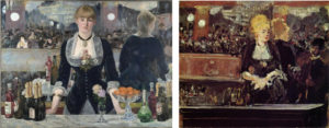
Figure 1:  Edouard Manet

A Bar at the Folies-Bergère  (1882) and Sketch for A Bar at the Folies-Bergère (1881)

First question:

Disregard for correct perspective is not a new feature in Manet’s paintings.
But why using a mirror to close up the background rather than a curtain, a wall or a dark space or some other partitioning as in previous paintings?

Staging the figures in a limited “flattened” space – in a “puppet theatre” – and leaving the viewer in a shifting position in front of the scene – that is a feature which is characteristic of Manet’s scheme as proposed in MyManet.
But, using a mirror – which is typically used to open up a space – to close off the scene in the back is counterintuitive. We should think that it simply does not work. It does in this painting.

The viewer is fully aware that the barmaid is standing in a very narrow space between the bar and the mirror. Manet is moving the balcony on the left side forward like in a magnifying mirror, as Flam (166) observes, and he uses a loser, impressionistic brushwork painting the background.
The black back of the reflected barmaid effectively closes off the view on the right side (an effect not achieved in the sketch!).

Using the mirror in ways obviously violating optical laws creates problems for his realistic style.
Why is Manet inviting doubts about his realism?

Second question:

The barmaid reflected in the mirror seems to be a different woman.

The mirror image has rather loose hair while the barmaid has her hair tightly pulled back. Flam (166) even suggests that she might have a ponytail. The cheeks of the mirror image seem to be rounder, her waist somewhat fuller, and her posture leaning forward and more attentive and friendly to the customer – if not inviting and “eager to please” (Flam 167).

But, does she look more like a casual prostitute than the barmaid confronting the viewer with her tight waist and low neckline, as many interpretations suggest?
Or is this a view following from an assumption that the gentleman in the mirror surely must be a potential customer?
As Lüthy (2003, 164) observes: In interpretations that follow T.J. Clark’s focus on prostitution in Paris at the time, it seems that “the interpreter approaches Manet’s painting like the customer the counter” trying to find out whether she is a prostitute or not (own translation).
Is Manet – perhaps critically – presenting the “male gaze” or is he playing with the expectations of the viewer?

Third question:

The viewer seems to be standing at a comfortable distance  from the barmaid
(about 2m following Flam).
However, the gentleman in the mirror is uncomfortably close leaning over the counter and looking down into the eyes of the woman. He is scaled a little too large and looming in the upper corner at a position which does not correspond to any possible place in front of the barmaid.
It is not even clear whether she is returning his gaze or looking somewhere through and beyond him. (Both facts are somewhat at odds with the interesting interpretation of Duve – see Post 25.)

In the sketch for the Bar in Figure 1, a smaller customer is positioned lower and looking up to the barmaid looking down on him. Their gazes in the mirror seem to meet. The barmaid herself is looking to a place to the right of the viewer where the gentleman actually may stand.
Why the changes?
Why is the barmaid in the final version looking toward the viewer but avoiding eye contact?
Why is the mirror image of the assumed customer now moved into an implausible position in the upper right corner?

Fourth question:

In the final version, the left side is on closer inspection a confusing collage of detached elements:
– The balcony is too close compared to the right side (compare also the width of the columns);
– the legs of the artist on the trapeze are too small and certainly not above the stage;
– the counter with bottles in the mirror is floating in the air;
– the balcony appears to be zoomed in to avail a better look at the people on the other side.
Art historians have identified the three women sitting around an empty chair, two looking toward the stage to the left, one seems to look at the viewer.
A fourth person, a gentleman with a black moustache, looks similar to the gentleman in the upper right corner and he seems to direct his gaze at the barmaid (or the viewer’s back).

Manet is clearly citing people he knows. We see a “little cabinet of perspectives”  (Lüthy p.178) in the focus of the left side.
How should we explain this grouping and the direction of their gazes?

So, what to make of these questions in view of MyManet and applying Manet’s scheme?

As a starting point, the painting has been described as a “testament” by several authors.
If it is true that Manet is looking back and citing many of his important paintings, and
if MyManet is capturing with Manet’s scheme some relevant feature of his work,
then we should find aspects of his scheme in the composition of the Bar.

On first sight, this is not really promising:

There is only one figure in the painting – and two or more reflections.
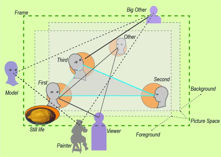
Manet’s scheme as developed in discussing the Luncheon on the Grass (1863) provides for four positions and gazes within the painting (see Post 9 and 24):

The First      – looking at the viewer:
“seeing being seen” by the viewer

The Second – looking at someone within the picture space supporting the internal “stage”:
“being seen seeing” by the viewer

The Third     – looking out and beyond the picture space:
“seeing without seeing being seen” by some other

The “Other” – looking from the back:
seeing from a position other than the viewer.

The barmaid is clearly puzzling since she is not really looking at the viewer.
If anything, she is gazing at some unidentified spot beyond the viewer – seeing without seeing being seen.
This would qualify her for the position of the Third.
An example of this variation of the scheme we found in Breakfast in the Atelier with the young man standing very up front and looking past the viewer (Post 18 and 19).
The couple reflected in the mirror would have to take the role of the First and the Second.
But that seems quite a stretch for the scheme.
The woman in the mirror as the First (seeing being seen) would use the mirror and look backward at the gentleman who takes the role of the viewer in front of the painting.
Conceivable; however, this leaves us without the Second.

The gentleman in the mirror seems to meet the gaze of the barmaid in the role of the First, establishing a relation between her and the viewer represented by him.
For the role of the “Other”, looking at the scene from the back, he is clearly much to close to her.
The ”Other” could be identified readily in the mirror on the balcony to the left.
Especially the gentleman with the moustache, as Flam (166) describes him, is literally looking from the back onto the scene.

Thus, to satisfy Manet’s scheme we need an interpretation for the missing Second.
(Somewhat like Sherlock Holmes and the dog that did not bark.)

For a solution, we consider the role of the couple in the mirror again.

What if their role is just to provide the viewer with a clue on how to “read” the painting and to see

the painting that Manet did not paint ?

 What is the clue?

Manet clearly invites the viewer to take the position of the gentleman in the mirror and to see what he is seeing.

Basically, that means that the entire scene is turned around and the reflected viewer is now in the position of the “real” viewer looking into the eyes of the barmaid who is gazing at him. The “real” barmaid will turn into the mirror on the left side looking toward the back. The “real” viewer will take a position in the mirror to the left, only that – keeping his distance from the barmaid – her reflection will appear more behind the barmaid in the centre.

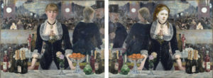
The new “painting not painted” would look somewhat like in Figure 2 !

Figure 2:    “The painting not painted”:
The original painting and the Bar seen with the eyes of the man in the mirror

The “new” painting is actually based on mirroring the original painting vertically,
thus, it combines a mirror image – like in a lithograph, an operation quite familiar to Manet – with the turning around of positions.

Some “photoshopping” is also needed. The waist of the barmaid is adapted and a ponytail introduced (following Flam). Most importantly, the face of the friendly barmaid has to be inserted. I took the liberty of utilizing the face of Manet’s favourite model of his earlier period – an undated portrait of Victorine Meurent.

But why using a reflection of the painting?

Unlike the small angle assumed in Duve’s interpretation (see Post 25) turning of the mirror – we now assume an almost 180 degrees turning of the painting and moving the position of the viewer. Duve wants to explain the positions of the two figures within the painting (barmaid and customer) keeping the place of the viewer fixed. This is still a meaningful layer of interpretation.

Given the positions, however, MyManet tries to explain:
Why are the mirrored figures painted as they are?
– clearly not as realistic reflections of the figures assumed in front of the mirror, as Duve implies.

Now, if we apply Manet’s scheme to the “painting not painted” – it works!

In Figure 2, we see the missing Second now impersonated by the (imagined) former viewer.
The barmaid is perfect in the role of the First leaning slightly forward and engaging the viewer.
The “Other”, the gentleman on the balcony, has switched sides, but is still onlooking.
The Third, the mirrored barmaid, in this variation is looking somewhere off to the back. She is “seeing without seeing being seen by some other”.
This is a variation in the direction of the gaze compatible with the scheme. And we still have the original barmaid with her evasive gaze in front of us (reminding us of the Third) when we – as viewer – imagine looking with the eyes of our reflection in the mirror.

Revealing the role of Manet’s scheme in the composition supports interpretations of the painting as a “testament”. It is not only citing previous own paintings but also revitalizing and creatively developing a basic compositional scheme.
Already since Olympia (1865) – as demonstrated in Post 17 – Manet has applied variations of the scheme with fewer figures. In the 70ies, after The Balcony (1868), he has used the scheme only partially in paintings with two figures (for instance,  Nana). We will have a look at the major paintings in the 1870ies in following posts to see the continuing influence of the scheme.

Here, in A Bar at the Folies-Bergère, Manet goes one step further and ingeniously – so the view of MyManet – applies the scheme with only one central figure and with a counterintuitive use of a mirror to set the “stage”.

The view that Manet is searching in the Bar for a new and innovative variation of his scheme can explain some of the changes from the study to the final version (Figure 2).

Moving the barmaid in the centre and giving her this famous avoiding gaze is designed to radicalize the attempt from Breakfast in the Atelier placing the Third front and centre – this time as the only “real” figure.
Already in the Atelier, we interpreted the gaze of the young man as looking into his open future. The role of the Third, more generally, signifies in the scheme the orientation to some “authority” outside the picture space.
Both aspects gain obvious significance in a painterly “testament” by a painter expecting his death.
With the gaze of the barmaid directed somewhere passed the viewer, the right side of the study (Figure 4) does not work anymore. Manet had to find a new solution which preserves credibility as a realistic painting, at least on first sight, and which allows for the application of the scheme to the other figures.
The result is the juxtaposition of a painting with a “painting not painted”.

The study and the first impression of the final version do not conform to the scheme,
but a viewer accepting the invitation to imagine looking through the eyes of his (or her) “impersonator” in the mirror will have the benefit of seeing the scheme – an important element of his “testament”.

But there is another clue on the left side. One is tempted to say, for those of us (including me) who do (or did) not readily recognize the clue on the right side pointing to the presence of Manet’s scheme.
Interpreters typically focus on the figures on the balcony only as representing friends and colleagues.
The “little cabinet of perspectives” (Lüthy p.178), however, can also be seen as a citation of Manet’s scheme!

The empty chair creates a space distinguishing the three adjoining figures.
The figure to the left reminds of Berthe Morisot in The Balcony posing for the Second (although she has been identified as another friend of Manet’s);
the figure to the right is citing a painting by Mary Cassat, and she is using her opera glass to stare beyond the picture space – a candidate for the role of the Third;
the woman in the next row (clearly accentuated by the empty chair) is looking straight at the viewer – taking the role of the First.
The gentleman to the far left plays already the role of the “Other” but – given his reflection – he can also be seen as doubling as an “Other” in the “little cabinet”. (The lady and the gentleman could change roles as First and “Other”, but I think that the empty chair is meant to join the lady to the triad.)

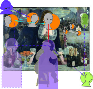
The complex composition is summarized in the diagram in Figure 3:

Figure 3:       Diagram of the scheme in A Bar at the Folies-Bergère

On the left and centre, now we see Manet’s scheme with the roles of the First, Second and Third. Additionally, the shifting position of the viewer is indicated. In the original, the viewer is induced to move slightly from the centre to the right trying to align with the mirror image within the painting. In the “painting not painted”, the viewer is motivated to shift to the left as indicated in the diagram.
This shifting from outside to inside and from right to left will motivate the viewer (if he or she is trying to solve the puzzle)  to look “from the side” on the level of the mirror plane – a position supporting identification with the Second and establishing the picture space.
On the right side, we see the “little cabinet” reminding of the scheme and the “Other” doubling inside and outside the painting.
Besides the painterly challenges of using a mirror as a background, Manet has solved the problem of staging his 4-figure scheme within a painting featuring essentially one figure.

Two questions (1 and 2) are still open from our list above:

Manet is playing games with the “male gaze”.
In view of the “painting not painted”, is there a clue that there is also a “female gaze not painted”?

And:

Manet seems to put into question a realistic interpretation more radically than in any previous painting.
This is especially troubling in the case of the looming face of the gentleman placed in the upper right corner.
Should we reassess Manet’s self-claimed position as a realist?

Good questions, but let us address them in the next post.

See you in about two weeks!

Seeing Being Seen (P24)

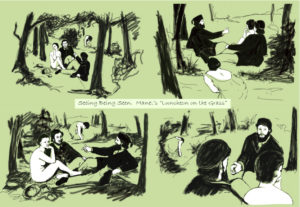
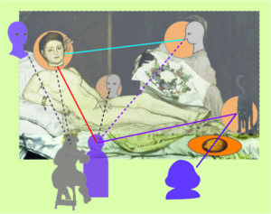
In my diagrammatic artwork “Seeing Being Seen” I tried to capture the changing perspectives on the scene of Luncheon on the Grass which a viewer walking around Manet’s “installation” would experience.
Confronted with the painting itself, a viewer will first be engaged by the gaze of the nude woman looking directly at the viewer – see the sketch in the lower left of Figure 1.

Her gaze includes the viewer as an onlooker, if not intruder, to the scene – we are drawn into the painting.

Figure 1: Seeing Being Seen. Manet’s “Luncheon on the Grass”  (Pieper 2020)

Being part of the scene, the viewer might follow the gazes of the other participants. We all have the natural disposition to do that.
Besides the woman’s perspective on the viewer (lower left in Figure 1), there are three perspectives, one for each participant:

Looking at the man to the right (the Second in Manet’s scheme), it is somewhat unclear who he is looking at, since the other two are clearly not responding to his gaze.
Following his gaze, we would stare into the trees to the left. Imagining walking around to the left and stepping into the line of his gaze, we might get a view like in the lower right of Figure 1.

Turning our attention to the other man (the Third in Manet’s scheme), his gaze is somehow trailing off beyond our right shoulder directed toward something or somebody beyond the more immediate scene. Following his gaze, we expect seeing the empty sky (or Nadar’s balloon, as suggested previously).
Stepping into his gaze appears to be impossible; we would have to imagine floating somewhere in mid-air looking down at him.
This is the perspective of the upper left in Figure 1.

Then, the viewer will become aware of the woman in the background. Her involvement with the group is obvious (she is even somewhat imposing herself on the group by being too large for her distance from the group), but she is looking at the group only from the “outside” in her peripheral vision.
Following her gaze will not reveal much, but imagining looking over her shoulder, as in the upper right of Figure 1, we become aware of the group as seen through her eyes “from the back” of the painting.
At this point, we “see” that we – the viewer – are not “really” included in the painting but in front of it:
We were sent on a walk around within the painting.

In MyManet, we assume that Manet was more or less intentionally trying to engage the viewer in this kind of walk. He wanted to make the viewer aware of the perspectives of the agents involved rather than arresting his or her imagination in the single viewpoint of the physical perspective looking through the “window” of the frame.

So far, discussing Manet’s scheme, I have paid attention only to the figures within the painting and the targets of their gazes identifying unrepresented agents outside the painting like the viewer or unrepresented “others”.

In view of MyManet, one way to enter the scene is to keep our position and to follow the gazes, but that seems only to point to unrepresented agents outside the painting. The development of Manet’s scheme was guided by this approach.

Another way is to “face” the figures as imagined in the walk described above.

In the imaginary walk, we also look back at the figures in the painting from positions outside the picture space. On this walk, the figures would “experience” being seen by us, and we “experience” seeing them while being seen by them.

Let us take a closer look at this “seeing being seen”.

  1. Seeing being seen                   (Figure 1 lower left)

In the case of the nude looking at us, the viewer, she is seeing us and she is aware of being seen by us.
The view is reciprocal – both are aware of seeing and being seen – and her little smile seems to be somewhat inviting, although not really committing. Since the other figures are – for the moment – not looking at us, her gaze and her smile is quite personal.

This intimate reciprocity is a special feature of Manet’s Luncheon and, in my view, accounts for much of its enduring attraction for viewers. We find the engaging gaze of a central figure in many paintings before and after Manet. Rembrandt and Velazquez in the previous posts provided great examples. But in Luncheon Manet succeeds to engage us in a way which I have not (yet) found in another painter.

In most cases, “seeing being seen” on part of the figure in the painting is only an imputation by the viewer. Following the laws of perspective, the figure looking out must see the viewer looking in. A common space for seeing each other is produced.
But the viewer does not feel addressed personally, even when affected emotionally; there could be any other viewer in front of the painting. The viewer does experience “being seen” but does not feel “engaged personally while looking in”. Portraits typically create this experience.

In other cases, there is an explicit attempt to communicate with the viewer to arouse certain feelings, for instance, of sympathy for the depicted poor child or of being threatened by an aggressor. An obvious case are erotic paintings where the depicted figure tries to allure the viewer. But this kind of “story” is not supported by Manet’s scenes.

In my view, the difference is that the viewer does not recognize and accept the woman “as a person” but only “as a painting of a person”.  For the personal experience, it seems necessary that the depicted person somehow claims the “recognition as a person” successfully. How Manet achieves this – in different ways in his figurative paintings – is the secret of his painting and is, I think, at the heart of his realism. His figures – at least the focal figure – are realistic because they are recognized as subjects and not just (visual) objects. The question is not just “What pictures want?” (Mitchell) or the “facingness” (Fried) of the painting, but that there occurs a “picture act” (Bredekamp) on part of the specific person depicted.

What seems to be essential in the case of Luncheon, is the element of a specific collusion with the viewer, an invitation to move around in the space defined by the gazes in the painting – not defined by the law of perspective (violated by Manet) and without committing to a “story” (avoided by Manet).
Besides the sympathetic gaze of the nude, this invitation is created by a puzzle:
– on the one hand, the lack of coordination of the gazes calling for an explanation
– on the other hand, the impression of a “staged” or constructed scene suggesting the existence of a hidden meaning.
This impression is enhanced by the fact that there is a minimal set of actors and that any obvious interpretation or narrative – like two ladies and two gentlemen having some fun – is not readily supported.

Thus, we are led to engage and to solve the puzzle – and solutions or interpretation have been suggested for over 150 years now. (My Seeing Being Seen is just another humble example among countless others exploring the puzzle with a diagrammatic approach.)

In the Luncheon, facing the nude, the collusion is enhanced by a layer of ironic distancing, because it seems to be Victorine, the model, who is giving the little smile rather than the sympathetic but anonymous nude sitting there on the grass. The smile of the nude would make the viewer feel “caught looking”, which we find in many erotic paintings and pictures, also in the exhibition of the Salon at Manet’s time. The smile of Victorine adds a specific subjectivity of “seeing being seen”.

This double-layered collusion between figure/model and viewer is needed in Manet’s scheme only when the First looking at the viewer is the focal figure and when her smile may be misinterpreted as “telling the wrong story”. Manet wants to invite us into a social space but not into an erotic scene.

For instance, in The Balcony (1868) with Berthe Morisot looking to the left out of the painting, Fanny Claus is in the role of the First engaging the viewer but needs no ironic distancing. Her “seeing being seen” supports the public situation on the balcony. (The fact that the insider may know the true identities of the models is not an essential element of the painting, it “works” without that knowledge.)

In another case, Nana (1877), the girl is looking somewhat flirtingly at the viewer, “seeing being seen” (Figure 2). The smile fits the “story” of a high-class prostitute finishing her make-up with her client waiting on the sofa.
Figure 2:


There is a lot of irony in the painting, but no distancing between the model (an actress) and her role in the painting. (The “story” is one reason why Nana is not a “clear case” of Manet’s scheme, as I will try to show in a later post.)

This experience of “seeing being seen” by both the viewer and a figure in the painting is an important element in Manet’s scheme. However, variations of the scheme may place this mutual experience between viewer and depicted figure into a side role, as in The Balcony.

  1. Seeing others [while unaware of seeing being seen]
    (Figure 1 lower right)

Seeing others (usually, but not always) within the picture space is the role of the Second in Manet’s scheme establishing the social space from within. This gaze invites the viewer to follow its line of sight in the picture, a natural reaction of the viewer, and to look at the other participants and/or to imagine what this person is seeing of the scene what we might not be able to see. This gaze places the person into a position in the painting where we cannot see his face directly creating a need for us to change position (or to hope that person to change), since we also want to see who is looking and complete our view of the scene by the view of the other.

Imagining, as viewer, moving to the left among the trees and stepping into the line of sight of the man to the right, we would see his face looking in our direction. But his seeing us will be non-engaging, perhaps not even noticing the viewer between the trees looking in his direction. He is looking at the other two figures trying to get their attention. Maybe in the next moment, he will be following the gaze of the nude and see the viewer in front of the scene who is imagining seeing him from among the trees…But in this moment, the viewer is “seeing” someone who is not aware of “being seen”.

We experience this often in busy streets when other people appear to be looking at us, but not really “seeing” us, and unaware “being seen” by us.

Actually, I found it quite difficult to depict this “accidental” gaze in my painting (Figure 1 lower right), because somehow, as the painter (or the photographer), one has to prevent the viewer from engaging with the gaze directed toward him or her. In a real-life situation, we simply “know” that a gaze is not “meaning us”, and we avoid catching the attention by looking only peripherally at the person.
In paintings, we often find this accidental gaze at the viewer, but then, we are – as viewers – treated as accidental onlookers (through the “window” of the frame) and/or we are obviously excluded from the “story” being told.
Walking around Manet’s painting, as imagined here, we tend to transfer the immediate engagement experienced with the first person into the imagined entering of the line of sight of the second person. Showing the gaze of the Second as a gaze not “seeing being seen” is not really achieved in Figure 1. Manet, however, is frequently depicting persons as not really – that is, fully aware – seeing the viewer or other persons in the painting.

For instance, puzzling in looking back at the man in Figure 1 (lower right) is the fact that he is not really focusing on any of the two others. We sense this already when looking from the front. There it adds to the lack of readability of the situation. While we have assigned to the Second in Manet’s scheme the role to establish the picture space within the painting by looking at the other figures, we now see more clearly that this does not imply a clear focus on those others. In The Breakfast (1868), we have seen that the man sitting at the breakfast to the right (the Second) is looking across the picture space without regarding the boy in front or the maid in the background.

In his later paintings, varying the scheme, Manet will often apply this “accidental” gaze, not clearly focusing the viewer or something in the picture space, to create a distancing effect while at the same time zooming in closer toward the subject.
The most famous example is, of course, A Bar at the Folies-Bergère (1882), his last great masterpiece.
However, in view of MyManet, the gaze of the barmaid may be seen in different ways.
We will return to it in a following post.

Here, we keep in mind for Manet’s scheme that “seeing being seen” might be a rather peripheral vision for those figures who are establishing the social space by seeing others. Moreover, seeing others will often – and for Manet typically – not imply focusing clearly on those others.

  1. Seeing [without seeing something in the visual space or being aware of] being seen (Figure 1 upper left)

This case is characteristic of the man sitting next to the nude, the Third in Manet’s scheme. In the upper left of Figure 1, the viewer tried to intercept the gaze of the other man somewhere in mid-air looking down at him.

But the viewer will not imagine that the man will be “seeing being seen” by somebody up there.

For the viewer, the case recognizes that we are aware – when looking at somebody – whether his or her gaze is “looking at” somebody (or something) in the common visual space, or not.
The gaze may be directed “inside” trying to think or (day-)dream of something not present, or directed “outside” imagining something not present in the visual field. Such a gaze can overlook an onlooking person within the painting or overlook the outside viewer even when being directly in the line of sight of the person.

Walking “around” the painting, this case is easily confounded with the unfocused gaze of the Second above.
Imagining looking into the face of a person not clearly focusing, and
imagining looking into the face of a person not looking at something in visual space becomes easily a matter of interpretation.
But in principle the distinction is clear: there is a difference between the unfocused gaze often required in a more complex situation involving e.g. multiple participants, and the unfocused gaze not looking at anything in the common visual field.

  1. Seeing [what is] being seen [by others within or outside the picture space]
    (Figure 1 upper right)

We communicate about the persons and objects in our common visual space effectively without thinking much about the fact that the visual field is different for each one of us. We see the objects from different angels and face some people while others are looking away from us.

Routinely, we complete the partial view we have to a 3-dimensional visual space with 3-dimensional objects. We assume that we can “see” what other persons see, since moving around we continuously complete and update our view of objects and experience that the other persons do the same.

Thus, “seeing what is seen by others” poses no problem, unless seeing what we from our perspective cannot see at the moment becomes relevant in the interaction. This applies typically to things in our back, to the other side of things in our view, and things beyond our visual field.
It applies also to our own face. This is why the faces of others are so important. Their faces and reactions show us who we are.
An interesting case, often explored in paintings, is the view into the mirror which shows what the viewer or the person in the painting might otherwise not see. The problem with mirrors is that they show the things reversed. Placing a mirror behind the group in Luncheon, the viewer would see a reversed image – not what the person in the background would see!
Manet’s most famous  painting featuring a mirror is, of course, A Bar at the Folies-Bergére (1882). We return to the case of mirrors when we look at this masterpiece.

Paintings are 2-dimensional, unlike sculptures and installations, and, therefore, we cannot walk around and get the 3-dimensional picture. Paintings showing a naturalistic perspective only succeed in pinning the viewer down to one position. Paintings showing persons aggravate the problem, because in reality they, in particular, are moving and changing their perspective on things. Casting them into a system of physical perspective only makes matters worse.

MyManet suggests that Manet – among other painterly means – tried to find a solution by detaching the figures from a fixed frame or background creating a kind of mobile with puppets hanging “on stage” in a picture space. This, we have shown already in previous posts. He was fascinated especially by Velazquez’ way of placing a figure into a diffuse background, a strategy, which Manet applied, for instance, in The Fifer (1866).
Another strategy by Manet is, in view of MyManet, the creation of a social space reaching beyond the picture space and stabilizing, as it were, the mobile by the system of gazes and gestures. By not using the perspective system and physical space, he allows for the imagination of the viewer to move more freely within and around the painting.

In this strategy, the perspective from the back becomes an important element.
(Alternatively, as we have seen in previous examples, Manet closes the background and moves the picture space towards the viewer. That way, like in a small theatre, the viewer is already “in the middle of it” and needs no “view from the back”.)

Handling the view from the back is, however, a delicate challenge.
In Luncheon, we find the other woman not looking straight at the group, although she is clearly oriented toward the group.

If we imagine the woman in the background looking up and straight at the group, the viewer – or an unrepresented person next to the viewer – would be in her line of sight. The viewer might feel an urge to follow the gaze and look away from the painting to the left or right in the viewer’s space. Rembrandt played with this effect, as we have seen in the last post. Manet avoids this effect, presumably because he wants no distraction from the engaging gaze of the first woman.

The “Other” in his scheme is never competing for the attention of the viewer but suggesting another position and perspective to be taken by the viewer completing his or her view by imagining “seeing what is being seen by others”.

In MyManet, we assume that Manet is exploring these complex views with his scheme. The Luncheon on the Grass is his model case. Moving his actors around in the picture space, their gazes create different compositional challenges in those paintings, as we have seen.

The greatest challenge Manet addressed when he reduced the figures to one person and substituted the other participants in his scheme by mirror images: A Bar at the Folies-Bergére.

Let us take a look at this masterpiece!

A personal note: Unfortunately, I got hit by Covid and I am still recovering.
This post is about a week late and turned out to be quite a demanding effort.

Hope to see you well in two weeks!

More on Diagrams and Paintings (P23)

In the previous post, I raised the question what I have learned from submitting paintings with a strong diagrammatic element – applying concepts and ideas from MyManet – to the Annual Exhibition of my art society.
One conclusion was that I still have a lot to learn as an aspiring painter.

But I also learned from the experience more about Manet and how the diagrammatic element in his scheme results from the content, from the objects and relations depicted.
If diagrammatic structures are intimately related to the content of Manet’s painting, then “painting diagrams” is one way to understand his art.

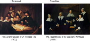
Figure 1:      Compairing two Group Portraits

How innovative Manet’s approach is can be understood better, perhaps, when we compare it with the tradition of group portraits in the Dutch painting tradition of Rembrandt and Frans Hals.
Two examples are shown in Figure 1.

Heike Baare (2009) has offered an inspiring analysis of Manet’s multi-figure paintings comparing them with those group portraits. (Actually, she refers especially to the art historian Alois Riegl who is cited also by other critics of Manet, e.g. Michael Lüthy and Richard Wollheim referred to in previous posts.)
Here, I will extract – irresponsibly simplifying her and Riegl’s arguments – only one interesting observation on the problem of group portraits:

Group portraits show a number of persons which are identifiable as particular individuals, for instance the participants of a lecture (Rembrandt) or of a board of an institution (Hals). The painter needs to arrange the portraits (or whole figures) in a composition and has two options,

  • either to arrange them in a formal composition distributing them somehow balanced in the picture space,
  • or to show the figures engaged in some activity which assigns each figure a meaningful position and provides a “story” about their relations.

Obviously, these are not alternatives but can be combined in varying degrees.

Rembrandt choses to provide an underlying “story” showing the participants of a lesson;
Hals arranges the portraits formally in the picture space just indicating a common physical space.

The more the painter refrains from offering an internal “story”, the more the viewer is put into the position to provide a unity to the group and will feel the need to invent an external story to make sense of the painting.
This is especially the case, because some of the figures – following the logic of portraits – may look at the viewer and engaging him or her.

In the case of Rembrandt, the figure in the upper centre is looking into the general direction of the viewer, but not engaging the viewer; in the case of Hals, two women appear to engage with the viewer, while the focus of the other three is unclear to the viewer just as in many portraits.

In as much as the viewer fails to detect some unifying relationships, the unity of the painting will rely solely on the formal composition.

Balancing the composition becomes a formidable issue, since all portrayed individuals want to be adequately represented. Nobody wants to play a side role – unless the role is grounded in the social position in the group, as in case of the lecturer in Rembrandt’s painting.

To solve the problem, Rembrandt finds a quite ingenious solution:
He shows all of the figures as being attentive to the lecture and five of them to the book in the foreground.
This way, everybody is sharing the same role, except for the lecturer who is obviously in a special position but not enhancing his role by engaging the viewer.

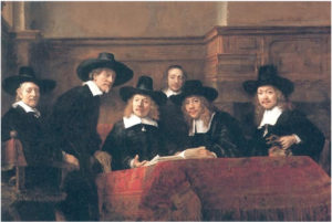
More radical is Rembrandt’s solution in The Syndics (Figure 2), where the figures are attentive to somebody next to the viewer outside the picture space and in front of the painting.

At the same time, Rembrandt is refraining from “telling a story” – like he did in The Anatomy Lesson. Instead, the gazes create a dynamic which, on the one hand, is much more compelling than the additive portraits by Hals, while, on the other hand, avoiding the impression of a genre painting telling a story about everyday life. And the viewer is assigned a very important role in the composition.
Rembrandt is quite daring in The Syndics, and the painting must have fascinated Manet on his visit to The Netherlands.

Figure 2:    Rembrandt  The Syndics of the Draper’s Guild (1662)

Rembrandt’s reaching out to the space of the viewer invites a comparison with Manet’s scheme:

The central figure might best be seen as thinking with a gaze beyond the painting – as a Third in Manet’s scheme.

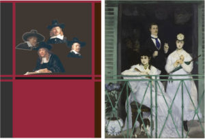
The gazes of the three figures to the right and the figure on the edge to the left dominate the painting paying attention to an unrepresented “other” outside the painting. Their role in Manet’s scheme is comparable to the Second (Berthe Morisot) in The Balcony gazing outside of the picture space to the left (see Figure 3).

Figure 3: Relating the gazes in Rembrandt’s The Syndics to the gazes in Manet’s The Balcony

Rembrandt shows three figures in this role accentuating this gaze. We can assume that this is partly due to the fact that he has to somehow accommodate six figures. Comparing it with Manet’s The Balcony (left side of Figure 3), we might, therefore, eliminate two of them as redundant.

Then, Rembrandt applies the strategy of The Anatomy Lesson of creating dynamic tension by a common focus of these gazes. But there, he captured their gazes by the book within the painting (see Figure 2), now their gazes reach out of the picture space. But the three gazes are crossing the picture space meeting the gaze of the fourth figure at the position of the unrepresented “other”. Thus, they are more contributing to the unity of composition than the disrupting gaze to the left in The Balcony. Re-arranging the gazes in Rembrandt following the composition of The Balcony (see the left side of Figure 3) demonstrates the disruptive effect. Manet is anchoring the composition with the gaze of the First (the lady to the right engaging the viewer).

This role of the First has no direct counterpart in Rembrandt’s composition. However, there is another interesting feature: The second figure in Rembrandt (from the left) might imply another unrepresented “other” to the right of the viewer. Thus, the viewer finds herself or himself between two other persons in front of the painting which has a similar engaging effect as Manet’s First.

In Manet’s scheme, this figure would occupy the role of the “other” completing the social space by a perspective on the group from the back (see left of Figure 3) rather than – like Rembrandt – populating the space in front of the painting with another viewer. With Michael Fried, we might say that Rembrandt produces a “facingness” of the whole painting without implying one viewer at a specific position in front of the painting. Still, the painting is showing a unity arising from the gazes within the painting, which is missing in the “additive” faces in Frans Hals’ composition.

Manet’s approach is even more disruptive by confronting the viewer with very diverging gazes which appear not to be harmonized by a unifying interaction with the space of the viewer. Worse still, the space of the viewer itself is ambiguously defined, since in front of the picture space the viewer seems to be hanging in mid-air (or standing at an opposite window?) and in the background the viewer is confronted with an almost totally black space which only indicates that someone is or could be looking out toward the group and the viewer.

In view of MyManet, comparing the paintings by Hals, Rembrandt and Manet, we see that

  • Hals presupposes that the viewer – guided by the formal composition – will be coordinating the group of portraits into the unity of a painting.
  • Rembrandt creates a dynamic of gazes within the painting producing a unity which engages the viewer in front of the painting.
  • Manet creates a complex social space through gazes relating the figures within the painting to unrepresented “others” – including the viewer – outside the painting and risking the unity of the painting in the process.

As pointed out in Post 20 discussing The Balcony, Manet supports the unity of the composition with a very strong frame in bright green colour. However, standing in front of the painting (as I had the opportunity a few months ago) one cannot help but realizing the tension created by the divergence of the social space of gazes that is only tamed by the physical space of a railed balcony.

The problem of the traditional Dutch group portrait, as sketched out above, was to decide (and to solve by composition) which role the viewer had to assume. The viewer could be enlisted to coordinate externally the portraits of the group by an interpretation, or the activities and relationships of the figures within the painting would internally provide a unity (“story”) which the viewer could readily engage with. The latter strategy ran the risk that the internal relations would assign roles to the portrayed persons which they would not readily accept.

This problem is, obviously, also important in Manet’s multi-figure paintings. Although his problem is not so much that the individuals want to have a fair place in the painting. Manet’s figures are identifiable, but not intended as a group portrait. They are typically family members, friends or professional models who will accept their assigned role (Fanny Claus, the second woman next to Berthe Morisot in The Balcony was apparently not so happy with her role.)

However, the basic problem applies also in Manet’s case. Since he aims to reduce the “story” regulating the relationships among the group and with the viewer, the issue of the “unity” within the painting shifts to the formal composition and/or to the unifying role of the viewer. The problem is enhanced by the fact that Manet deliberately violates the rules of perspective breaking up the physical space within the painting and, thus, not extending the picture space into the space of the viewer. The viewer finds herself or himself in a rather insecure position in front of the painting, or – as MyManet suggests – as viewing a scene “on stage”. Manet’s paintings show not the unified space of naturalism, his realism is a re-construction of “what is seen” and “what exists”.

The interpretation of Manet’s paintings is, therefore, often driven by an alternative between

  • focusing on the formal composition providing a unity with painterly means, and
  • focusing on the “story behind” the illegible gestures and activities of the figures.

Thus, the “modernity” of Manet’s painting is interpreted either as revealed in his first steps away from naturalism and toward abstraction in modern art (in the following generation of painters), or in Manet’s representation of the fragmented and socially alienated life of contemporary Paris with painterly means.

Regarding the first alternative,
with the loss or avoidance of a narrative, the “facingness” or expression of the painting becomes important, but the viewer is losing a “face” because he or she is addressed as an increasingly anonymous viewer (if not customer) who is as alienated as the portrayed figures.

Regarding the second alternative,
Baare refers especially to the sociologist Georg Simmel – cited often by other critics as mentioned in previous posts. Baare misses, however, an essential feature of Simmel’s sociology. A generation after Manet, Simmel is not only the analyst of modern urban life and culture, he is also the founder of a “formal sociology” and social network analysis. Today’s diagrams of social relations or “sociometry” is heavily indebted to Simmel. Just like Manet – in view of MyManet – tries to establish the internal and external unity of his group paintings not through a “story” but through an underlying model of social relations in social space within and around the picture space, Simmel is looking for the infrastructure of social relations which is carrying the diversity of cultural lifestyles. (Interestingly, Simmel sides with Rembrandt’s internal vitality in his view on art, while the focus on external form is characteristic of his sociology; see Georg Simmel, Rembrandt, 1917).

In the Post on Manet’s Realism, I have suggested that Manet’s realism is inspired by “reasoned images” – by drawings of scientific objects like the human body or animals and plants. In case of Manet’s scheme, the “scientific object” is the human group and the structure of basic human relations as constituted by the gazes within the picture space and to agents not represented in the painting.
Formal or compositional aspects are closely interrelated with aspects of content.

Unlike Rembrandt, however, Manet is not trying to engage the viewer by the imposing vitality and subjectivity of the figures. The content of social space – created by the gazes and gestures – retains in Manet an objective formal character. The role of the viewer is more complex, the viewer is asked to reconstruct the social space within and around the picture space, not just to “face” the painting.

In “Seeing Being Seen”, I tried to capture the role of the viewer in reconstructing a social space by “walking around” the group. The painting assumes the character of an “installation” as pointed out in the first post.
“Seeing Being Seen” addresses directly the content of Luncheon on the Grass – the way gazes structure the social scene depicted.

In the next post, I will take a closer look at the different meanings of “Seeing” and “Being Seen”.

See You in two weeks – in 2022!

On Paintings, Diagrams and Exhibitions (P22)

Sometimes life interferes in significant ways with the plans of human beings – actually, it does that on a quite regular basis.

In my case, the plans for this post were intercepted by the Annual Exhibition of the Järvenpää Art Society of which I am a member.
Aspiring to full membership, I need contributions accepted by the jury.

So, I submitted these three paintings:

Figure 1: My contributions to the Annual Exhibition 2021

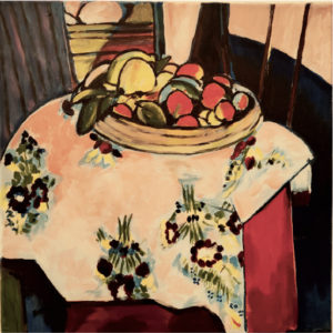
“After Matisse”

“A Bar near Folies-Bergère”

“Seeing Being Seen”

The event clashed with my plans into different ways:

  • The preparation of the three paintings submitted took much more time and effort than anticipated. That may be considered a rather usual miscalculation on part of a novice in the “art business”.
    But it made it necessary to postpone the publication of my post.
    Sorry about that!
  • The other interference occurred with the planned content of the post and was equally unexpected.
    The jury accepted one of my three paintings and excluded two others.
    This is also an event to be expected and accepted, but it got me thinking about the reasons why these two were excluded.
    These reflections suggested a different theme for the post.

So, I would like to share my reflections on the jury’s decision, because the issue is directly related to MyManet – both paintings present themes on Manet!

The problem may be put in the following way:
Did the jury select a painting and reject two diagrams?

Let me state at the outset that I am not questioning the decision of the jury.
I would like to be – however modestly – proud of having a painting accepted for the Annual Exhibition.
So, to be proud I must assume that the jury was competent making that positive decision!
But then, it makes no sense to question their competence in the other two cases…
Besides and obviously, I have a lot to learn and to experiment on my way to expressing myself in artwork. The experience of preparing my submissions to the event demonstrated that again.
The task of the jury was to evaluate the quality of the paintings and I accept their verdict.
Thus, the quality of the three paintings is not my concern here (but in front of the easel).

My question is more self-critical and, in part, conceptual, and related to MyManet:

Looking at the three paintings, one difference between the selected “After Matisse” and the two “Manets” stands out:

  • “After Matisse” (original: Still Life with Oranges 1913) is a still life which does not try “to make a statement” beyond “pure painting”. It just offers an art experience – “art for art’s sake” – as is typical for Henri Matisse. This was also my goal for the free copy. “After Matisse” is not a strict copy, the dimensions are already different – the copy (40×40), the original (94×83). My version tried to catch my impression of the original (as if it would be a still life itself) – and learn something about painting in the process.
  • The two “Manets” are not copies, they are “about” Manet and cite elements of his paintings. “A Bar near Folies-Bergère” (acryl, 80×100), obviously, cites Manet’s famous “A Bar at the Folies-Bergère” (1882), but it includes also references to four other bar paintings of Manet (besides a citation of Velazquez).
    I will return to my painterly interpretation of Manet in a later post when looking at the original Bar as his last application of – what I call – Manet’s scheme.“Seeing Being Seen. Manet’s Luncheon on the Grass” (digital drawing) presents a sketch inspired by the gazes of the four figures of Manet’s scheme in Luncheon (lower left)
    – with the gaze of the First (the nude) looking back at the viewer,
    – the gaze of the Second looking towards the other two persons,
    – the gaze of the Third to the more distant “authority” beyond the picture space, and
    – the view looking “over the shoulder” of the “Other”, the bather in the background.
    Thus, the sketch combines the different views which the viewer would have walking around the group and meeting their eyes (or looking over the shoulder).
    The participant viewer would experience “seeing being seen”.

Both “Manets” are “about Manet” in the sense that they are conceptually inspired by MyManet. They are not only paintings but illustrating arguments: They support the general thesis that Manet is applying – consciously, or not – a certain scheme.
In case of “Seeing Being Seen”, this is quite obvious; in case of “A Bar near Folies-Bergère”, it is more subtle, since the painting presents an own application of the scheme. However, the accentuation of the perspectives of the main actors by straight lines crossing the painting suggests quite strongly that there is some kind of model or scheme at work.

While the “Matisse” is straight forward a painting, the “Manets” can be seen (also) as diagrams.

The question arises whether or to what extent the jury preferred paintings over diagrams.

Or, since I do not want to discuss the criteria of the jury:
Did I make the mistake that I painted (too much) diagrams rather than paintings?

Clearly, in MyManet the aim is to interpret Manet’s paintings with the support of diagrams.
Did this aim influence my painting of the “Manets” too much?

Another question may be what I learned about MyManet when trying to paint with his scheme or diagram in mind.

This question, I will take up in the following post.

First, let us look at the differences between paintings and diagrams.

The question assumes that there is a substantial difference between paintings and diagrams and that their principles are, to some extent, in conflict with each other.

So, what is the difference between a painting and a diagram?
There is, of course, a wealth of literature on this issue.
And the question very quickly leads into a deep discussion about “what is art – and what not?”.

So, here I like to share only some personal reflections motivated by the three paintings.

We might expect a categorical difference between the two concepts based on semiotics.
Take, for example, the well-known distinction between icon, index, and symbol in the semiotics of Charles S. Peirce. This distinction is derived from his fundamental triadic system, here applied to the level of signs:
– an Icon presents certain qualities which it shares with the objects it presents;
– an index represents a certain relation between qualities or aspects,
often a causal law is depicted;
– a symbol is interpreting qualities and relations in some meaningful context.

Following a triadic scheme, we might distinguish between pictures, diagrams, and text. Then, diagrams and paintings appear, at first sight, as categorially different. However, Peirce saw diagrams foremost as visual schemes distinct from logical relations and symbolic language (another triad in Peirce’s system). Therefore, pictures and diagrams both belong to our visual ways of “world making”
which Peirce, by the way, believed to be quite fundamental to our understanding of the world.

On the level of painting, we would distinguish – following the triadic scheme – between the painterly means (like colour, line, shape, brushwork, etc.), the formal composition or design relating elements, and the narrative (“story”) contextualizing the elements. We would point out that Manet is clearly focusing on painterly means, that he follows in his multi-figure paintings a certain scheme, and that he is decidedly avoiding “telling stories”.

In this view, “After Matisse” is clearly focusing on painterly means, “Seeing Being Seen” is the most diagrammatic work, and “A Bar near the Folies-Bergére” attempts a more interpretative application of the scheme.

However, we would not expect that there is a categorial problem in combining painterly and compositional or formal aspects in a painting.

Let us agree that diagrams and paintings are both visual ways of “world making”, but have different aims:

  • Diagrams cast information and relations or patterns into a visual form.
    The content of a diagram is usually described in a text, but typically the content displayed in the diagram cannot be adequately and practically formulated in a text. Some information and insights depend on the visual medium. “The Art of the Diagram” (Schmidt-Burkhardt 2019) consists in creating a representation which allows us to grasp essential insights visually, literally seeing the pattern in a flood of data. Modelling and experimenting on the computer has enhanced diagrammatic methods dramatically. We are understanding and “making worlds” with the aid of “beautiful evidence” (Tufte 2006) represented in diagrams.
    The “truth” of the diagram resides in the adequate representation of the world including possible, past, or future worlds; it depends on knowledge about the world and adds to it.
  • Paintings do not necessarily represent anything in the world, although they often do or are perceived as representing something. “Seeing-in” a painting something represented or “seeing-something-as” a work of art is not an act of simply recognizing an object in the painting or a painting as art.
    On the one hand, our ways of seeing are culturally developed. When we see faces or horses in the shapes of clouds of a painting (or in nature), this does not mean there are those objects independently of our ways of seeing. Our perception applies culturally learned distinctions and patterns, but we also apply these patterns in an act of creative imagination, it is a way of “world making” changing in history and with societal circumstances (Davies 2009).
    On the other hand, in the creation of each painting the artist is not simply applying our culturally developed ways of seeing. Painting is also an act of creative imagination and of “world making” which, in turn, may suggest new ways of seeing. This creativity is limited only by the material restrictions of the production. In the virtual worlds of computers, these limits can be stretched to the limits of our innate visual capacities.
    Boundaries for this creativity are not so much in the process of production expanded by ever new technologies and media, but in our culturally mediated ways of perception, our understanding of what is art, and to what extent we want to restrict our concept of painting (e.g. to the application of lines, shapes and colours to a 2-dimensional flat surface rather than including sculptures, installations, performances, holograms, film, photography, etc.).
    The “truth” of painting resides in the way it enriches our aesthetic experience of the world and by (eventually) being perceived as belonging to the “world of art”. The cycle of production and reception of ways of seeing involves learning processes and takes time. In the case of Manet, his contemporary audience did not (yet) understand how to align his painterly innovations with established ways of seeing.

The aims of adding to our knowledge and the aim of enriching our aesthetic experience do not necessarily harmonize. Often, we find one aim pursued on the costs of the other. However, as the history of diagrams and paintings demonstrates, diagrams can be very artful without violating the requirements of knowledge, and paintings can incorporate new knowledge about the world without losing their aesthetic quality.

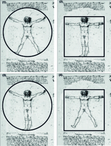
A good example working both ways is the well-known drawing of the proportions of the human body by Leonardo da Vinci (Figure 2) who was an artist and a scientist as well as an engineer.

Figure 2:  Leonardo da Vinci (1490)  The Vitruvian Man.
The proportions of the human body according to Vitruvius
 

 and four versions generated by the diagram

This diagram is over 500 years old, and it still inspires generating new ideas.

As shown in Figure 3, I have extracted four versions from the original scheme. We can easily imagine that these figures will motivate rather different paintings.
Moreover, the figures suggest quite different socio-psychological states of the person depicted.
We might even associate the four basic emotional and interactional states described in Post 16 with the figures:

  • Figure 1 conveys a rather elated and expansive mood reaching beyond the confines of the drawing
  • Figure 2 seems rather down to earth established in his own world
  • Figure 3 is reminding of the proud and victorious sportsman or warrior
  • Figure 4 appears to be rather insecure and vulnerable, perhaps even lying on the ground.

Certainly, these interpretations are not the only ones suggested by the figures, but they demonstrate that diagrams can give rise to a variation of forms and even content (not only) in painting – just like Manet’s scheme, where moving the basic roles of the scheme into different positions of the composition generates different challenges.

Thus, diagrams can be integral and productive structures of paintings, not only on the level of formal composition but also on the level of content.

I have to conclude that the question about the exclusion of my “Manets” has less to do with their diagrammatic content than with the quality of my painterly means. Actually, the decision to submit the “Matisse” was motivated by my anticipation that the focus on painting rather than supporting MyManet with paintings may prove to be the more successful strategy.

Which leaves us with the question, what I learned about Manet’s scheme trying to apply it in my own paintings.
This will be the topic of the following post.

See you in two weeks!

Manet and Political Power (P21)

For some critics, Manet is foremost a painter interested in the subject only as an occasion to paint – and avoiding a clear political message.

For other interpreters of his art, Manet is one of the most political painters of his time and an engaged participant in the political events.

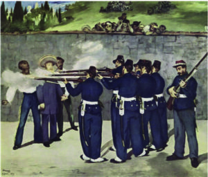
His most political painting – The Execution of Emperor Maximilian – is claimed as an example for both positions:

Figure 1:  The Execution of Emperor Maximilian (1867)             and The Barricade  (1871)

On the one hand,
the painting is seen as a case for Manet’s search for “pure art for art’s sake”.
How else can you account for the lack of great emotions and dramatic action in a painting of an execution?
On the other hand,
Manet is seen as searching for an alternative to traditional, pompous history painting and making a political statement exactly by frustrating expectations.
Usually, The Barricade (1871) – depicting a dramatic scene of soldiers shooting activists of the Parisian Commune is shown to demonstrate that Manet is also a political artist.

In this post, I will not comment at any length on this debate.
Certainly, being a political painter in Manet’s time was totally different from today. The execution in June, 1867, was the result of Napoleon III’s attempt to install Maximilian as Emperor of Mexico. The Mexican insurgents under Benito Juarez liberated their country, and captured Maximilian who was left behind by the French army retreating to France.
Napoleon III strictly prohibited any artistic comments on the event.

So, Manet used “a razor-sharp irony” (Rubin) hiding his political commentary in subtle ways.
The sergeant to the right looked much like Napoleon III in the second version. The soldiers’ uniforms were similar to French uniforms. Thus, it could seem that French soldiers were executing the Emperor.
Although Manet changed that in later versions, the painting was excluded from the Salon exhibition. The painting was not shown in France during his lifetime (only on an exhibition in the USA, without any great success). Manet himself, however, considered it one of his most valuable paintings.

For the description of the historical event itself, I refer to the extensive literature.
A most informative account, I have found in Joachim Kaak (2014) who discusses Manet’s political paintings and demonstrates the political undercurrent also in other works (unfortunately only in German; but see Sandblad 1954; Hanson 1977; Fried 1998).

For MyManet, two aspects provide an important background:

First, there was an intensive public debate about the event (not only) in France. Manet followed it closely and produced five versions of the painting starting already in July and incorporating new information about the event as it became available.
This in itself testifies to his political engagement and his determination to create a realistic as well as symbolically convincing representation.

Second, the public reception and evaluation of the event changed during the process, at least for republicans like Manet, from seeing the execution as an horrific crime of Mexican bandits to recognizing a regular army legitimately liberating their country from a foreign regime.
Accordingly, for instance, the uniforms of the soldiers changed after the first version (Figure 3).

At least equally important for the changes – as “updating” the content and evaluation of the event – were the compositional problems encountered by Manet.
Some problems are best understood as resulting from his new realistic approach to historical painting. These issues are usually addressed by commentators.
Other problems concerning the structural composition and resulting in changes over the versions are often noted but not sufficiently explained. These are questions as to why Manet experimented with certain changes.

In view of MyManet,
these WHY-question may be better understood as motivated by Manet’s scheme!

This does not turn The Execution into a clear case of the scheme but throws some light on the development of the final version.

Let us look first at the approach of Manet to painting historical scenes.

An illuminating way may be the comparison of The Execution with one of the “most famous History paintings” (Lüthy) by Manet’s idol, Diego Velazquez The Surrender of Breda (1635) and Goya’s The Third of May (1814) which is even more widely known.

Both paintings are certainly great examples of history painting and motivating Manet.
But they also demonstrate what Manet not wanted to do.

Figure 2: Comparing  history paintings

Velazquez’s painting is showing a simple interaction – the surrender of the key of the city of Breda – and he places the scene into an impressive setting of two opposing armies and a burning city in the background. The painting is lacking the pathos of most history paintings which Manet despised. It displays a realism which Manet admired without failing to express the symbolic importance of the event. It rather shows a quite human touch between the two generals exchanging the key. It even includes the viewer by at least four participants (and a horse) looking directly out of the picture, one at the edge to the left in a position Manet chose for himself in Music in the Tuileries. Another central soldier in a white uniform (inspiring Goya?) is rather absorbed in own thoughts reminding of the soldier to the right in The Execution.

Manet follows Velazquez in avoiding the pathos and showing the human side of the event, but he clearly wants to simplify the scene by a focus on the interaction and by eliminating the extensive historical setting.

Goya succeeds in bringing the focal interaction – the shooting – to the forefront.
But he loads the scene with emotion in a way which for Manet is too much drama.
Now, the violent event clearly calls for an emotional reaction in the viewer.
But Manet seems to have asked himself if there is a realistic way of showing a historic event in its timeless importance beyond the description of particular scene and avoiding Romantic “story telling” and “emotional drama”.

Critics often imply that Manet had to choose between emphasizing a Romantic narrative about the historical event or the formal structure of “pure painting” – less content implying more reliance on pictorial structure (Lüthy 2003).
But there is a third option: Showing an enduring social reality beneath the contingencies of the concrete historical event.
Manet’s realism wanted to capture the “universal symbol” (Sandblad) in the historical event,
or the “human condition” expressed in the “cold actuality” embedded in the action rather than a “gestured drama “(Hanson).

Beth Archer Brombert  offers the wonderful formulation: “For Manet the human figure replaced nature as the source of meaning – human frailty, human mortality, human futility. And the light he cast on it has no beginning and no end; it is a light as eternal as nature.” (1996, p.215)
In MyManet, we would add – looking at The Execution – that realism of human figures replaces naturalism throwing an “eternal light” on a social reality encompassing not only the suffering of victims but also the exercise of power – and supporting reflection on the legitimacy of human actions (symbolized by the detached sergeant to the right).

The paintings by Velazquez and Goya are both political in the sense that they describe an important political event. They message is, however, very different.

Velazquez shows the moment after violence when building up trust is the political goal – even including the viewer in the hope for a future, legitimate regime.

Goya shows the moment of violence when the demonstration of brutal power is the goal of the regime while destroying the legitimacy of the act by the overwhelming tragedy imposed on victims and onlookers.

While Velazquez’s painting is inclusive, Goya’s is confrontational – within the painting and in relation to the viewer!

Obviously, Manet faces a problem:

How to show an act of political violence against an Emperor – perceived personally as a man of human dignity – without questioning the legitimacy of the quest for political freedom by the Mexicans? (Especially, when Napoleon III looms in the background as responsible for the event.)

The dualism opposing “good” on the left side and “evil” on the right side in Goya’s painting does not apply that readily in Manet’s case. The political dimension – the content of the painting – causes the problem of reflecting the complexity in a compositional form.

Usually, art historians point out that Manet was inspired by Goya’s dualistic composition, but the differences are often neglected or underrated. A major difference is that Manet distinguishes three major parts – the victims to the left, the soldiers in the centre, and a separate figure (or two) on the right (Figure 3).

Figure 3: The Execution of Emperor Maximilian – five versions 1867 to 1869, distinguished by their current location “Boston”, “London”, a lithograph (London), “Copenhagen”, and “Mannheim” (final version with added markings)

    Mannheim

Juliet Wilson-Bareau (1986) in her detailed analysis of the five versions and the underpaintings (visible by X-ray) argues that Manet did not especially like Goya’s paintings. He “may have been more impressed by his prints and by the striking reproduction of the Third of May, just published in Paris. In the final analysis, Manet’s design was no doubt based as much on general patterns of representations of an execution, and his own deeply felt response to the accounts of the drama, as on any specific source (p. 51; emphasis added).”
She does not elaborate what these “general patterns” are, but she does emphasize that the most striking fact about the five versions is that the basic structure of three major parts was not changed.

This “general pattern” does not correspond to the dualistic opposition in Goya, and we should look for some other source.

So, let us consider Manet’s scheme as the underlying compositional pattern!

As a starting point, we should look at the overall strategy.
Especially in the first “Boston” version, Manet is moving the figures closer to the front, so they occupy nearly the whole canvas. “Zooming in” places the focus squarely on the participants, the historical scene is reduced to the scale of the human interaction.
The picture space is divided into three parts for the victims, the soldiers, and the figures to the right (black verticals in Figure 3). In the final version, the figure to the right, the sergeant, takes less space but is clearly distinguished. The three spaces appear to be illuminated by different light sources throwing shadows at distinct angles.

With this strategy, the figures are “on their own” – overarching historical or societal contexts of interpretation are eliminated. The interaction is unfolding between these individuals. This makes their gazes and gestures, their positions and relationships, all the more important and symbolic.

The three spaces help also to cope with another challenge, the number of participants.
Clearly, Manet’s scheme is blatantly overpopulated by three victims, six soldiers, a sergeant, and an officer, besides the crowd overlooking the wall. Sticking to a realistic approach, there is little he can do about it.
Therefore, spaces serve to group the participants; they are standing collectively for a position in the scheme.

This invites the application of a reduced version of Manet’s scheme to both Goya and Luncheon on the Grass as in Figure 4 (agents outside the picture space are left out here):

Figure 4: Reduced version of Manet’s scheme comparing
Goya’s Third of March and Luncheon on the Grass

Goya distinguishes only to spaces, “good” and “evil “or “white” and “black” figures, and perhaps the onlookers (green).

Manet differentiates a triad of First (red), Second (blue), and Third (purple), “Other”/onlooker (green), and absorbed figures (yellow) (as optional, not included in Luncheon).

Two differences are crucial:

  • Manet has to deal with the position of the First engaging the viewer, and
  • the relations within the picture space between Second and First/Third are now a dominant power relation which cannot contain a First directly engaging the viewer without distracting and subtracting from the force imposed on the victims.

The differences amount to (at least) six challenges or issues Manet must resolve – each answering to a question typically asked by critics:

  1. WHY does Manet introduce the figure on the right?

In the “Boston” version, the answer seems obvious: Manet wants to engage the viewer like Velazquez above (Figure 2). The figure is clearly distinguished by his Mexican peasant dress from the other soldiers, while the second figure, presumably the commanding officer with a saber, is only indicated.

The problem is, as already mentioned, that this distracts from the central theme – the shooting. Manet seems to decide that an overt First (red) does not serve his purpose, the action has to speak for itself and confront the viewer.

But he does not give up his triadic scheme, he rather changes the role of the First. The separation and detachment of the sergeant preparing his rifle creates a very compelling focus engaging the viewer exactly by the contrast with the tragedy he seems to be oblivious to.

His space seems to call on the viewer to reflect on the meaning of the event. His role is exactly the same as the First in Luncheon, it is only defined by a gesture rather than a gaze. (Fried (1998) even suggests that the figure is an allusion to the painter Manet – with the soldier contemplating his rifle as a painter would his palette; this underlying relation, we also saw in Luncheon.)

  1. WHY does Manet move the soldiers into the centre and detaches one soldier slightly from the group almost joining the space of the victims?

Many commentators see the soldiers as a compact group. This is certainly intended by Manet to enhance the impression of a brute force directed toward the victims. The direction is not only signified by the rifles, there is also a horizontal rhythm moving through the group created by the white patches of their belts, swords, and gaiters.
Still, the left soldier is somewhat detached and marks an own vertical line (white in Figure 3) running from his shoes (pointed in different directions!), through the white cloud above his head to the left edge of the onlooking peasants, even dividing the background into a rising hill and the cemetery with cypresses to the left. In the lithograph, Manet is even experimenting with a corner in the wall (black vertical) accentuating the soldier, and with a wall running now diagonally behind the victims distinguishing their space.

Manet has to find a solution for six or seven people (including the officer) to stand in for the position of the Second. Moreover, he faces the issue that those soldiers are neither clearly the “bad guys” nor the “good guys”. They are Mexican freedom fighters shooting French nobility. Manet choses to accentuate the position of the Second as a symbol in one soldier while grouping the others as an anonymous collective. Additionally, he signals the ambiguity in their mission by the slight separation and by diffusing the boundary between their space and the space of the victims by overlap or intrusion and by gun smoke.

  1. WHY are the victims depicted rather blurred by smoke and not expressing their tragedy like in Goya?

One reason, certainly, rests in the ambiguous role of the victims. In one political perspective, they are the victims of violence; in another perspective, they are foreign imperialists, the Emperor, if not traitors to their own country, the generals. Manet surely wanted to avoid openly taking sides and to highlight the human tragedy beyond national politics. His political convictions were known, and he indicated them by subtle ironies to those who could “read between the lines”.
Another reason might be that Manet wanted the three victims forming a unity signifying the position of the Third. This position in his scheme addresses the “higher authority” beyond the picture frame. Their heads rise above the gun smoke, and their space has a strong vertical orientation continuing in the cypresses beyond the wall. Most important perhaps is the bright yellow rim of the Emperor’s sombrero reminding of a Christian saint (and Manet certainly did not miss the irony that a Mexican sombrero signified the Emperor’s appeal to a higher authority).

In the final version, Manet accentuated the individuality of the three victims in their gazes and gestures. Presumably, he did it to balance their impact against the prominence of the soldiers. But, perhaps, he wanted them to communicate with their gazes also across the painting to the sergeant appealing to his (and the viewers) reflection on the event – and closing the triadic relation in the scheme.

  1. WHY is the officer eliminated in the final version?

Descriptions and photographs clearly contained the role of the commanding officer who gave the signal for the execution with his saber. Manet included him in all but the final version (white circle in Figure 3). In a social science perspective, I would have liked Manet to find a place for the officer, because it is somewhat questionable to leave the soldiers “on their own” in such an event. Micro politics must include the lowest level of management, as it were.
But it seems that Manet had compositional challenges to solve. For once, the saber introduced a distracting and disturbing directionality intersecting with the direction of the rifle of the sergeant exactly in the space between the soldiers and the sergeant. Moreover, the officer himself was closing the space between them. As discussed in WHY 2, the relative isolation of the sergeant was crucial for his role engaging the viewer. Thus, Manet deleted the officer in the final version and kept a sober greyish wall.

  1. WHY did Manet give up the open background in the first two versions and introduced a wall?

Velazquez and Goya both staged their interaction in an open space signalling the historical and national relevance of the event. Manet “zoomed in” – as we said above – eliminating most of the context. The experiment with an open space in the “London” version was apparently so disappointing that Manet cut up the painting leaving us with fragments. Producing a wall as a background instead, is not very realistic; we would expect at least that the wall runs diagonally behind the victims as indicated in the lithograph. Equipped with Manet’s scheme, however, we should not be surprised. Closing the background with a coulisse, creating a narrow stage, and pushing the figures to the front is a familiar strategy by now.
This is the “puppet theatre” setting of Manet’s scheme!

  1. WHY does Manet attribute a more prominent and defined role to the peasant crowd in the final version?

Again, referring to Manet’s scheme we should not be surprised. The onlookers, obviously, fulfil the role of the “Other” looking from the back. They create the social space of the scheme in their relationship to the scene and to the viewer in front of the painting. The onlookers, moreover, help to define the space of the soldiers by hovering exactly above them marking their space.

Manet does not always include this role explicitly, as we have seen, but in this case – compare Goya – and with a widely and controversially discussed public event, it is clearly asked by the scheme to include the “Other”. Fried (1998) confesses that he wished Manet had eliminated the onlookers. In his view, Manet made a great effort to control the “theatricality” of the painting in suppressing emotion and drama – and the onlookers convert the scene into a stage event!

Well, Fried may have a point here, but the enhancement of the role of the “Other” strengthens the view of MyManet. It demonstrates again the relevance of Manet’s scheme in explaining the changes to the final version.

In summary, we have seen that Manet’s scheme helps to interpret the “logic” behind the changes Manet introduced in the development of the final version. The painting is not a straightforward application of the scheme, but its composition is still inspired by it. In view of MyManet, the often attested “emptiness” or the impression of “absence” of meaning (Bataille 1955) is at least partly due to two fundamental problems Manet had to solve: the moral ambiguity of the event and the representation of positions in his scheme by groups rather than individuals. The result is a history painting which impresses by its lack of individual emotions and by the presence of a timeless tragedy.

I tried to demonstrate that Manet was a political painter. I also pointed out that Manet had to cope with an interdependence of content and form, of expressing social relations of power and representing these relations in his scheme. We encountered this interdependence between content and form already in the case of emotions. In the next post, I would like to take a closer look at this interdependence.

See You in two weeks!

On Manet’s Balcony (20)

Enter Berthe Morisot!
In The Balcony, she is painted by Manet for the first time and certainly “frontstage”.
And I was able to see her last week visiting the Museum D’Orsay in Paris!
As expected, the original was much more impressive than any of the reproductions.

Manet took his inspiration from a painting by Goya (or from engravings made from the painting).
But again, there are interesting deviations making the painting a variation of Manet’s scheme!

Figure 1: Manet The Balcony (1868) and Goya Majas on a Balcony (1800)

Discussions of the painting typically focus on two aspects imposing themselves on the viewer on first glance, as I can confirm:
the strong composition with contrasts of colours and the presence of Berthe Morisot.

The composition balances different forces:

Like Breakfast in the Atelier (see Post 18 and 19), the viewer is somewhat disoriented by the divergent gazes of the figures directed out of the painting and almost tearing the picture apart.

This is what Lüthy (2003) called the “situative incoherence”; the figures seem to be in no transparent relationship to each other and not involved in some common activity.

But the painting displays a clear geometrical order with a triangle of three figures framed by the intrusive green colour of the railing and the shades on either side cutting out an almost square “picture in the picture” in the upper half.

This strict order might have motivated Magritte to place four coffins on the balcony:

Figure 2:  Manet The Balcony (1868) and René Magritte The Balcony (1950)

Although, the “gazes” and “bodies” of Magritte’s coffins seem to form a rather social group turning toward each other.  Magritte apparently suggests that Manet’s figures are even more isolated than coffins.
Actually, the coffins remind me of the group in Luncheon on the Grass – perhaps another hint by Magritte?

Concerning the composition, Sandblad (1954) proposes a strong influence of Japanese woodcuts creating a “decorative unity” of the elements. In the previous year 1867, Japanese art was presented to the French public in the World Exhibition, and Manet was surely motivated to compete with this style which he admired, and which was consonant with his own ambitions.

But, obviously, Goya and the Spanish tradition also inspired the painting.
And, typical for Manet, we find allusions to own paintings, especially, with the boy in the dark background reminding of previous appearances of his son Leon (interestingly, at a much younger age in the painting than in Breakfast of the same year).

Most striking is the way Manet has placed the figures in the foreground, almost before the picture space. The figures literally sit or stand “out on the balcony”. We don’t see the anchoring of the railing in the floor, the figures float in space, and the black background further pushes the figures toward the viewer.

In Goya’s painting this effect is not so pronounced, because the railing is moored to the floor and the woman’s foot is resting on a beam fixing the railing.

Additionally, the three figures are highlighted by colourful accessories: a red fan, a green umbrella and a blue tie which stand out much more in the original than in any reproduction I have seen.

In this confrontation of the viewer, the painting reminds of modern advertisement strategies. Viewers at the time were not so used to this “pushing” design. As Dombrowski (2010) suggests, Manet might quite deliberately have chosen this composition to make the painting stand out, in case it would end up in an unfavourable place high up on the exhibition wall.

The presence of Berthe Morisot is the other striking feature.

Her gaze is responsible for “the deep secret behind this picture – the beauty and intensity of life itself” (Georges Bataille 1955, p.85).

The Balcony was the first of a series of paintings and sketches Manet made of Berthe Morisot over the next six years until she married his brother Eugène in 1974.

In Figure 3, we see her famous portrait by Manet (1872) and the detail of a portrait by Marcello (1975). (Marcello was actually the pseudonym of Adèle d’Affry, an acclaimed female sculptor and painter and friend of Morisot, who chose a male artist name to be accepted in the male art community. Today, you can admire her sculptures in the Museum D’Orsay next to works by Manet and Morisot. Pino Balsone made me aware of this portrait – thank you!)

Figure 3:
Manet Berthe Morisot  (1872)   and   Adèle d´’Affry (1875) Portrait of Berthe Morisot (detail)

Morisot was a founding member of the impressionist movement and an artist in her own right, but in books about Manet she features especially as his muse, model, and – possibly – lover.
Art historians are still not sure whether the two had an affair or not, but I agree with Beth Archer Brombert (1991) that this is really irrelevant.

What we know is that the two were loving friends and – looking at the two portraits – we understand why Manet would love her and feel that she looks lovingly back.

In view of MyManet, two things are more important:
that Morisot influenced Manet (more than he influenced her) to try a more impressionistic style of painting, and that this apparently had an impact on his pursuing Manet’s scheme.
Until December 1874 – her marriage with his brother – she was Manet’s favourite model; in 1875 he made his last impressionistic painting (The Laundry). During this period, Manet produced a great variety of paintings including non-impressionistic works, but nothing clearly following MyManet.
Why?

Afterwards he painted Parisian life (trying to suppress his feelings for Berthe Morisot?). The painting of a demi-monde woman – Nana (1977) modelled by an actress – was the next painting following more readily Manet’s scheme.
(There are two other famous paintings – The Railway  (1873) and Argentuille  (1874) – one featuring as model Victorine Meurent (!) and the other an unknown “loose” woman – which show elements of the scheme; we look at them later.)

To understand what happened in view of MyManet, let us take a closer look at The Balcony.

In a first step, we recognize Manet’s strategy to choose an example from the art tradition, in this case, Goya Majas on a Balcony (Figure 1).
Comparing these figures with his group in The Balcony, we see that Manet again rearranges the gazes and positions. In Goya, the women lean toward each other forming a couple with one woman looking down into the street, the other gazing upward and somewhere out of the picture. Behind them we identify two men “looking from the back”.

Figure 4:  Manet’s Scheme applied to The Balcony


comparing with Breakfast in the Atelier

In The Balcony (Figure 4), we find a triad – like in Luncheon – only that now the woman to the right is looking at the viewer (First), the man is looking upward and out of the picture (Third), and the woman to the left, Berthe Morisot, directs her gaze to the left out of the picture into the street.

In view of Manet’s scheme, we would expect her to take the position of the integrating person (Second) looking at the others. However, Manet has placed her on frontstage (and to the left) where she cannot make eye contact with the other two.
Comparing the Breakfast in the Atelier with The Balcony (Figure 4), we see that Manet tries a variation by moving the Second (the smoker in Breakfast) up front and moving the Third (the boy) in the middle ground. The effect is that now all gazes are oriented in different directions out of the picture.
This creates a great tension which is then tamed and contained by the geometrical order of the railing, the shades, and the black square.
To complete the scheme in The Balcony, the boy is looking as the “Other” from the back, although the dark background makes him almost invisible (easier to see in the original than in most reproductions). The flowerpot and the dog stand in for the “still life” (Lemon) in the foreground.

There are now (at least) two different interpretations on what is happening here:

One interpretation, for instance by Dombrowski (2010), argues that the underlying theme is the dynamic between private and public sphere.

The figures are stepping out into the public sphere – on the balcony – and keep their private sphere literally in the dark – the room behind them. They step out to participate, but they also protect their private life.

The relationship between individual privacy and influences of the public market and state was ardently debated at the time, as Dombrowski shows. Visualizing the precarious situation between private and public spheres by floating the figures in a semi-public space on a balcony might, in fact, have motivated Manet who was politically very engaged if not active.

The theme of the public sphere, especially the marketplace out there in the street, was introduced into Manet’s scheme already in connection with the different types of gazes (Post 16: Manet and Emotions). Berthe Morisot is clearly fascinated by some public event in the street.
I will come back to this interpretation in the next post.

Another interpretation keeps the focus on the relation of Manet and Morisot.

As indicated in Figure 3, there is a strong attraction between Manet, the painter, and Morisot, the model. (Brombert is seeing a small smile on Morisot’s face reminding us of the knowing smile of the model Victorine in the Luncheon.)

Manet is placing Morisot on frontstage for very personal reasons, and, tellingly, he paints the faces of the other two persons less defined. (Fanny Clauss, modelling the other woman, apparently was somewhat irritated by that.) He even turns Morisot’s face a little more toward the front – toward him – as would be afforded by the scheme.

Manet is interested in Morisot not only as a painter who indifferently organizes elements of composition in pictorial space, as Georges Bataille points out. Or in his words: he is not only composing the “underlying unity of insignificant things” (p.91). Manet realizes already in this first encounter with Berthe that he is looking not only at an object of his gaze as a painter, but at a person he desires and values; and he is looking at a subject that is gazing back as a person who is attracted to him.
Or in the words of Nancy Locke (2001, p.154)):
Manet sees “Berthe’s gaze as an artist rather than an object”, and as a “distinctive subjectival presence”. So, in the portraits of Berthe in the following years:

“Manet explored the very nature of subjecthood, of what might constitute ‘self’ and ‘other’.”

We see in the portrait of Morisot by another female artist (Figure 3) that Morisot is claiming in her gaze to be recognized as a person – and not only as a woman by an attractive male painter.

The problem is that this loving interaction between painter and model does not fair well with applying a formal scheme to the object of painting.
Locke cites Sartre: “By the mere appearance of the Other, I am put in the position of passing judgement on myself as on an object, for it is as an object that I appear to the Other” (p.171).
In Manet’s scheme the Other is already included as the alternative view (“Other”) on the object of painting and as a reflective view on himself positioning him as painter in the art tradition (“Big Other”). Now Manet becomes aware that the object looking back as a subject on him as a subject adds another level or depth to his understanding of self and other.
Berthe’s view is not just like any other view, it is a view privileged by their mutual recognition as persons with an own identity to be respected and reflected in the painting.
Painting his view of her requires a reflection of her view of him.
Painting with sincerity means not to arrange “insignificant things” (Bataille) anymore, but to do justice to a very significant relationship with implications for the conception of the painter’s own self.

Locke identifies the problem specifically between Manet and Morisot and explicitly not with Victorine Meurent. But we encountered already a similar problem in Olympia.
In that case, MyManet assumed that the strong gaze of Olympia – insisting on her dignity – was partly enforced by the attitude of the model Victorine opposing her perception as a prostitute.
As a counterweight, Manet introduced the black cat.
On the level of design, this saved the balance of the picture and realized Manet’s scheme;
on the level of content, the expressive cat served to unsettle the viewer making him or her aware of the underlying dynamics between painter and model, painted figures and viewer.

Thus, the depth of reflection can be integrated into Manet’s scheme and handled with painterly means. But the complexity of the painter-model relationship certainly increases the complexity of any solution aspiring to sincerity.
In The Balcony, the problem is demonstrated by the strong geometrical frame taming the tensions and by the reaction of the other model, Fanny Clauss, who did not appreciate her role in the painting.

It seems – to avoid the issue – Manet decided to paint Morisot without the scheme in a series of portraits, to explore seeing the world through her impressionist eyes without her in the picture, and – looking at her looking back – to develop a “feminine gaze” (Locke) on other women and himself.

Besides, he chose other topics outside the scheme (portraits, still lives, sea views, landscapes) waiting for the occasion to apply his scheme again.
And we should not forget that in 1870/71 France was at war with Germany – but more on that in the next post.
After Morisot’s marriage, the issue was solved – at least, their relationship was recast in an entirely different set of social norms which prevented Morisot from modelling for him – and Manet started another phase in his painting.

I promised to return to the first interpretation, the theme of private versus public sphere in The Balcony.
For this purpose, we will take a closer look at the most political painting among Manet’s major works, The Execution of Emperor Maximilian of Mexico (1867). It is – like Olympia – not a clear case for Manet’s scheme, but it demonstrates how Manet confronts the problem of power in his work.

And Yes!   Visiting the Museum D’Orsay I certainly also saw the Luncheon on the Grass again!!!

See you in two weeks again!

More on Manet’s Enigma – Breakfast in the Atelier (P19)

Manet’s Breakfast in the Atelier is still fascinating me – and I got hold of another source with new insights.
So, The Balcony – which I planned for today – must wait until next time.

In the previous post on the “Enigma” of Breakfast, I distinguished between a content level and a design level. There are, obviously, many more levels of interpretation.

To acknowledge the complexity of this painting, I should complement the view of MyManet with additional levels or layers of meaning.

Figure 1:  The viewer’s gaze moving over the Breakfast in the Atelier  (1868)

Some layers are more connected to the design of the painting – the order of elements.
In Figure 1, I tried to indicate how Manet is directing the viewer’s gaze over the picture space – at least my gaze.
The gaze of other viewers may roam differently, but I think my reaction is not totally missing what Manet intended.

I return to Figure 1 shortly.

Some layers are created by the content associated with the figures and requisites shown.
Presumably, there are “hidden” meanings “betrayed” by what is depicted, such as an allegory of painting or an underlying “family drama”.

Let us return to Figure 1 and look at the design:

The painting is troubling for the viewer showing a lot of figures and things which seem to be quite arbitrarily assembled.
But there is some order – not the least by the way the viewer will try to “read” the painting (and Manet will lead the viewing):

Obviously, the boy on frontstage is capturing the viewer’s gaze first.
However, the boy is ignoring the viewer. This is not very polite and, additionally, he is almost stepping out of the painting violating the personal space of the viewer.
So, we might step back, and – in a second attempt – turn to the maid in the background.
After all, she is looking at us returning our gaze. We are invited to come closer again, but there still is that boy with that dominating black jacket. Avoiding his presence, we might step back again and look to the right to the brightly illuminated table with the breakfast. Instinctively, we step closer, since the lemon is almost dropping from the table – we have to catch it!
This way, we approach the man looking to the left side of the painting.

So, stepping back again – and easing our way around the boy – we look also to the left side.
Here the white flowerpot with its – somewhat “out of place” Japanese decoration – catches our attention. It is way in the background, but we don’t step closer because it is somehow looming large (“facing” us) keeping us at bay.
Trying to bridge the void in the middle ground, we focus on the still life on frontstage, and we are amazed and puzzled by this theatrical arrangement ad odds with the Japanese flowerpot.
Are we in an atelier or at a breakfast table?
Then, we discover the black cat – and we realize we are looking at a painting by Manet, the painter with the black cat!

O.K., now we know that this must be an allegory of Manet reflecting on painting.
Knowing that he loves citing painting traditions and his own works, we start the “treasure hunt” of the art historian, and we will find a lot of elements referring back to other paintings.

One of the observations I like very much is offered by Richardson (1982):
Behind the back of the boy, there is a diagonal connecting the Dutch looking maid and the still life in the Dutch tradition on the table (also citing an own painting). There is another diagonal leading from the romantic smoker (Richardson) to the assemble of theatrical requisites on the front left (again citing own still lives and the puppet theatre).
Richardson also points out that this retrospective painting is produced when Manet recovered from a period of “self-doubt and gloom” (p. 17). This explains the self-reflection in the painting.

Our view of the painting moved from a first, somewhat disoriented, impression of complexity (level 1) to reading more and more order into it – following the way our gaze is directed (level 2) – and, then, associating the meaning of elements with Manet’s work (level 3).
We also experienced – if you followed my experience – that not only roamed our eyes over the picture space. The eye movements even induced a “dance” stepping back and forth and sideways trying to engage with different elements.
A great example for how Manet is engaging the viewer!

On yet another level, the view of MyManet suggests seeing the painting as a variation on Manet’s scheme. This was the theme of the previous Post 18.

This level, I like to enrich with two insights gained from my new source, “moments of thought” which Werner Hofmann (1985) devoted to Breakfast in the Atelier.

First, Hofmann shows an x-ray of the painting which indicates some interesting changes made after the first draft.
Most commentators point out that the scene originally played out at his summer resort at the sea in an atelier with large windows in the background. Returned from the resort, Manet closed this background with a wall and with a painting (to the right) creating a more domestic ambience. This domestic flair is further supported by introducing the maid in the final version who may be serving some milk (in a can bearing the letter “M”).
More important in view of MyManet, with her, the role and position of the First looking at the viewer is entering the painting. Back home in Paris, we might say, he re-conceived the painting in terms of his scheme!

Another important change occurs to the smoker to the right.
In the draft, he is looking more at the back of the boy (and along the diagonal toward the weapon still life). Now his hand is moved somewhat between him and the boy and his gaze is directed across the middle ground to the left.
With the introduction of the First, the maid, in the background, and with the Third, the boy in the foreground, Manet now covers the middle ground with the gaze of the Second, the smoker.
These changes enhance the “dance” of figures over the “stage” and make the viewer “dance” in response!

Second, another observation by Hofmann concerns the gaze of the boy.

This insight, I like to relate to the interpretation of Nancy Locke (2001). She chooses a psychological reading of the painting starting with the fact that Leon is the illegitimate son of Manet (or of Manet’s father?). According to her, there is a “tone of estrangement” (p.131) in the painting. This estrangement gains momentum when we identify the man to the right with Manet himself and the maid with the mother, Suzanne, a Dutch woman! Then the boy will turn his back to a situation of illegitimate childhood and look into a yet indeterminate future adulthood.

This is certainly an own and important layer in the interpretation. She adds another layer by pointing out that Manet had himself a very problematic relationship to his father. Only after his father’s death in 1862, Manet – somehow liberated – had his breakthrough in painting. In this view, we might even see Manet’s parents looming behind the vision of Manet and Suzanne as suggested on the previous layer.
Locke is exploiting here the theme of the father-son relationship and its psychoanalytic significance.

And Locke takes still another turn with the theme of father-son relations. She connects the Breakfast with Manet’s religious paintings. According to her, Manet’s paintings of Christ are variations on his relation to his father: “Manet paints a gaze that expresses the difficulty of accepting the will of the Father” (p. 139).

In view of MyManet, this is a very interesting way of interpreting the gaze of the Third!
We suggested a similar interpretation for the gaze of Christ – the role of the Third – in Christ Mocked by Soldiers (see Post 14).

Locke proposes a psychological interpretation of the Third. She somewhat abruptly changes between paintings – from Breakfast to Christ Mocked, from Leon as Third looking at his “father” to Christ as Third looking at his “Father”. Leon is not looking at his “father” at the breakfast table, unless we follow the interpretation of Gisela Hopp (1968). She sees the boy daydreaming and imagining the very scene pictured behind him.
So, the connection is the more general theme of the internal conflicts of a father-son relation and the role of the “father” as an internalized authority.

Figure2:  From “looking out” to “looking without seeing”
– Manet’s portraits of Leon and the “iconic barmaid”

Hofmann offers an interpretation which is less psychological and more rooted in the tradition of religious painting.
With the loss of religious convictions, the gaze toward a meaningful agent beyond all sensory experiences loses its “transcendental axis” (p.79). The gaze of “looking without seeing” does not express security in faith anymore but alienation and individual isolation. Hofmann sketches this development  since the 15th century with some fascinating examples. With the loss of the (religious) narrative, the figures become “icons” of the human condition in modern society.

In Figure 2, we can see how Manet in his own work changes the view on Leon from the child posing in a “Spanish” painting to the realistic view of him in the drawing. Then – in Breakfast – we see the “turn to the icon” (Hofmann). The boy is not just depicted like we “see” him but shown as an “icon” representing how it is to “exist” in the situation of a boy on the threshold to adulthood.
To highlight his point, I have added the famous “icon” of Manet’s “looking without seeing” – the barmaid in his A Bar at the Folies-Bergère (1882).

In view of MyManet, I like this interpretation of Manet’s figures as “icons” of the human condition. It is a meaningful way of capturing Manet’s scheme as a “social form” assigning roles and positions. The Third “looking without seeing” is not focusing attention on “what one sees” but experiencing “what exists” (see Post 10 on Manet’s realism). Following Locke (and Sigmund Freud), we can agree that the realities of psychological conflicts in family relations are also exactly that: existing realities.

However, we have to come back in a later post to the social dimension of the scheme.
For Manet, the human condition was not so clearly characterized by individualism and isolation as Hofmann and later expressionistic and existentialist visions of modernity would see it.
Manet still believed in tradition and institutions – submitting his paintings to the official Salon – and he infused his figures with the energy of a social existence and awareness (see previous post) that united them beyond their individual subjectivity.

Last comment: With all those reflections on the father-son relation, we seem to have lost the female perspective. In Breakfast, the female plays only an “assistive” role (Hofmann) in the background and is painted rather undefined.
That changes clearly in the next painting! In The Balcony, females are frontstage.

See you in two weeks!

Manet’s Enigma – Breakfast in the Atelier (P18)

Most commentators agree, including the first reactions of critics in the Salon 1869: Breakfast in the Atelier (1968) is perhaps his most enigmatic painting.
It is puzzling to understand what is going on in the scene.
Already the changing titles of the painting in different sources reflect that we cannot even be sure if this scene is before or after a breakfast or  rather a luncheon than a breakfast, taking place in a studio or at Manet’s home. We use the title above especially to distinguish it from the Luncheon on the Grass.
Manet submitted it together with The Balcony which left the visitors equally puzzled.

Figure 1:  Breakfast in the Atelier (1968)       and       The Balcony (1968)

For the contemporary critic Castagnary, both paintings were arrangements “without reason or meaning”; for him, recording the appearances of modern life was not enough.
Manet demonstrated too much “fantasy” and too little “sincerity” and traditional finish (Hanson 1977, p. 30).

Looking at the two paintings next to each other (Figure 1), I find it especially astonishing how different the paintings are in their style and composition although Manet created them in the same year.

Michael Fried (1998) pointed out that the two paintings show a return to the multi-figure paintings after a “Spanish phase” with single-figure paintings following Manet’s travel to Spain.
Here he tried to recover from the harsh criticisms of Luncheon and Olympia by getting new inspirations from his admired Diego Velazquez.

As the art historian James Rubin (2010) suggests, the two paintings document a transition in Manet:
– from Charles Baudelaire to Berthe Morisot;
– from the romantic and naturalistic novelist who died the year before in 1967 to the young impressionist painter whom Manet first met in the summer of 1968.
Both were very close friends but had a very different influence on Manet.
Well, one was an old male friend deserving a memory in the most Baudelairian painting (Rubin), and the other a charming young lady who turned out to be one of the most important members of the impressionist movement.
Quite a transition of friendships!

Since the two paintings were presented in the same Salon exhibition in 1869, they are often compared.
But the first is somehow looking back to paintings in the Spanish and Dutch tradition, the second is moving forward integrating impressionist influences.
So, it is not surprising that The Balcony is getting usually more attention and is seen easier to understand as testifying to Manet’s modernity.

In view of MyManet, this is not doing full justice to either painting, because there is a focus on the differences marked by the transition, while the common aspects are neglected.
Both paintings – as the reactions confirm – are riddled:
– by the interpretation of the gazes and the (lack of) emotions shown by the figures, and
– by the logic of the composition.
In fact, the divergent gazes seem to seriously disrupt or endanger the composition.

In view of MyManet, let us consider both aspects.
In this post, we take a closer look at Breakfast, in the next post at The Balcony.

Developing Manet’s scheme in the previous posts, we have seen already how Manet varies the application of the scheme shifting the emphasis between the roles of the figures (First, Second, Third, Other, Big Other) and their position in the picture space (frontstage, middle ground, background, backstage).
In some cases, he might substitute a position by another figure (e.g. the cat for the Third in Olympia).
In some cases, he might omit a position, but implicate it by other means (e.g. omitting the “Other” by closing up the backstage in Olympia).
Additionally, basic emotions are indicated by gestures and postures depending on their relations to each other, to “unrepresented” agents outside the painting, or to the viewer (e.g. the empowered and defiant gaze of Olympia toward the viewer).

Breakfast in the Atelier shows – in this perspective – another variation of Manet’s scheme!

To start, let us look at the dominating  figure of the boy (or young man) standing right in front of us (the viewer).
The undetermined age of the fellow gives rise to interpretations that we observe the transitional state of Leon (the model and Manet’s son) between childhood and adulthood.
The gaze of Leon is directed somewhat to the right of the viewer, not looking at the viewer or anything else specifically. He might be contemplating his future as an adult.
Gisela Hopp (1968) suggests that the painting itself shows a kind of dream world, so the boy may be looking at this dream presented to the viewer in the atelier behind him.

Hanson (1973) discusses the painting in her chapter on Manet’s “still lives”, since the boy seems to stand in an arrangement of “still lives”: the weapons in the left forefront, the breakfast on the table (if, indeed, it is a breakfast), and the flower in the left background.
Actually, the figures are also quite “still”: the maid holding the coffee pot, the man peacefully smoking, and the boy holding on to the table without any signs of intention to go anywhere.

The whole painting has a nostalgic or retrospective atmosphere, and as Hanson notes, it invites psychological interpretations: some reference to an underlying or hidden “drama” which the unfocused gazes are “hiding” and all those requisites are “betraying”.
And as Richard Wollheim (1987) has pointed out, this “drama” is not an effect of the portrayal of individual characters. The figures have presence and energy, but no clear personality or motivations to act, whether alone or together (see also Post 2 and his comparison with Edgar Degas).
Still, art historians like Wollheim (and Nancy Locke , among others) have tried to uncover a deeper psychological layer – a personal or family drama – by exploiting, for instance:
– the similarity of the Dutch looking maid with Manet’s Dutch wife Suzanne,
withdrawn in the background,
– the signature “M” on her coffee pot,
– the similarity of the man to the right with Manet himself,
not paying attention to the other figures, and
– the fact that the boy is modelled by their son Leon,
looking out of the painting into his own future.

These interpretations provide interesting contexts, although they do – in my view – not reckon enough with Manet’s inclination to stage an ironic and self-reflexive “theatre”,
and with his sincerity as a painter in designing the scene.
So, I like to pursue another suggestion about the meaning of the gazes in the painting offered by Charles Stuckley    (cited in Fried 1998, p.592 in a footnote fn 205).

Stuckley argues that what realist painters like Manet “truthfully reveal are the necessarily artificial underpinnings of the activity of painting per se.” These underpinnings are the reality of the model’s work in the setting of the atelier. Stuckley suggests – in Fried’s words – “that the strangeness of Manet’s Breakfast in the Atelier was the work of Manet’s models, not the painter himself”. And citing Stuckley:
“As if irked by their model’s roles, Manet’s sitters seem to sabotage his efforts at Realism, for they refuse to remove their hats and they leave the table at which the artist had presumably instructed them to remain for as long as it took to complete the picture. Resigned to their lack of cooperation, Manet’s only option was to record people unwilling to hide their genuine impatience with a slow painter.”
(Fried wonders if Stuckley means this humorously, but I think he makes a serious point humorously.)

This imagery of models – coming to the setting of the painting process like to the set of a theatre performance – is also vividly described by Carol Armstrong (1998). In her case the setting is the Luncheon on the Grass, and she also sees Manet purposefully keeping the artificial and theatrical appearance of the scene alive in the painting. The models in her imagery are very cooperative. Nevertheless, their actual behaviour in the setting is reflected in the painting to enhance its Realism – not to “sabotage” it (Stuckley).

Models should – in Manet’s view – act and pose as natural as possible, that is like in everyday life. This is also reported in an often-cited anecdote from Manet’s time of studying in the studio of Thomas Couture. Here Manet is angry with a model striking a classical pose, and he ask him whether he would behave like that when buying his groceries down the street.

I suggest combining this imagery of somewhat detached models with another imagery evoked by the description of performance training in a practical guide for teachers, dancers, and actors.
The authors, Anne Bogart and Tina Landau, describe their method in “The Viewpoints Book” (2005), a method developed in close interaction with postmodern painting and postdramatic theatre in the 1960ies.

Like Manet’s models, a group of dancers or actors enters the stage. Then they are asked to focus their awareness as much as possible on the immediate situation and their position in relation to the other persons on stage.
They are asked not to focus on the others, but rather to keep them in “soft focus”, i.e. in their peripheral vision and in their perceptual and bodily awareness of each other including all the senses.
In this state of “soft focusing” on the “between” of their relations in space and time and embedded in the architectural setting of the stage, they are then instructed to move in different patterns. They are asked to take their impulse to move or to shape their body from the others rather than from their own impulses.
Obviously, it takes training to create in this way coordinated and harmonized group movements on stage.
It is, actually, quite astounding that it works at all! (Visit the examples on Youtube!)

Now imagine Manet’s models taking their places under the guidance of the painter in this spirit.
They got a general introduction into the theme (e.g. scene after a breakfast) but no great “story”. They are assigned their position, but they have to find a posture, gaze, and gesture with which they are comfortable. They know that they have to keep the pose for a while to allow for the painting process.
But as long as their relations are harmonized by their mutual awareness of each other, Manet is not intervening.
This way the models have a certain freedom to “interpret” their gaze, role, and position.

As Struckley correctly observes, this exactly allows for the realism of the scene, and this is what Manet wants to paint!
It is also clear that with a “soft focus” on their relations rather than on their individual mental states and emotions the models will not “strike a pose and keep it” but adjust within a frame of relations with all others.
Their pose will appear somehow “arrested” – if you are looking for “meaningful” activities – but not lifeless!
I think, Stuckley is wrong when seeing “genuine impatience” in their faces and postures, there is something relaxed but intensive about them.

The authors of “Viewpoints” use the metaphor of an act of shooting an arrow with a bow to a target.
The most intensity rests in the moment when the arrow is pulled back, the bow is under pressure, the whole body of the shooter is lining up with the target, but the arrow is not yet released.
The eventual act of releasing and shooting might carry most of the purposeful meaning, but this moment displays the potential energy.

Now looking at Breakfast with this imagery in mind, the three figures show a presence and energy which flows from their awareness of the presence of the others, including the viewer/painter, without directly gazing at them.
This is the reality Manet tries to capture!

To be able to achieve this, Manet is relying on models with whom he has personal and trusting relationships and who engage with his practice – family, friends, or models like Victorine Meurent.
This may also be a reason why Manet preferred multi-figure compositions to portraits, because in this case he himself has to perform in the double role of the “Other” and the painter.
And, obviously, that becomes especially complicated when the person portrayed is an adorable woman like Berthe Morisot…

Certainly, the models cannot just do what they please.
Manet is communicating with them to create the situation he wants – there is a programmatic dimension in the arrangement, and everybody has to take their position and role.
And in each modelling session his vision has to be communicated again, most likely with some changes.
After all, Manet is likely to have scraped off the sketch from the last session – as his models report – and for a reason!
In view of MyManet, an important part of this programmatic dimension is Manet’s scheme.

In Breakfast, Leon has to take the position and role of the Third in the scheme, as I show below.
This implies that his posture cannot be simply “natural”.
In Figure 2, we confront the painting with a sketch of the boy from the same year in preparation of the painting:

Figure 2: Breakfast in the Atelier     and    Drawing of Leon   (both 1868)

The sketch demonstrates that Manet is perfectly able to make a lively and “naturalistic” drawing of his son.
But in the painting, he is asked to take his hands out of the pockets and to look out of the painting. He also has to lean slightly back to rest on the table connecting with the man behind him resting his elbow on the same table, while the maid is arresting her approaching them.

The energy of dancers with a “soft focus” on their spatial relations to the others permeates the atelier!
This is less than the dynamics of a “good story” or a “family drama” but capturing the reality before Manet’s eyes.

This brings us to the second riddle of Breakfast, the logic of its composition.

Comments on the painting agree that the painting shows an arrangement of somewhat arbitrary figures and other elements in a rather strict composition. The elements seem all related to Manet’s biography and previous paintings, but the logic of their composition appears non-transparent.
Lüthy describes it as “situative incoherence” bound by a “planimetric order” (2003, p.35).
It is as if Manet is taming the diverging forces on the social content level – produced for the viewer by the uncoordinated gazes and the unrelated meanings of the requisites (still lives) – by a compositional order.
This order creates a unity for the viewer on the design level of shapes, colours, and spatial relations. Lüthy sees the logic of the composition in these dynamics of incoherence and order between the elements of the picture and the relationship to the viewer.
In view of MyManet, these dynamics capture an important aspect of the composition. However, there is more structure in the dynamics as the opposition of inner “incoherence” and stabilizing order for the viewer suggests.

Above, I have already argued that the inner “incoherence” might better be understood as “unfocused” unity created by the figures being aware of each other. This compositional unity is supported by the hidden order of Manet’s scheme: the figures have a position and are aware of their roles.

This hidden order becomes apparent when we apply the scheme to the painting as in Figure 3:

Figure 3:     Manet’s scheme applied to The Breakfast in the Atelier (1968)

The most striking variation in the scheme is clearly that Leon in the position of the Third is moved onto the frontstage.
This creates a dominant position and role for him. We have indicated already that interpretations see the boy looking “at his future”, his future role in society. In view of the daring position he occupies almost encroaching onto the viewer and breaking the “fourth wall” separating the stage from the audience, we should interpret his role also as challenging painterly traditions of composition.

Comparing the position of the boy as the Third with the positioning of Christ as the Third in Christ Mocked by Soldiers, we see how dramatically the Third is moved against all rules to the front (see Post 14).
Thus, the boy’s gaze is directed at the Big Other in Manet’s scheme.

The maid is taking the position of First engaging the viewer.
However, she is doing that from a position in the background. Nancy Locke (2001, p.130) rightly observes that the triangle of the Luncheon – with the nude (First) in front and the man (Third) behind her – is here reversed.
This position provides some depth to the triad, although the effect is more to push the Third even more to the front, since behind her is only the wall (or painted coulisse) sealing off the back. (In an earlier draft, there was a larger window behind the triad which Manet has painted over hanging a small painting on the dark wall.)

The Second, the man to the right, also shows a striking variation of the scheme.
He is moved far to the right, even cut off by the frame. From this position, he is looking not at the others but straight across the picture space to the left. He is focusing on nothing in particular, may be even lost in his own thoughts.
But he is establishing the middle ground of the painting – occupied by him and the table – as an own layer between the boy in the foreground and the maid in the background.

This distinct distribution of the three figures over three different layers of the painting must have been an essential element in Manet’s experiment with the scheme!

The dominant role of the figure frontstage must have been a compositional challenge which Manet balanced with a prominent still life in the front:
the theatrical arrangement of weapons and, again, the black cat, his signature animal from the Olympia (orange circle). Additionally, he lets the bright yellow lemon almost drop from the table to the right (orange circle).
So, this scene of the “puppet theatre” is clearly talking to the audience from the frontstage.

Finally, the white flowerpot to the left plays an interesting role in the composition.
On the one hand, it is placed somewhat behind the figure of the maid; on the other hand, it is painted surprisingly bright and colourful, even with Japanese motifs. It is pushing forward from the back – and in this feature – the pot is reminding of the second woman in Luncheon on the Grass looking from the back! The pot is also somehow “too large”, not a face but clearly “facing” the scene and the viewer.
Indirectly, it is accentuating the void space between the pot and the weapons supporting the independence of the middle ground across the composition.
Thus, we may see the position and role of the “Other” taken by a flowerpot!

We see an inversion of the scheme from Luncheon on the Grass and, as I would like to show in the next post, the painting The Balcony is displaying yet another variation of the scheme!

See you in two weeks again!

On Painting a Modern Nude – Manet’s Olympia (P17)

Olympia is certainly one of the most reproduced and discussed paintings in Western art.  Together with Luncheon on the Grass it is considered to be a “founding monument” of modern art (T.J. Clark). However in direct comparison their evaluation is somewhat controversial. Between the two paintings, the opinions of art historians are divided as to which painting deserves a higher ranking as “founding monument”.

Figure 1 :    Olympia by Manet (1863)

                 and  Venus of Urbino  by Titian (1538)
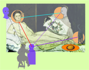
While Luncheon is seen by the art historian Niels Sandblad as “troubled” in conception and painting lacking the “greatness of the self-evident”, Olympia becomes the “definitive work” which Manet clearly wanted to achieve (1954, p.94).
Picasso, on the other hand, found Luncheon so inspiring that he devoted over 200 works to it, more than to any other painting of another painter (Wollheim 1987, p.243-48).

Manet’s Olympia is inspired by another painter like most of his early works, in this case by Titian’s Venus of Urbino (1538). He made two copies of Titian’s Venus while he was on a study trip to Italy.
The resemblance of the two paintings is quite obvious (Figure 1) and has been commented at length by countless critics.
An interesting difference is that

– Titian used a courtesan as a model but painted her as a nude wife in her home environment, presumably looking lovingly at her husband, with her hand resting on her pubic area rather innocently, and exerting a subdued eroticism, while

– Manet used a model posing as a courtesan apparently looking at her customer with her hand covering her genitals in a way that rather enhanced the sexuality of her naked body.

The problem is that the critics and the public expected an idealized nude with a “story” justifying her presented beauty, while Manet showed a contemporary woman which reminded the viewer pretty much of photographs of naked women available in Paris at the time.

As Clark has argued, the scandal exploded especially, because Manet made it not sufficiently clear whether the viewer was looking at a – somewhat acceptable – courtesan of the bourgeois high-society or at a disreputable lower-class prostitute. Actually, there was no accepted way that a respectable contemporary woman could present herself in the nude in a painting. The model had to be from the lower class, only posing as a courtesan and the credibility depended on a “story” making her posing respectable as art.

Manet, however, did not provide the alibi-story, and, worse, lacking the story motivating her gaze, the direct gaze seemed to be produced by the lower-class model herself confronting the viewer. As Clark notes, the scandal was all about class identity, not about Olympia looking straight at the viewer – like other nudes in the exhibition. Her look is “not the simple, embodied gaze of the nude”. She “looks out at the viewer in a way which obliges him to imagine a whole fabric of sociality in which this look might make sense and include him – a fabric of offers, places, payments, particular powers, and status which is still open to negotiation” (1984, p. 133; emphasis added).

Thus, Olympia raised issues of the relation between prostitution and modern class society (”the price of modernity”) and of the precarious position of women inside and outside the respected role of a married wife. Women depended in their social status on men and found themselves always balancing their sexuality between asserting their integrity and independence or commercializing their “assets” in forms of prostitution.

This societal context of Olympia in Paris around the 1860ies has been described extensively, often inspired  by Marx (e.g. T.J. Clark) and complemented with analyses inspired by feminism (e.g. Carol Armstrong 1998,  Nancy Locke 1998, Anne McCauley 1998, and Linda Nochlin 2019).
These approaches are interesting and illuminating, but in MyManet, I would like to pursue two own questions:

  1. Why did Manet in painting a modern nude take up the issue of prostitution in this explicit way by depicting a courtesan?

and

  1. How does Manet’s scheme relate to Olympia – if at all?

Considering the first question:
We might point out that Manet was well aware of the social problem and political debate on prostitution and the role of women, also discussing it presumably with his friend Charles Baudelaire. Following Rubin (2010), Olympia is the most Baudelairian painting among Manet’s work. But this perspective leads us back to the societal context.

I find a remark by Clark quite interesting that Olympia has “two faces”, a face characterized by “hardness” and a “closed look of its mouth and eyes” and a face “opening out into hair let down” over her left shoulder (p. 137). The first is “close to the classic face of the nude”, the second seems to indicate the model herself as a person, “it is her look, her action upon us, her composition of herself” (p. 133). Both faces are placed by Clark into a “taxonomy of woman” (p. 137), moving again to the level of social and cultural classification of women.

I would like to stay for a moment in the concrete situation of the atelier with Manet and his model Victorine. As said before, the concrete situation of the atelier is the reference frame for Manet’s realism – that’s where the (painting) action is!

Olympia is painted by Manet parallel to Luncheon on the Grass and finished somewhat later.
The early drafts of Olympia around 1862 do not show the “hardness” observed by Clark.
The face is smiling rather sympathetically, and the hand is not always demonstratively covering the pubic area. It is tempting to suggest that the self-asserting gaze of Olympia entered the painting under the impression of the reactions to the Luncheon on the Grass.

After all, Manet and – we should expect – Victorine Meurent were shocked by the interpretation of the woman in the Luncheon as a prostitute having fun with a couple of young students. While Victorine certainly was participating in the “loose” Bohemian lifestyle of artists, no art historian has claimed that she was a prostitute in Clark’s sense. And we have every reason to assume that Manet was not seeing her as a prostitute modelling for him, nor was Victorine seeing herself as one!

In fact, Manet is credited generally with a deep respect for all the women he painted including clearly lower-class street singers or waitresses in the bar.
The explicitness of the presentation of a courtesan with all the accessories identified by art historians (e.g. the black cat, the coloured maid with flowers of a customer) may be, in part, motivated by reactions of the artist and his model to the derogative reception of Luncheon.

Manet is confronted in the reality of the painting situation with “two faces”:
– he is “seeing” the model impersonating a nude courtesan ironically citing the painting of Titian
and
– he is recognizing that there “exists” in front of him a woman challenging and resisting the implications of “being seen” as a prostitute.

The first “face” is troubled by the problems of painting a contemporary nude courtesan:
Directing her gaze at the viewer, she engages him in the “fabric of sociality” implied by prostitution, destroys the art conventions of painting a nude and arouses a public scandal.
The second “face” looks at Manet himself – the “fabric of sociality” is here the situation of painting – with Victorine reminding him defiantly that she is involved in a power game with the viewer, if not with Manet.

The point is that Manet depicts this power game on both levels – societal and situational – at the same time:
By violating the conventional strategies of idealization of female nude beauty and presenting her realistically, he allows Victorine to express her challenge of social norms in a direct personal confrontation with the viewer. He deliberately places her high on the bed looking down on the viewer, while Titian had the loving wife looking up to her husband.
The fact that Manet identifies the painted courtesan as a contemporary living woman must have motivated Victorine even more to her gaze.
Thus, Olympia is a perfect example of Manet’s realism painting with self-awareness and self-reflection what he “sees” and what “exists” in the social situation of painting.

This reflection on the power games leads back to the second question:
How does Olympia relate to Manet’s scheme?

As a reminder, the scheme is proposed as a generic template which is realized – with variations – in other paintings. Especially since Olympia is produced in close connection with the Luncheon, we should expect some formal relationship to the scheme, not only the content relation due to Manet’s ( and possibly Victorine’s) reaction to the interpretation of Luncheon as involving prostitution.

The relation is certainly more complicated than in the case of Christ Mocked by Soldiers (see Post 14):

First, there is the question of the number of persons or positions in the painting:
Can the gazes and gestures of two people effectively instantiate the scheme?
Lüthy (2003) sees only two persons depicted, which constitutes for him a favourable reduction of the complexity of the viewer–painting relation (in 3-4 person scenarios), a relation which he considers central for the interpretation of all multi-person paintings of Manet.
In view of MyManet, the abstract viewer-painting relation (inspired by the subject-object relation of Hegel) is not differentiated enough to capture the social space of painting.
We want to identify more positions inside and outside the painting, more “polyperspectivity” (Lüthy). Notably, Lüthy is not discussing the role of the cat in the composition – an important actor, as we will suggest below.

Second, there is a problem created by the dominant gaze of Olympia.
It tends to reduce all other elements to decorative functions – like in a portrait. Her gaze is not an invitation to enter the scene but a confrontation challenging the approaching viewer. It takes some reflection on part of the viewer to become aware of the multi-layered power game described above and to see more than “she” versus “me”.
This narrowing of perspective is an effect of power games!

The hesitating and deferring gesture of the maid offering the flowers is a revealing indication of the on-going power game. The maid is almost retreating behind the flowers, as it were, and all but merging with the dark background. (Manet might have chosen a coloured person as maid to enhance this effect.) It is only by moving Olympia’s face far to the left and dividing the scene by a vertical line that the maid gains sufficient independence as an actor in this game.

Third, the cat becomes an important player in the game!
Interestingly, contemporary caricaturists like Cham and Bertall (Figure 2) acknowledge the importance of the cat more than many art critics.

Figure 2:  Caricatures of Olympia by Cham  and   Bertall  (1865)

Manet clearly felt the need to introduce a counterweight to the dominant outward-gaze. But unlike Olympia’s gaze, the gaze of the cat is not so evidently focused on a single viewer in front of the painting – a fact also recognized by the caricaturists. The cat’s gaze is more starring at the public out there, and in Cham’s graphic is even scared by the reactions of the public.

The cat represents the position of the Third!
Her gaze places the bilateral confrontation of Olympia with the viewer (and the painter) into the wider context of public reactions and institutions.

As noted by Rubin (p. 88), the cat is not only an erotic symbol – fitting into the discourse on prostitution in most interpretations – but also a symbol of freedom – fitting into the role of the cat in the power game in view of MyManet.
Rubin (p. 95) recognizes that Manet’s interest is “far more socio-psychological than erotic” and “focused on the woman’s power over her commercial transaction”. Manet underlines his intentions by avoiding “seductive use of paint”, since a dominant marketing attitude of the courtesan would suggest enhancing seductive beauty, while in a power game we oppose exactly the “commodification” of our own self (p. 96).

So far, we have identified the elements of Manet’s scheme as shown in Figure 3:

The triad of “First”, “Second” and “Third” is represented by Olympia, the maid and the cat engaging the viewer in front of the painting. As noted above, we should also include the “second face” of the model “behind” the courtesan which communicates especially with Manet, the artist.
The scheme also shows the rather flat “stage” which Manet typically uses to push the scene toward the viewer. The background – the coulisse of the “puppet theatre” – is closed by curtains and the frontstage is minimalized by the drapery hanging over the edge of the raised bed (the “still life” in the scheme).

Figure 3:  Olympia represented in Manet’s scheme – a first version

Figure 3 makes aware – perhaps more than any words could – of a central focus of the composition, namely, the hand covering defiantly the pubic area for the viewer.
The move has clearly a meaning in the power game, although critics usually propose some erotic or even psychoanalytic meaning. But I agree with Rubin that the main game played by Olympia (and Manet) is about dominance and defiance rather than erotic.
With Rubin, I would also emphasize the importance of the hand in Manet’s paintings. In Post 14, we have seen that in the case of Dead Christ with Angels the hands can play the role of persons or positions in the scheme. In the centre of Luncheon, the hand of the man to the right (“Second”) mediates – with the pointing finger and the up-raised thumb –  between the triad in the middle ground and the woman (“Other”) in the background.

Thus, the hand suggests that another person might be allowed to “see” what is hidden from the viewer.
This position or alternative perspective is “The Other” in Manet’s scheme!

Figure 4:   Olympia represented in Manet’s scheme

In Figure 4, this virtual “Other” is introduced looking from the back. Additionally, Figure 4 slightly modifies the role of the cat with her gaze now directed toward the institutional “Big Other” of the scheme.
Again, I think the graphical representation supports this role of the cat more than words could, opening another dimension or perspective in Olympia.

To sum up this analysis of Olympia let us return to the evaluation by Sandblad in the beginning.
Olympia – this was his evaluation – is the “definite work” Manet wanted to achieve, at least in this phase of his development. Sandblad reaches this conclusion, because he sees Manet achieving a synthesis of “Japonism”, the fashionable influence of Japanese woodcuts, with the French, Spanish and Dutch art tradition. This interpretation relies heavily on the decorative and unifying qualities of contemporary Japanese art adapted by Manet to his own style. For Sandblad, it also means that Manet is anticipating the Symbolism of e.g. Paul Gaugin and actually overstepping the bounds of his “analytic realism” (p. 86) by painting “paper dolls pinned to the surface of the canvas” (p. 94).

In view of MyManet, I would agree with Sandblad to the extent that Olympia is taking a step forward to more unity in painting techniques and composition. Although, I would insist that Manet is not painting on the “surface of the canvas” (except in a trivial sense), but that his “dolls” are more like puppets on a stage – with all the layers and depth required to arrange the social relations between the actors on stage and relating to the agents beyond the picture space.
Manet’s “analytic realism” never relies on the naturalistic realities of “what is seen” alone but tries to capture “what exists”, i.e. the reality of relations created by gazes and gestures. Although I have to agree with Sandblad that Manet is playing here with a symbolic or “uncanny” dimension both with the cat and the “hidden other”. We have to return to this “depth” in Manet’s realism in a later post.

Olympia offers a special application of Manet’s scheme reduced to a two-person scenario; in this sense it is not the “definitive work” but a more specific work.
The impact of the dimension of power on the compositional aspects of the scheme is, however, important. We have seen already (in Post 16 about emotions) that the scheme has to be further differentiated to accommodate the basic structural realities of social relations, namely, the influence of power, exchange, truth, and trust.
We will keep this in mind when we take a closer look at the next multi-person painting following Jesus Mocked by the Soldiers (1865), namely, the Breakfast in the Atelier (1868).

In between, Manet had to recover from the shock and disappointment caused by the negative reception of, especially, Luncheon and Olympia. In 1865, he travelled to Spain to get re-assurance from his “Master” Velasquez. Following the trip and – relevant for our purposes in MyManet – he produced for about three years paintings which either chose the scale below the multi-person interaction (like still lives) or above (like the Execution of Maximilian). I will return to these paintings later.

In the following week, I will concentrate on painting myself rather than interpreting Manet.
Hopefully, I can contribute then to my neglected gallery!

So, see you again on September 23 !

Page 1 of 3

Powered by WordPress & Theme by Anders Norén