Explorations of Edouard Manet's paintings with diagrams

Month: May 2021

Manet’s Realism (P 10)

Manet considered himself to be a realistic painter – but what is a realistic painter?
Even worse, there were (and are) different versions of realism.

Courbet saw himself – and critics admired him – as the most prominent realist painter of his time, initiating the realist movement after the 1848 French revolution.
But Manet, a decade younger, distanced his art (and himself personally by keeping away from Courbet’s circles) from Courbet’s naturalism.
Novelists like Baudelaire and Zola initiated a new realism in literature and poetry, but it seems that Manet never agreed with their interpretation of his art.

And then, there is the final question of “Installation My Manet”:

Question 7: What happens to Realism while using an abstract formal scheme?

As the caricature by Honoré Daumier suggests, a “Battle of Schools – Realism versus Classic Idealism” was waged already before Manet created his version of realism.

Figure 1:   Battle of Schools – Realism versus Classic Idealism
by Honoré Daumier (1855)

In this battle, the realists developed new styles of painting in opposition to traditional academic conventions,
choosing topics from modern life and contemporary landscapes rather than from history and mythology,
and siding with the political goals of workers and peasants in the new republic.

The philosopher and anarchist Pierre-Joseph Proudhon – Courbet’s friend whom he portrayed – is quoted as saying: “Any figure, whether beautiful or ugly, can fulfil the ends of art”
and the poet Desnoyers added (cited in Rewald 1961, p. 28):

“Realism, without being a defence of the ugly or evil, has the right to show what exists and what one sees.”

Manet – himself from the upper middle class – supported all his life the republican cause, although the political revolutions and wars of his time (Manet is a contemporary of Karl Marx) are reflected only in few of his works.
As mentioned before, his friend Edmond Duranty revitalized the tradition of puppet theatre in the early 1860ies with realism as a framework for art, public education, and entertainment.
Realism, thus, had a distinct ethical and political dimension.

Unfortunately, Manet never articulated his own understanding of realism, so we rely on his pictures to reconstruct his concept of realistic painting.
To make things even more complicated, his painter friends and followers – Frederic Bazille, Gustave Caillebotte, Mary Cassatt, Edgar Degas, Claude Monet, Berthe Morisot, Camille Pissarro, Alfred Sisley, and others – developed into the school of impressionism.
They saw him as their mentor and leader, but Manet never called himself an impressionist and did not exhibit with the impressionists.

In art history, however, at least since John Rewald’s The History of Impressionism (1946), Manet is usually regarded as an impressionist or at least as bridging between realism and impressionism. Impressionism is seen as the new stage of realism based on scientific insights: on the rapidly growing disciplines of physiology and psychology and their application to understanding modern urban life and the nature of visual experience.
Robert Herbert (1988, p.33) counts Manet among the impressionists and both under naturalism, since Manet like the others paints his impressions of Parisian life.
Michael Lüthy (2003, p.73ff) rejects this view and insists that Manet is not an impressionist and misunderstood as realist, at least in the sense of naturalism.

So, what is Manet’s realism and how does it differ from impressionism?
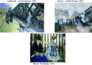
After all, there is a world of differences between Gustave Caillebotte and Claude Monet (for a comparison: Herbert 1988, p.20-32). Does Manet fit somewhere in between?

Figure 2: What is realism? Comparing Caillebotte, Monet and Manet
Interestingly, I found the most convincing argument not by art historians (not yet?) but in the history of the philosophy of science. Here, Daston and Galison (2007) researched the meaning of the concept of objectivity in natural science since about 1600 – the time of Diego Velazquez.
Their examples are visualizations of natural objects for research purposes. Natural scientists and artists were cooperating in depicting objects like botanic plants, animals, or the surface of the earth.
Their goal was truth-to-nature in drawing or etching objects like they really are, or naturalism.

From the start, they had the problem that in reality each object of a certain kind, say, an orchid or butterfly, was a little different from the other. There were accidental variations and the natural scientist had to advise the artist which deviations were relevant, and which were not.
Truth-to-nature did not mean to show an “ideal” flower; it simply meant that there is a general type which “exists” while variations just happen. Moreover, it was common practice to show the blossom and the fruits of a given flower on the same depicted plant, although this image could clearly not “exist” in reality.
Again, the scientist decided what to show and what not and the artist showed a “reasoned image” (p.42).
The image was objective because it showed what the scientist knew to “exist”.
If the artist got it wrong, these deviations were only subjective errors, as every knowledgeable person could “see”.

The terms of objectivity and subjectivity, in this sense, were introduced only later. (I recommend to read the fascinating story how the meaning in philosophy completely reversed!)
For our understanding of Manet, it is sufficient to recognize that this original meaning of “true-to-nature” persisted in the concept of naturalism in art.
While naturalism would only show what can be “seen”, realism would show what science claimed to “exist”.

But in science and philosophy things changed around the beginning of the 19th century:
     subjectivity acquired the meaning of “existing according to theory” or “universal forms of experience”;
     objectivity referred to “merely empirical sensations” or “merely objective nature”.
Thus, the meaning of the terms changed completely!
However, there was no basic problem with understanding that abstract schemes are realized in our subjective ways to perceive the world. Following the philosopher Immanuel Kant, we all use subjective schemata which enable us to “see” what “exists”.
Artists like Courbet could show what exists realistically, while scientist could rely on their senses observing phenomena and discovering theories.

But then, in the early 19th century, a number of developments interacted and shattered this view.
Political, economic, technological, and social revolutions – the transition to modernity – impacted on society.
An important effect was an increasing individualism supporting concepts of subjectivity linked to  individual freedom and capacity to reason.
That was welcomed in art:
The transition lead to the idea of “art for art’s sake” or the autonomy of art, and to the expression of the artist’s freedom and subjectivity in art.
The effect in science was ambiguous. Enhanced subjectivity strengthened the scientific self, but it also resulted in increasing awareness of the ways subjectivity interfered with objective science. Especially, research in physiology and psychology demonstrated how researchers themselves were prone to misperceptions and bias.

“What exists” (objectively) and “what one sees” (subjectively) drifted conceptually apart!

In science,
methods were adopted which produced “objective images”, images as independent as possible from any interference by humans, both scientist and artists. The paradigmatic case is photography, which to some extent substituted the artist’s drawings and engravings. Objective procedures were introduced which, in effect, controlled scientific subjectivity by rational rigor on the level of observation, measurement, and visualization (“what one sees”) as well as on the level of theory construction (“what is known to exist”).

In art,
the new insights of physiology and psychology – research on the perception of light and colour, for instance –  sparked a new awareness for the appearance of the world (“what one sees”), both in landscape painting and in the depiction of contemporary urban life. Impressionism, and later expressionism, can be understood in part as an exploitation of the results of this natural research, while, at the same time, claiming the full freedom for the expression of artistic subjectivity – Impressionism seen as new naturalism.
Both, Caillebotte with his exaggeration of perspective in modern urban planning and the presentation of fashionable people on the bridge, and Monet by showing the elusive play of light on the same bridge, will count as impressionists in this sense.

But what about Manet?

The railway bridge appears only at the right edge of the painting; a perspective into the picture is barred by an iron grill and hidden in white smoke, presumably from a passing train; in the centre and forefront, we find two people – a woman and and girl – who strangely command our attention, as we, the viewers, seem to have disturbed the woman reading . We are very close, but the woman is not really looking at us. The girl is holding on to an iron railing looking into the white smoke barring the background from view  as the railing barres her (and us) from moving back toward the railroad. We are together “boxed in” in the foreground not really looking at each other and seeing little beyond the railing.
Unlike the scenes of Caillebotte and Monet, who present to us their subjective view of  urban life, Manet’s scene is strangely “staged”. He makes the viewer “step back” to look at the scene more objectively by the tension created between spatial closeness and social distancing by the woman’s avoidance of a direct gaze.
Is this naturalism depicting a certain scene? Or impressionism of “what one sees”? Or realism of “what exists”? In what sense, is Manet the realist he claims to be?

Just as the concepts of objectivity and subjectivity have changed, the term realism changes and still changes – just think of modern hyperrealism.
So, we have to ask what the realistic concern was for Manet at the time.
He did not want to depict every detail. In the spirit of the tradition of drawing and engraving, he opted for simplicity and concentration on the essential elements with sincerity.
Manet practiced printing techniques himself and used extensively engravings rather than the originals of Old Masters as examples – like in Luncheon.
He extracted “structural elements” – as Lüthy describes it – and combined them in own compositions.
We have already identified some of these elements:
the narrow “stage”, the violation of perspective, the implication of a space before the painting by gazes toward the viewer, the flattening of figures and elements by direct light from the front eliminating modelling and shading, the arrangement of somewhat isolated elements and shapes, the collage character of the composition.
Realism in a narrow naturalistic sense presenting “what one sees” is clearly not his goal.

His realism aims at “what exists” but may not be “seen” readily:
Manet is focusing on “seeing others and being seen by others”, which in a social situation is a very real phenomenon!
The “structural elements” are elements of social forms which Manet presents just like the engravings in natural science, like combining the essential elements of a flower regardless of whether they can be observed in natural settings in exactly this way. His accent is on the more abstract forms which “exist” in a certain kind of situation rather then in the accidental aspects of “what one can see” in a specific case.
Manet creates “reasoned images” of painting as a social situation with interrelating gazes.
The figures and scenes appear somehow arrested, because Manet wants to capture them in an essential configuration, not in the fleeting, subjectively experienced moment characteristic for impressionism or in the accidental “freeze” of a photography producing “objective images untouched by human hands” but typically full of irrelevant elements.

So, Manet’s realism consists – in MyManet – on “showing what exists” in the situation of painting.
His special focus is on the configuration of real gazes and gestures relating persons. These configurations will change with the setting depicted, so we should expect variations in other paintings than Luncheon on the Grass – as the example of The Railway above shows.
The composition of the painting will not produce a naturalistic image of “what anyone can see”, but the composition of a “reasoned image” of essential elements incorporating insight into “what one knows”. Still, Manet is a realistic painter and not illustrating science. We have to come back to the difference between realism in art and in science.

At this point, I just want to link his realism again to the puppet theatre. As we have seen, the production of “reasoned images” required a close cooperation between the scientist and the artist. Unlike a theatre performance with writers, directors, and actors, each with their own agendas, the puppeteer is in command over the production. Like the scientist cooperates with the artist, the painter has, however, to cooperate with the model to sustain the social form he wants to present in the painting.
Therefore, it is not surprising
– that Manet had his quarrels with professional models and their “unrealistic” poses at the art academy,
– that he preferred to use the same models which were able and patient to realize a “reasoned imagination”,
and
– that he apparently had a great respect for his models and their dignity even if they were waitresses in a bar.
This social empathy he shared with Velazquez and it qualified him as a social leader of his own circle of painter friends.
(Feminist art historians have a lot of criticism for male artists (not only) of the time – like Courbet or Degas and their treatment of models – they are remarkably restrained in the case of Manet.)

“Reasoned images” are not merely formal compositions of abstract “structural elements”.
They claim to show reality or content of real life.
The new realism in literature of Baudelaire and Zola claims the same.
The puppet theatre makes the same claim.
We have to follow up on this aspect of content in Manet’s paintings.

So, see you next week!
Manet’s Scheme: Composition in Social Space (P9)

Two essential features of composition in Manet’s scheme – in MyManet – are the figures’ gazes and the setting of the puppet theatre, or:
the relation between the social space of gazes and gestures and the material space of the setting on stage.
Manet made deliberate choices on both features when he created Luncheon on the Grass.
This we understand better looking at two studies for the Luncheon
and the X-ray visualizing Manet’s first draft underlying the final version.

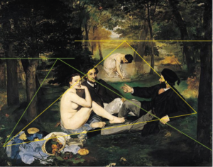
In Figure 1, the four versions are compared, scaled to the same size, and supported by diagrams indicating perspectives:

Figure 1:   Comparison of four versions of the Luncheon on the Grass

A – the final version of Luncheon on the Grass 1863
B –  a later copy made by Manet himself dated between 1864-68
C –  a study in watercolour with pen and ink dated between 1863-65
D –  a print from an X-ray of the final version revealing a first draft

All four versions are presented and discussed by Juliet Wilson-Bareau (1986, p. 37ff)
– including a comparison with the painting Pastoral Concert by Titian and the etching by Raimondi after Raphael’s Judgment of Paris (see previous Post 8). Her X-ray analysis is a much acclaimed and quoted source in the discussion.

Wilson-Bareau proposes that the study (C) was made from the final version, and that the copy (B) was probably made even later. She concedes, however, that the sequence is only hypothetical since the exact dating is unresolved.

Her analysis demonstrates convincingly how Manet was experimenting with elements and their composition directly on the canvas and even at a late stage (like inserting and deleting a little dog to the left of the nude).
She concludes:
“One of Manet’s major problems with the Luncheon was evidently his difficulty in integrating the very solid, sculptural group into the original open and airy setting” (p. 39; title adapted as Luncheon).

In view of MyManet, I suggest a slightly different sequence and interpretation of his “problems”.

Two major changes are occurring between the draft in the X-ray (D) and the final version (A):

–  On the left side,
in the X-ray an open view reaches from the foreground to the open landscape beyond the river,
with grass and bushes in the foreground instead of the clothing of the nude in the final version.

–  In the group,
the gaze and position of the head of the man next to the nude is changed;
in the final version, he looks slightly upward into some undefined distance
rather than connecting with the other man as in the X-ray,
while his head – in relation to the nude’s face – is a little moved upward and forward in (A)
placing the three faces almost onto the same plane in the picture space.

Looking at the final version, the X-ray, and the study C, it is remarkable that all three versions show the same “solid, sculptural group”. This is indicated by the identical white triangles connecting the faces and by the position of the background female in the diagram of perspectives.
“Sculptural” may not be the appropriate term, since the triad is rather “flat” with the second woman set backward and too large in perspective. But I agree that the impression is rather “solid”; the formation of the four figures appears to be the same and clearly predetermined in all three versions, and rather independent from the landscape in the X-ray.

Taking up the first change:
Manet may have seen a “problem” with the integration into the landscape, but he resolves this “problem” in a rather unusual way by enhancing the difference between the landscape on left side and the solid group!

He introduces the “split horizon” from Pastoral Concert (the two perspectives in the diagram) and accentuates the vertical divide (left red line) by dark bushes and trees above the nude’s head.
Then, he keeps the “too large” woman pushing the background forward and the horizon upward and promotes the artificiality on the centre and right side – the “stage”.
He paints the background rather indistinct as “coulisse” and fits the triad into a middle ground with reduced depth. To maintain the balance under these conditions, he introduces in the foreground the elaborate “still life” to the left and a dominant dark tree to the right.
All this makes sense, when he is determined to preserve the formation of the group though violating a “natural” perspective. He is not caring about integrating the group “into the original open and airy setting” (see Wilson-Bareau above).
Manet invents a programmatic scheme.

Taking up the second change, the gaze of the man next to the nude:
This change raises the question of the role and dating of the study (C).
Wilson-Bareau suggests that the study is made after the fact, after completion of the final version. Her argument appears to be that the study reflects too closely the original to precede it.
Placed before the X-ray, the differences of the study with the X-ray become incomprehensible.
Placed between X-ray and final version, Wilson-Bareau apparently would expect more resemblance with the X-ray.
But why would Manet do that kind of study after the fact?
Certainly not to prepare the later version (B) which is in many ways different again, as I will show below.

An alternative interpretation is suggested in MyManet.

First, it is telling that the left side of the painting is not explicated in the study. This side includes in the final version the attractive “still life”. Why would this be neglected in the – admittedly, unfinished – study?
Second, it seems that Manet wanted to clarify the formation of the group before changing the left side:

The crucial change from the X-ray appears to be the face and head of the man next to the nude!

For the direction of this gaze Manet has no example in either Pastoral Concert or Judgement of Paris. He has to decide where the man should look, and he is not satisfied with an internal communicating gaze to the other male or with an “absorbed” gaze within the triad – as in the X-ray.
If Judgement of Paris is to be the model, then the gaze has to be directed toward the “authority” or Big Other – the god Jupiter arriving from the sky.
Thus seeing the study as an experiment for the gaze of the Third – in terms of MyManet – also underlines the importance that Manet attaches to this gaze!
To my knowledge, only Gisela Hopp (1968, p.23) has declared the gaze of the Third, in connection with the gaze of the nude, a decisive centre of gravity in the design of the painting, although she tries to derive this crucial role only in terms of internal design of areas, colours and perspectives.
(In her words: “Sein Blick ist erst der endgültige Kernpunkt des Bildes, nicht zu lösen von dem der Frau, aber auch für diesen Ausgangs- und Anziehungspunkt.”)
MyManet could not agree more!

It is interesting or puzzling that the nude’s gaze in the study (C) seems to follow the gaze of the man next to her – not gazing to the viewer! This is difficult to understand, if the study is made after the final version, as Wilson-Bareau proposes.
Rather, experimenting with her gaze in conjunction with experimenting with his gaze demonstrates what Manet is attempting: designing the interactive effects of the gazes in constituting a certain social and pictorial space.
When the nude is not looking at the viewer, the interaction with the viewer is lost and the gaze of the man is not effective anymore either, because it loses its singular force.

Finally, we have to consider the later copy (B).

Wilson-Bareau offers a questionable interpretation – from the view of MyManet.
She perceives in the copy “a more coherent, close-knit relationship between the foreground figures, while … improving the perspective view of the bather in the background” (p.39).
In my view, Manet appears to be testing after the fact and after receiving all kinds of harsh criticisms about his “failures”, whether his programmatic scheme is successful in achieving what he wants to achieve.
He revises all the major changes which account for the originality and modernity of Luncheon on the Grass:

  • The perspective is “improved” by reducing the size of the background woman, setting her lower and lowering the horizon, and creating a more integrated background across the painting breaking the dark vertical above the nude.
  • The man to the right is moved closer to the other two figures creating more intimacy (see right red line and perspective). He is also positioned a little bit lower and to the front (white triangle), while the other man appears a little smaller following the perspective toward the woman in the back.
    Together, these changes produce a less “flat” middle ground extending into the depth of the painting.
  • The man next to the nude is now modestly looking toward the man to the right – sinking back into insignificance.

The result is a more “natural” setting which might have caused less of a scandal, because viewers could “read” those pastoral scenes – but we certainly would not be talking about this painting as a starting point for modern art!
The dynamics in the composition – the perceived lack of intelligibility, of inconsistencies and ambiguities – aroused the criticism of the art community, but caused also the later recognition of its ingenuity.

No wonder that Manet did not finish or exhibit this version!
Maybe he kept it ready at hand in his studio to show it to anybody worth to be engaged into a discussion about his innovative great scheme in the final version.

To be sure, this scheme is a hypothesis about the concepts guiding Manet. But I think it demonstrates two things:

  • It is necessary to consider not only the sources inspiring Manet to understand his compositions, especially, since he is substantially changing and adapting them to the needs of the emerging painting.
  • It is not enough to interpret Manet’s composition as “defined in terms of their rejection of academic conventions” (John House 1986, p. 12). The rejection is a critical attitude certainly shared by Manet, but it does not yet explain the programmatic choices and specific innovations introduced by Manet.

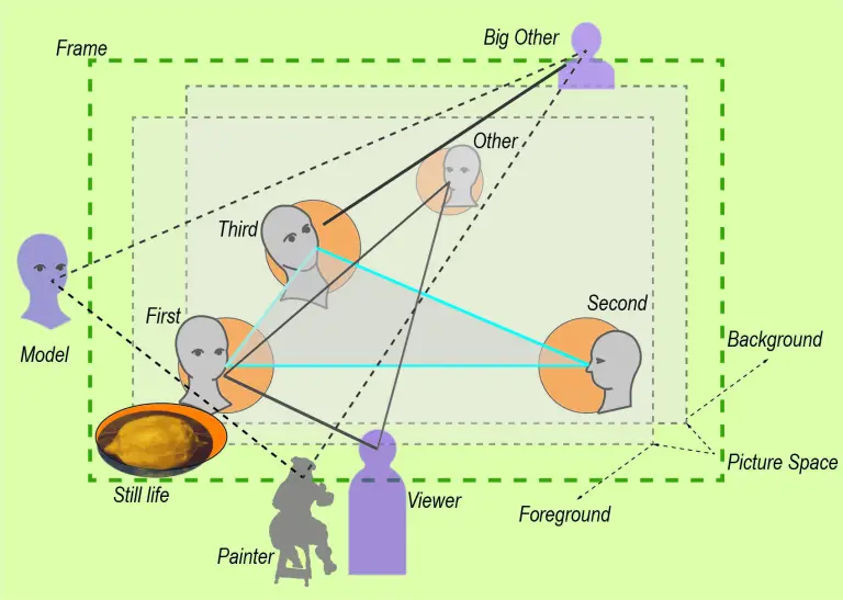
Time to summarize the elements of this scheme in form of a diagram integrating the results so far:

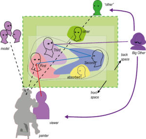
Figure 2:   Manet’s Scheme – Composition in Social Space

The diagram should not be understood as a “manual” which Manet is following in the composition of Luncheon on the Grass, or in the creation of any of the other paintings to which we will apply the scheme. The diagram is mediating between the painting itself as experienced by us today and the process of painting as an event happening about 160 years ago. It is a tool for understanding – as are all diagrams – not a “theory” of the painting.

The essential dynamic is the interaction of social and pictorial space, of the roles outside the painting with the roles inside the painting.
Obviously, such a dynamic is – in the strict sense – only meaningful in figurative painting. And not all figurative paintings, and not all of Manet’s figurative paintings, are exemplifying this scheme as developed in Luncheon.
To understand our experience of other types of painting, we will have to introduce new concepts and schemes which appeal to different ways of relating to “What do pictures want?”(Mitchell 2005).

Manet is inspired by the structure of the puppet theatre which provides a model or stage for the activity of painting.
As anybody who has witnessed a puppet performance knows, there is no clearly defined inside and outside in the relation between audience and performance. The relationship is negotiated as the “show goes on” in each performance.
In terms of painting, we should imagine a situated installation artwork with the painting presenting certain elements “performing” on the “stage” carried by the canvas. The essential medium for this “performance” is the way our eyes move through the painting following the network of gazes and gestures of figures in the painting while engaging us and other agents outside the painting. In a sense, the relations are the “spiderweb” that stretches the social and spatial relations “in mid-air” reaching beyond the frame.

As indicated in Figure 2, Manet does not see these relations as realized on the flat surface of the canvas, although he is certainly aware of the material vehicle. He creates his own version of a socio-spatial “reality” which does not follow the rules of perspectives but stages figures and objects in a layered way, similar to a collage.
The “stage” is structured into a picture space rather narrow in depth and delimited by a front plane and a back plane. The front plane defines the foreground and is often accentuated by a “still life”, symbolized in the diagram by the lemon.
The picture space holds the triad of social roles with the First relating to the viewer and the painter, the Second integrating the relations on stage, and the Third linking to the “world beyond”, to society and tradition, symbolized as the Big Other or – in Manet’s case – by his idol of painting Diego Velazquez.

An interesting role in Manet’s scheme is taken by the “Other”. The “Other” reflects Manet’s insight that placing the scene “on stage” – like a puppet theatre performance – implies that there is an alternative perspective “from the back”. This “Other” may be represented within the picture, “painted on the coulisse” as in Luncheon, but the role may be only implied by the way the scene is staged.
As we will see in some interpretations of Manet, this “Other” – besides the relation between Third and Big Other – provides a welcome entrance for psychological or psychoanalytical interpretations looking from an unconscious “deep back stage” (often symbolized by a dark background) or for sociological interpretations emphasizing societal influences.

Similarly, the other external agents may be presented or unrepresented and only invoked by elements in the painting. Manet strongly reminds us of the presence of the painter by the very style of his painting. The viewer is, obviously, engaged by the outward gaze of the First; only on rare occasions does Manet introduce a “represented” viewer. The Big Other is implied by the diversion of the gaze of the Third, which avoids the gaze of the viewer and makes the viewer aware that looking at the painting is not only an individual subjective affair by the viewer – there is a “world beyond”. Finally, we have seen that Manet produces an awareness for the model – in case of Luncheon, by the amused gaze of Victorine Meurent who contacts the painter Manet in the process of painting.

The diagram offers a tool especially for the structural features of Manet’s scheme.
In that sense, it can be understood as representing aspects of the aesthetic form of the painting. However, the scheme is not simply aesthetic, it is incorporating a social form. It reflects how Manet (and, consequently, how the viewer) experiences the social reality and transforms it aesthetically in the painting.
This interaction between social form and aesthetic form, between the social reality of the painter and the development of new ways of seeing and expressing the reality in painting, has been brilliantly described, in the case of impressionism, by Robert Herbert (1988).

Obviously, the diagram does not tell us everything about Manet’s approach to painting.
There is much more to be told about the form and content of Luncheon on the Grass.
The diagram must be placed in a broader context to be meaningful.

Two important themes, we have already identified and postponed:
One theme is about the question how the paradigm of a puppet theatre can be aligned with Manet’s avoidance of “telling stories”. His figures are typically not engaged in clearly identified activities.
Another theme is closely related; it is about Manet’s realism which seems in conflict with the idea of a puppet theatre as well as with the application of an abstract compositional scheme.
Enough stuff for another post!

Meet you next week!

The Composition of Luncheon on the Grass (P8)

The “story” of Luncheon on the Grass has been told many times, and the interpretation usually focuses on two themes:
The scandal provoked by the female nude, and the fact that
Manet borrowed the basic composition from two Old Masters, Titian and Raphael.

As far as the scandal is concerned, I tend to agree with Robert Herbert (1988), among others, that Manet himself did not intend to produce a scandal. The “story” of Manet, the rebel, causing a scandal, is based on the reception of the painting by the public and the rejection by contemporary criticism.
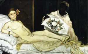
To some extent, we have to attribute the interpretation of the Luncheon to the reactions to the other painting causing an even greater scandal, the Olympia (1863). The latter painting does show a prostitute or, rather, a courtesan reclining on an impressive diwan who could afford a coloured woman as a maid presenting a quite expensive flower bouquet from a well-to-do customer.
There were literally hundreds of paintings with nude women in the Salon in 1863 when Luncheon was rejected, or in 1865 when Olympia was exhibited.
So what exactly caused the scandal?

Figure 1:  Two scandals starting Manet’s career – Luncheon on the Grass and Olympia 


The relationship between the two paintings is, indeed, very interesting. But in my view, the fascinating relations are not linked to the presumed allusion of both to the issue of modern life and prostitution in Paris of the time. I do not think that Luncheon on the Grass is about prostitution at all, although it is about modern urban life.
I will return to the theme of social scandal in a following post.

What I find interesting has more to do with the second theme, the question of composition of the Luncheon.
The two paintings are created at the same time, and yet they seem to be totally different in their approach to composition. This is easily explained, if we are content with pointing out that they cite very different Old Master paintings.
This causes a problem, however, if we propose – like in MyManet – that Manet developed in Luncheon a programmatic scheme for other paintings to follow.
How are the two paintings related on a structural level?
We have to return to this question when discussing Olympia, and after clarifying the scheme for Luncheon on the Grass.
So we ask:

Question 6: How can I paint a female nude following the formal scheme?

As Michael Fried – an expert on Manet – describes the painting:
It is “his sheerest, most intractable masterpiece” (1998, p. 57; emphasis added).
He notes that Manet’s “use of previous art was highly conscious, even programmatic, though it has not yet fully emerged what that program was” (p. 81). He goes on to argue that Manet aimed at a new synthesis of the French art tradition with Italian, Dutch and Spanish traditions. Manet’s way of achieving it, Fried sees in a certain kind of “theatricality” found in the realism of the French tradition, especially in the Le Nain brothers and Antoine Watteau.
Aspects he describes as “essentially theatrical – that the figures are grouped, that they either confront the beholder or in effect pose for him, that they participate only in the most formal or conventionalized of actions  – were experienced not just as compatible with realism but as intensely, even uniquely realistic in their own right. The crucial notion, here as elsewhere, was that of naiveté” (fn 111, p. 485; italics added). Thus, Manet found “a new paradigm of what a painting was” (fn 97, p. 482).
But what is the compositional aspect in that paradigm of grouped figures?

I learned immensely from Fried’s analysis about the sources and the meaning of elements in Manet’s painting. However, his way of composition is not explained by the selection of elements, especially, since it is generally agreed that Manet did not simply “borrow” entire compositions.

John Rewald (1961, p. 86; emphasis added) detects a “curious lack of imagination” leading Manet to “borrow” subjects from other artists. But Manet certainly demonstrates a lot of creativity in integrating these citations into an own composition.

This is not John Richardson’s view, he flatly states: “Manet’s sense of design was faulty”(1982, p. 9f; emphasis added). He initiates a discussion on “Manet’s compositional difficulties” referring to the Luncheon on the Grass as well as other paintings in the 1860ies.

Anne Coffin Hanson tries to defend Manet discussing critical reactions to Richardson’s evaluation. But in the end, we are left with few remarks on more formal principles of composition such as proportional systems, diagonals and triangles. “Of all the qualities of Manet’s art, his picture construction has been least understood”, is her resume (1977, p. 197ff; emphasis added).

For Sandblad (1954, p. 93f), Manet makes “efforts to transform the pastoral idyll which he had set up on the floor of his studio into a decorative and ordered picture on the surface of the canvas” … ” the three strictly contoured figures in the foreground appear like paper dolls pinned to the surface of the canvas”… “(Luncheon on the Grass) did not become the definitive work which Manet had presumably dreamt of” (emphasis added).
This – according to Sandblad – was achieved in Olympia.

Robert Herbert offers a brilliant description of the “social form” of picnics and the Parisians’ concept of leisure and landscape comparing it especially with Claude Monet’s version of the same theme two years later.
While pointing out Manet’s ironic way of “mocking history and its guardians, the academy”, Herbert also has his difficulties with the figures: “Not only do they appear as virtual cut-outs, arbitrarily transported from the studio, but their wooded clearing seems as artificial as a stage set. Among other things, our view back to the water on the left cannot be reconciled with our view through the center (the foliage over the nude’s head is too obvious a device to bridge the two perspectives successfully). … Manet’s painting, in fact, is built upon the juxtaposition, rather than the integration, of its separate parts.” It is not yet “a piece of contemporary leisure that embraces a more satisfactory narrative” (1988, p. 172f; emphasis added).

I find it amazing that one of the most famous paintings in European art history evokes such puzzled reactions from the art community!

The most convincing analysis I have found so far in the literature is the one by Michael Lüthy (2003).
His approach focuses directly on Manet’s use of gazes in the “internal” order of the painting and the “external” relationship to the viewer, and it places Luncheon on the Grass in the context of other paintings of Manet to discuss an emerging pattern.
MyManet is inspired by him, and I will return to his book for guidance in other cases, also discussing the differences of our approaches.

The emerging scheme is obviously only one perspective among many others, but it confronts the issue of Manet’s “compositional difficulties” directly. Interpretations of the composition are quick to demonstrate that Manet was inspired by at least two paintings. What is typically overlooked is the question:
Why these two – and not any of the countless other paintings in the Louvre museum?
Manet did not copy either one, he selected elements from both and combined them in a new way.
Why did he choose these elements and combined them the way he did?

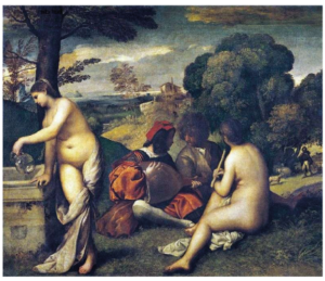
Let us take a look at the first painting Pastoral Concert (1508) by Titian, attributed to Giorgione at Manet’s time. The painting was (and still is) in the Louvre museum and Manet made a free copy of it earlier.

Figure 2: The Pastoral Concert by Titian (1508)

The painting delivered the basic idea of two nude women and two dressed men. They have interrupted their music, and the female to the right seems to wait patiently until the two men have settled some issue, while the second woman gets the drinks (sounds somewhat familiar?).
In the background, a shepherd is tending to some sheep, but no one is alarmed; there is no sexual activity interrupted here. In the good old days (over 3oo years ago) painting this scene was no scandal, and it hanging in the Louvre at Manet’s time was no scandal either.

So, Manet transposed the scene into modern urban life – only, now it was a scandal if people did that sort of leisure activity in the Bois de Boulogne, the park near Paris! And a metaphorical interpretation – like long ago – was not acceptable by the viewers (and not intended by Manet). After all, these people could quite readily be identified as contemporary, living individuals, at least by insiders of the art community.

Again, I am not worried about the scandal, but interested in two other aspects.
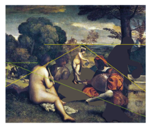
Therefore, I did a little transformation of the piece by mirroring it and moving the lady at the left edge into the background – see Figure 3.
First, this way it is obvious that Manet borrowed the theme and the basic composition from Titian. Mirroring images was something very common to him since he worked often with printing techniques.
Second, we see that Titian used a split horizon with a different perspective into the depth toward the shepherd, now on the left. We find the same split in Luncheon, and in both paintings the areas are separated by dark bushes and trees, as noted by Herbert (see above; although without mentioning the same element in Titian).
The relationship between the two paintings was generally recognized by contemporary critics.

Figure 3: Modifying Pastoral Concert to match Luncheon on the Grass


But there is an important difference which was not mentioned then, and not in later discussions.
In Pastoral Concert the three central figures are looking at each other – they are “absorbed” in their activity.
Why did Manet change that if the composition was so suitable?

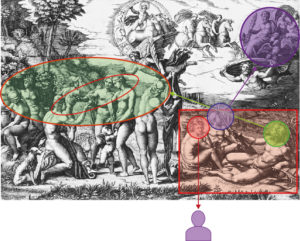
Noticed by the art critic Ernest Chesneau at the time, Manet had a second inspiration from where he took the arrangement of the central triad, an etching by Raimondi of Raphael’s Judgement of Paris (ca. 1475).
Here we see three river gods sitting in the right-hand corner in the same arrangement as the triad in Luncheon.
In Raphael’s composition, the triad and especially the outlooking woman has the function of introducing the viewer into the picture. This relation to the viewer is exactly what Manet is aiming at – only that he is not interested in leading the viewer into an allegory or “story” shown in the main part of the painting.
The viewer relation is the “story”!

Figure 4: Etching by Raimondi of Raphael’s Judgement of Paris – with markings of Manet’s scheme

The elimination of the rest of Raphael’s painting induces certain changes – marked in Figure 4 following our scheme.
The basic orientation of the figures with the female (First, red) turning toward the viewer and their gazes away from each other is maintained.
But the male to the right (Second) is leading into the whole painting or onlooking (green) toward the scene to the left – his right hand extended by a palm branch behind the group. In the  Luncheon, he is only looking at the other two (blue). His right hand is not needed to point to the scene beyond; in Luncheon, a somewhat indistinct pointing or arguing finger has to do. The oar in his left hand is substituted by a fashionable cane supporting a main diagonal in the painting.
The other male (Third, purple) is in the Luncheon not looking up and backward toward Jupiter arriving from heaven. In modern urban life in Paris, you might see the balloon of Manet’s friend Nadar drifting by in the sky, but this would occur more to the front where the light is coming through the foliage. (Remember, Manet was making lithographs of this balloon.)

For the interpretation of the Third in Manet’s triad we have previously identified the function of relating to some external “authority” or Big Other. This interpretation is readily supported in Raphael’s painting!
After all, Jupiter is the final authority arriving to confirm the judgement of Paris (the figure to the left in the inner circle) on the beauty of Venus (the female hugged by the little angel). I am sure, Manet appreciated the “theatricality” of the scene with a backfigure, the nude in the centre, wisping away the cloth hiding her beauty. But this kind of storytelling is exactly what he was trying to avoid.

Another intriguing element in Raphael’s painting is the figure of Hermes who is in the inner circle looking from the back onto the scene! So far, I found no reference to this element in the literature on Manet.
Quite clearly, Hermes is completing the inner scene to a group of four figures which again form a mirror image of Manet’s composition. Thus, Hermes is in the position of the “other”! Since Hermes is the messenger and mediator between humans and the divine, there hardly could be a better figure in Greek mythology to fill that position in Manet’s scheme.

Manet did not talk or write about the choices he made in the composition of Luncheon on the Grass.
We know that he made his decisions deliberately with knowledge about traditions in literature and art and with a witty irony directed both toward traditions and modern society. The choices for inclusion of elements and their arrangement in the Luncheon are no exception. What he deliberately modified into a composition of his own were the gazes of the figures establishing a relationship between an “internal” and an “external” order.

Manet was developing a programmatic scheme, a “new paradigm of what a painting was” characterized by a new realism and naiveté (Fried).

In the next post, I will pull all these elements together in a diagram of Manet’s scheme.

See you next week!

The Emergence of the Scheme (P7)

Manet’s scheme – the MyManet scheme – did not emerge in one creative step, but over several paintings experimenting with figures, their gazes, and their roles.
As we have seen, the scheme implies at least three figures and their gazes within the painting. Therefore, we look especially at his multi-figure paintings, and try to find elements of the emerging scheme:

Question 5:  How can Velazquez – figures within – and Courbet – figures outside – be combined in a social scheme?

According to Michael Fried, the years 1862-63 saw the breakthrough of Manet’s art (1996, p.1).
After copying The Little Cavaliers (1859) and before he created The Luncheon on the Grass (1863) and Olympia (1863), Manet painted four scenes with three or more figures (excluding graphical works and sketches):

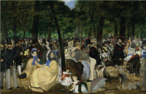
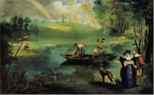
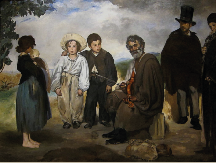
Music in the Tuileries (1862), Spanish Ballet (1862), The Old Musician (1862), and The Fishing (1863).
In Figure 1, the four paintings are shown together.

Figure 1: Four multi-figure paintings preceding the Luncheon on the Grass

Music in the Tuileries

Spanish Ballet

The Fishing

The Old Musician

What I find striking is that these painting are so different!
Would anybody (without some acquaintance with Manet) guess that they are even from the same artist?

As Fried demonstrates in detail, this is at least in part due to Manet’s attempt to integrate very different sources from past Old Masters.
In Spanish Ballet and The Old Musician, the reference to Valezquez and Spanish art is obvious.
In The Fishing, we find references to the French tradition (e.g. Watteau) but also to Rubens.
Music in the Tuileries seems to pick up The Little Cavaliers, and  – assuming (wrongly) that the original was from Velazquez and that the Master pictured himself at the far left  – Manet is putting himself in his place.
But citations go also across these lines e.g. with French masters also appearing in The Old Musician and Spanish influences in Music in the Tuileries.

Actually, Manet kept generations of art historians busy to find the references to past and present art and to identify persons in the painting.

While I find these discussions of sources and influences of different painting traditions very interesting in themselves, these interpretations emphasize the differences between the four paintings. Typically, Manet is described as experimenting with different styles and techniques, and often he is said to be still lacking certain skills.
What is somewhat missing – as far as I dived into the literature – are the common themes or issues guiding Manet’s exploration in these paintings. The theme of combining past and present in each painting is always acknowledged but the common themes cutting across these paintings are reduced to the development of different aspects of his painting style.
Music in the Tuileries receives in this perspective most recognition, since the painting appears to be most “modern” both in subject and in painting technique. The other three examples owe more to the past, it seems.

In Post 3, I pointed out one theme that unites Music in the Tuileries and The Fishing with Luncheon on the Grass, namely, the issue of scale. The paintings are different from Luncheon in their scale of the figures and the social and spatial relations between them, but they have in common an exploration of the effects of scale:
The Old Musician is, in this respect, comparable to the Luncheon: it shows the figures on the level of direct face-to-face interaction.
Music in the Tuileries and Spanish Ballet are like The Little Cavaliers in showing the figures lined up in a middle distance trying to keep contact with each other at least by proximity.
In The Fishing, this contact is broken or rather restricted to relations of body orientation and gestures. The grouping dissolves into a pattern of distributed small groups or individuals.

Manet does not like to paint large groups – like the traditional paintings of historical mass scenes of war or festivities. To connect larger groups in a composition, the painting needs a “story” uniting the figures – Manet avoids telling stories. The number of people produces problems, when you want each individual to play a specific role. It becomes even more of a problem when each person in the painting is assumed to have his or her own “story”. This is especially the case in a group portrait, where we expect that each individual has a distinct personality and a contact to the viewer – as in the typical portrait.

We can see the problem in the Spanish Ballet.
Manet invited the group into the studio to make a group portrait, and we can imagine how he found everybody looking at him. This was not the social situation, he wanted – we can feel the distance he created between the group and himself. As a result, he focused on two couples, dispersed the group, placed some dancers in a darker background, and tried to achieve unity in the composition by spatial rather than social relations – and he never tried to paint a situation like this again!
I do not think that Manet was incompetent to paint large groups or group portraits. He was familiar e.g. with the Dutch tradition of group portraits, and he found innovative solutions whenever he wanted them. But his interest in the direct relationship between the viewer and the action “on stage” is impossible or missing in those situations.
So, Spanish Ballet demonstrated for Manet that his concept of pictorial space – the puppet theatre – is not in alignment with a viewer facing a crowd or a larger group facing the viewer.
This, indirectly, supports the view of MyManet. (It also tends to contradict Fried’s concept of “facingness” of the whole picture as a central aspect of Manet’s art.)

At first glance, Music in the Tuileries is a counter example to the point just made – that Manet does not like crowds. But a closer look shows that Manet emphasizes a series of distinct figures, small groups, and even specific faces lined up from left to right. We see a series of individuals, and many of them have been identified as members of his social circle. The art historian Niels Sandblad (1954) is right, I think, when he draws a close connection with The Little Cavaliers. Most figures in the crowd are not more than an atmospheric background – except a few figures (highlighted by red circles in Figure 1) stand out.

Interestingly, the painting is structured by the trees into three sections.
Only in the left section, perhaps 4-5 figures look towards the viewer, most prominently one of the ladies (First).
She catches our attention and induces us to “read” the painting from left to right – just like in The Little Cavaliers.
The centre breaks this move – by a deceptive perspective deep into the park – but it is puzzling with its diffuseness of figures except for the strangely enhanced gentleman (Second) looking down at a sitting woman and for the “absorbed” children playing at the front edge of the painting (or “stage”).
To the right, again one gentleman (Third) stands out greeting somebody outside the painting lifting his top hat – taken directly from The Little Cavaliers.
Finally, a strangely enlarged gentleman (a reversed “other”) with a grey top hat is looking toward the back.

I have emphasized the references to the diagrams to highlight the “testing” of roles occurring in the painting.
As Sandblad sees it, Manet is distributing a series of “faces” that are “flat, unmodulated areas on the surface” replacing “reality with a kind of sign-language” (p. 63), an element showing an unusual “respect for the pictorial surface … most remarkable in the whole painting” (p.23). Sandblad detects here first traces of symbolism modifying Manet’s realism (distinct from current naturalism or emerging impressionism).
I would agree with him that Manet is presenting here a hidden constructed scheme arranging symbols of faces and gazes. And that this is not to deny that the painting is also the first “modern” painting of leisure activities of the urban bourgeoisie, as many art historians point out (like Herbert 1988).
But Music in the Tuileries can also be seen as testing elements of the scheme. However, the model built on The Little Cavaliers turns out to be an alternative second scheme for the middle range of the scale. We will encounter it again in other paintings (like Masked Ball at the Opera 1873).

Considering The Fishing in this perspective, it shows dispersed groups and individuals with a combination of social relations across spatial distances in a rather free composition. This arrangement should also be regarded as an alternative third scheme for the large distant range of the scale (like View of the World Fair 1867).
As I suggested in a previous post (P3), Manet has, obviously, not only one scheme for his compositions.
But MyManet tries to demonstrate the impact of a specific scheme – realized in Luncheon on the Grass – on other paintings beyond this special case. We will see this influence even in paintings following alternative compositional schemes.

So, let us take a closer look at the remaining fourth picture: The Old Musician.

As Fried tells us, this painting is a perfect starting point for analysing the way Manet is citing and borrowing from other paintings – an El Dorado for art historians. It is also a great example for the way Manet is combining freely – like in a collage – elements for his own purposes. He is not copying.

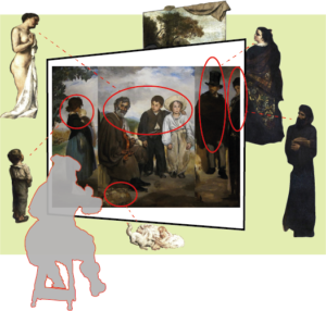
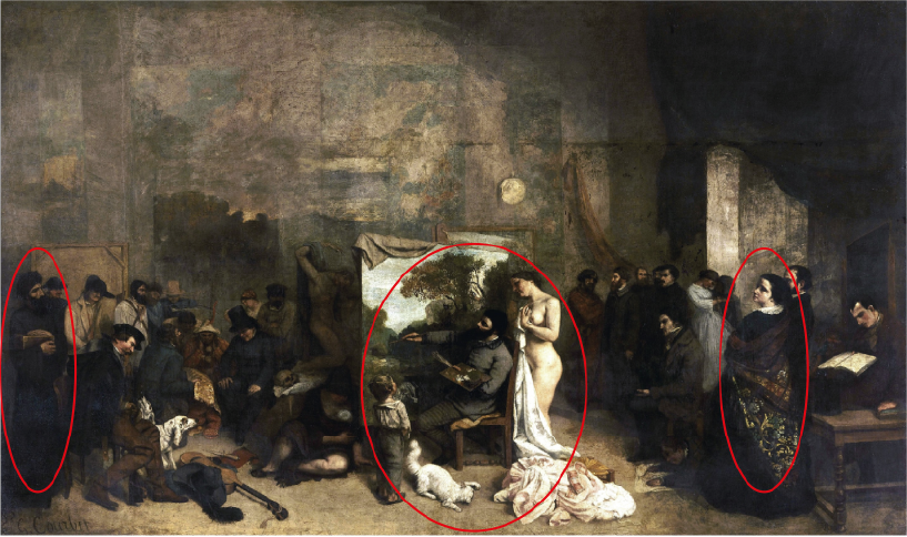
I have engaged in some own collage making. In Figure 2, I combined The Old Musician with the figures from Courbet’s painting representing the roles outside the painting. Although not exactly, since I mirrored the inner group of three figures, and added some red ellipses and a face diagram to enhance the critical elements.

Figure 2: Combining The Old Musician with Courbet’s roles outside the painting


The diagram fits to the emerging scheme almost perfectly. We see all five roles outside the painting and their corresponding “partners” within:

The triad – First, Second, and Third in the middle (with Second and Third switching positions).
The girl – inspired by the boy? – looking from the left like another “represented” viewer.
The “other” – looking from the back; quite tellingly, he is The Absynth Drinker from Manet’s own painting (1959), thus, Manet is citing himself as the “other”.
The “authority”– the philosopher or the representative of society and tradition is cut off by the right frame.
And we find a little still life marking the front stage.
The “absorbed” figure is eliminated in this case; we have kind of an “absorbed half-figure” represented by the cut-off philosopher.

The experts agree that
simplification”, “sincerity”, and a “new type of connection with the beholder”,
besides a “resistance to available modes of pictorial understanding” (Fried p.21-23), is characteristic for Manet.
So, Manet, looking at the painting as his own first viewer and critic, might have reached some conclusions:

For simplicity, the girl as a “represented” viewer is not really needed in a generic scheme realizing a new type of connection with the beholder. A painting surely should allow for additional figures, but they may vary with the subject.

In communicating the relationship with the “authority”, the Third has to be credible as connecting to an agent outside the picture space and not e.g. day dreaming. A boy, not even looking at the “philosopher”, may be not convincing and evoking other interpretations e.g. related to his youth or social class.

Placing the “authority” clearly outside the painting (like Velazquez) may be the better solution for the generic scheme. Although, depending on the subject, strong clues for the implication of “authority” may be required (like Velazquez representing the royal couple in the mirror of Las Meninas).

Citing the painter himself as the “other” is a nice ironic touch, but for a generic scheme it will not always work .
The “other” looking from the back should perhaps be less dominant.
Moreover, like in the lithograph with Polichinelle peeking out from the coulisse (Post 2), it might be better to imply the “other” rather than representing the figure in the painting e.g. by moving the background forward and making room for imagining a social space “behind the stage”.

So, in the perspective of a sincere, new scheme presenting the “painting of painting” – including roles inside and outside the painting – we should focus on the essential elements.

Now, Manet needs a subject that allows for the realization of the consolidated scheme, but also for his way of mediating between the past and the present while critically and ironically distancing himself from both.
The nude is clearly the “classical” subject which – transposed into the context of modern life – offers all the possibilities for confronting existing traditions in art and society.
The paradigm of the puppet theatre provides not only a vision for the composition, it clearly feeds into all ironic and critical intentions of the project.

So, the subject will be a Luncheon on the Grass with a female nude accompanied by the three additional figures required by the scheme!

See you next week!

Powered by WordPress & Theme by Anders Norén